Chart.js基于Canvas画布的HTML5统计图表库
Chart.js 是一个简单、面向对象、为设计者和开发者准备的图表绘制工具库。可以绘制柱状图、热点图、曲线图等,使用HTML5中的Canvas画布,支持原生的和jQuery的调用方法。
特点
6种图表类型
Chart.js帮你用不同的方式让你的数据变得可视化。每种类型的图表都有动画效果,并且看上去非常棒,即便是在retina屏幕上。
基于HTML5
Chart.js基于HTML5 canvas技术,支持所有现代浏览器,并且针对IE7/8提供了降级替代方案。
简单、灵活
Chart.js不依赖任何外部工具库,轻量级(压缩之后仅有4.5k),并且提供了加载外部参数的方法。
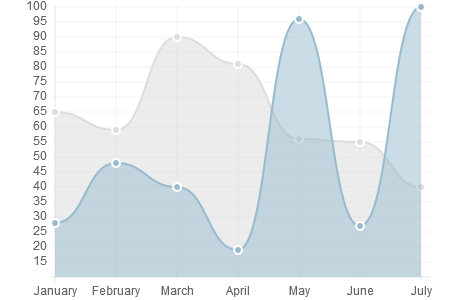
曲线图(Line charts)
Line graphs are probably the most widely used graph for showing trends.
var lineChartData = {
    labels : ["January","February","March","April","May","June","July"],
    datasets : [
        {
            fillColor : "rgba(220,220,220,0.5)",
            strokeColor : "rgba(220,220,220,1)",
            pointColor : "rgba(220,220,220,1)",
            pointStrokeColor : "#fff",
            data : [65,59,90,81,56,55,40]
        },
        {
            fillColor : "rgba(151,187,205,0.5)",
            strokeColor : "rgba(151,187,205,1)",
            pointColor : "rgba(151,187,205,1)",
            pointStrokeColor : "#fff",
            data : [28,48,40,19,96,27,100]
        }
    ]
};
Chart.js has a ton of customisation features for line graphs, along with support for multiple datasets to be plotted on one chart.
柱状图(Bar charts)
Bar graphs are also great at showing trend data.
var barChartData = {
    labels : ["January","February","March","April","May","June","July"],
    datasets : [
        {
            fillColor : "rgba(220,220,220,0.5)",
            strokeColor : "rgba(220,220,220,1)",
            data : [65,59,90,81,56,55,40]
        },
        {
            fillColor : "rgba(151,187,205,0.5)",
            strokeColor : "rgba(151,187,205,1)",
            data : [28,48,40,19,96,27,100]
        }
    ]

};
Chart.js supports bar charts with a load of custom styles and the ability to show multiple bars for each x value.
雷达图或蛛网图(Radar charts)
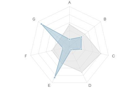
Radar charts are good for comparing a selection of different pieces of data.
var radarChartData = {
    labels : ["A","B","C","D","E","F","G"],
    datasets : [
        {
            fillColor : "rgba(220,220,220,0.5)",
            strokeColor : "rgba(220,220,220,1)",
            pointColor : "rgba(220,220,220,1)",
            pointStrokeColor : "#fff",
            data : [65,59,90,81,56,55,40]
        },
        {
            fillColor : "rgba(151,187,205,0.5)",
            strokeColor : "rgba(151,187,205,1)",
            pointColor : "rgba(151,187,205,1)",
            pointStrokeColor : "#fff",
            data : [28,48,40,19,96,27,100]
        }
    ]

};
Chart.js supports multiple data sets plotted on the same radar chart. It also supports all of the customisation and animation options you'd expect.
饼图(Pie charts)
Pie charts are great at comparing proportions within a single data set.
var pieChartData = [
        {
            value: 30,
            color:"#F38630"
        },
        {
            value : 50,
            color : "#E0E4CC"
        },
        {
            value : 100,
            color : "#69D2E7"
        }

];
Chart.js shows animated pie charts with customisable colours, strokes, animation easing and effects.
极地区域图(Polar area charts)
Polar area charts are similar to pie charts, but the variable isn't the circumference of the segment, but the radius of it.
var polarAreaChartData = [
    {
        value : 62,
        color: "#D97041"
    },
    {
        value : 70,
        color: "#C7604C"
    },
    {
        value : 41,
        color: "#21323D"
    },
    {
        value : 24,
        color: "#9D9B7F"
    },
    {
        value : 55,
        color: "#7D4F6D"
    },
    {
        value : 18,
        color: "#584A5E"
    }
];
Chart.js delivers animated polar area charts with custom coloured segments, along with customisable scales and animation.
环形图(Doughnut charts)
Similar to pie charts, doughnut charts are great for showing proportional data.
var doughnutChartData = [
        {
            value: 30,
            color:"#F7464A"
        },
        {
            value : 50,
            color : "#46BFBD"
        },
        {
            value : 100,
            color : "#FDB45C"
        },
        {
            value : 40,
            color : "#949FB1"
        },
        {
            value : 120,
            color : "#4D5360"
        }

];
Chart.js offers the same customisation options as for pie charts, but with a custom sized inner cutout to turn your pies into doughnuts.
相关链接
如果你对这篇内容有疑问,欢迎到本站社区发帖提问 参与讨论,获取更多帮助,或者扫码二维码加入 Web 技术交流群。

绑定邮箱获取回复消息
由于您还没有绑定你的真实邮箱,如果其他用户或者作者回复了您的评论,将不能在第一时间通知您!


发布评论