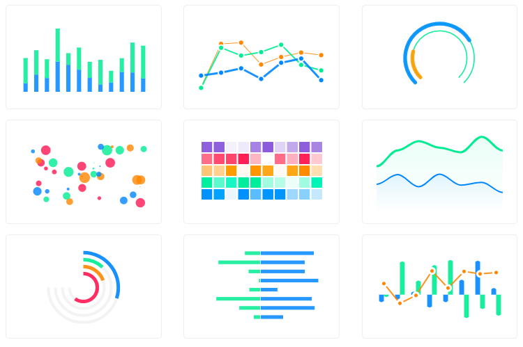
@29aries/apexcharts 中文文档教程

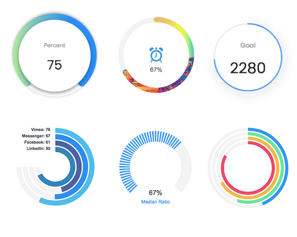
一个现代的 JavaScript 图表库,用于使用简单的 API 构建交互式图表和可视化。
我们的合作伙伴
ApexCharts 现在是 FusionCharts 的合作伙伴,带来更广泛的数据可视化组件。
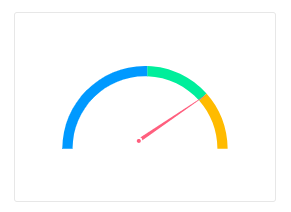
他们提供数据驱动的地图、仪表、小部件、高级时间序列图表等等。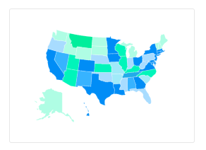
Browsers support
 Firefox |  Chrome |  Safari |  Edge | IE11 |
|---|---|---|---|---|
| 31+ ✔ | 35+ ✔ | 6+ ✔ | Edge ✔ | (IE11) ✔ |
Download and Installation
Installing via npm
npm install apexcharts --save
Direct <script> include
<script src="https://cdn.jsdelivr.net/npm/apexcharts"></script>
Wrappers for Vue/React/Angular
与第 3 方框架轻松集成
Unofficial Wrappers
除了上面提到的流行框架之外的包装器的有用链接
- stencil-apexcharts - Stencil Component for ApexCharts
- apexcharter - Htmlwidget for ApexCharts
- apexcharts.rb - Ruby wrapper for ApexCharts
- blazor-apexcharts - Blazor wrapper for ApexCharts demo
Usage
import ApexCharts from 'apexcharts'
要创建具有最小配置的基本条形图,请编写如下:
var options = {
  chart: {
    type: 'bar'
  },
  series: [
    {
      name: 'sales',
      data: [30, 40, 35, 50, 49, 60, 70, 91, 125]
    }
  ],
  xaxis: {
    categories: [1991, 1992, 1993, 1994, 1995, 1996, 1997, 1998, 1999]
  }
}

var chart = new ApexCharts(document.querySelector('#chart'), options)
chart.render()
这将呈现以下图表
A little more than the basic
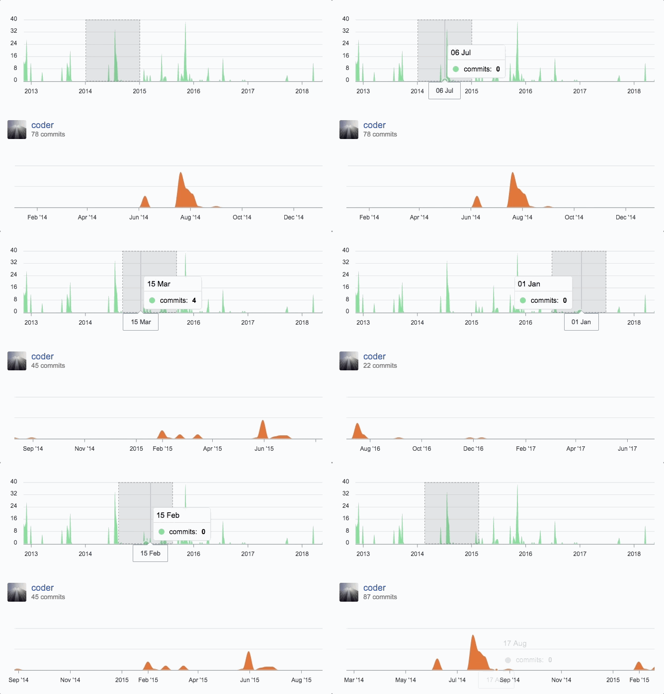
您可以创建不同的组合图表,同步它们并以无限的可能性提供您想要的外观。 下面是一个 github 样式的同步图表示例。
Interactivity
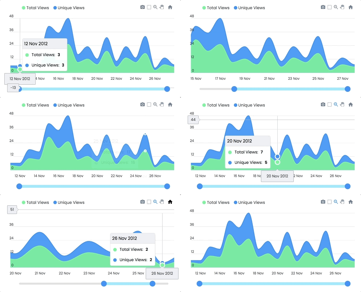
缩放、平移、滚动浏览数据。 使用这些选择进行选择并加载其他图表。 性的示例
显示一些交互 ="interactive chart">
Dynamic Series Update
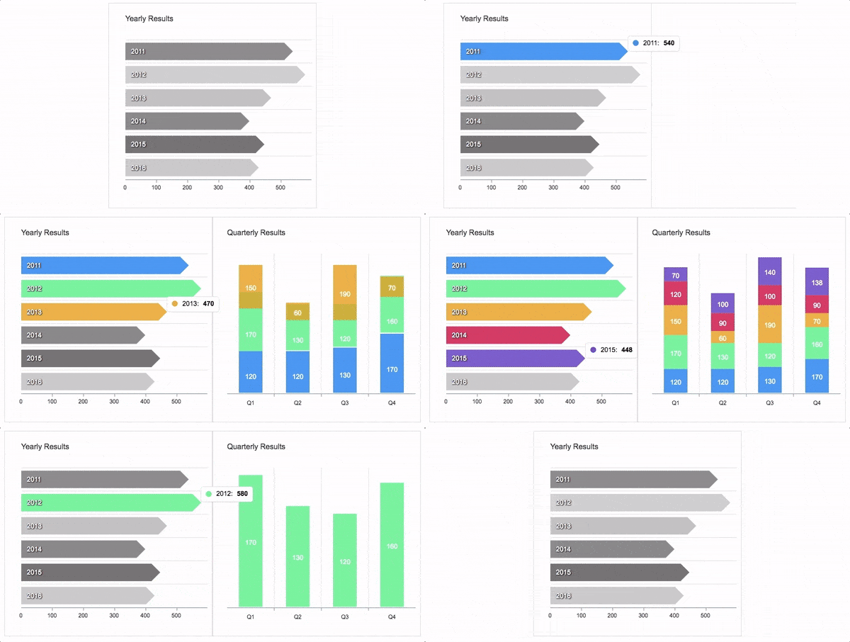
另一种向下钻取图表的方法,其中一个选择更新其他图表的数据。 将动态系列加载到图表中的示例如下所示
Annotations
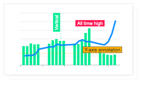
注释允许您在特定值或轴值上编写自定义文本。 对于扩展图表的视觉吸引力并使其提供更多信息很有价值。
Mixed Charts
你可以组合多种图表类型以创建组合/混合图表。 可能的组合可以是单个图表中的线/面/柱。 每个图表类型都可以有自己的 y 轴。
Candlestick
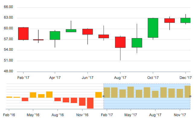
使用烛台图(一种常见的金融图表)来描述证券、衍生品或货币的价格变化。 下图显示了如何将另一个图表用作画笔/预览窗格,它充当浏览主烛台图表的句柄。
Heatmaps
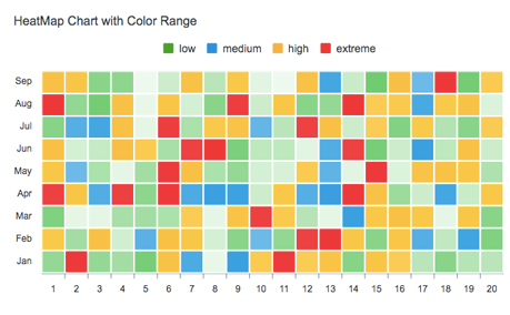
使用热图通过颜色和阴影表示数据。 它们经常与更大的数据集合一起使用,对于识别模式和重点领域很有价值。
Gauges
微型仪表是仪表板的重要组成部分,可用于显示单系列数据。 这些仪表的演示:
Sparklines
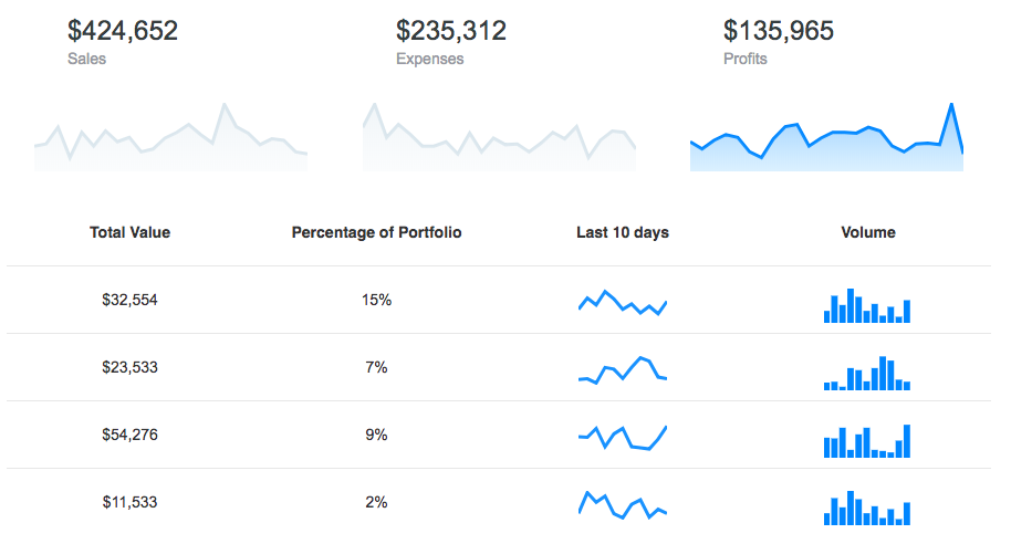
利用迷你图表示数据趋势,例如,偶尔增加或减少、货币周期,或显示最极端值和最小值:
More advanced chart types from our friends at FusionCharts 
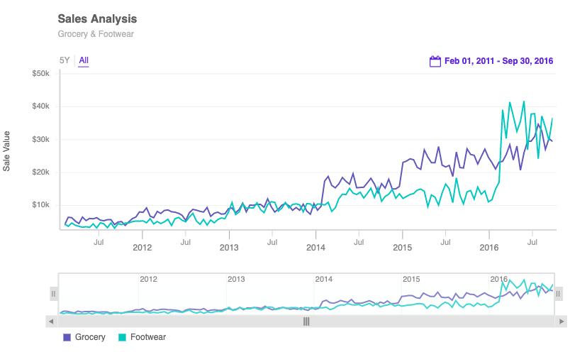
感谢我们在 FusionCharts 的朋友,您现在可以更好地体验 时间序列数据,具有可视时间导航器、带日期和事件标记的注释、多变量分析和实时支持等功能。
Export full dashboards 
想要将您的仪表板导出为 PDF、通过电子邮件发送或只是在服务器端导出图表? 您可以使用 FusionExport 完成这些以及更多操作,我们 FusionCharts 朋友的新产品。
What's included
下载包包括以下文件和目录,在 dist 文件夹中提供一个缩小的单个文件。 包括图标/css 在内的每个资产都捆绑在 js 本身中,以避免加载多个文件。
apexcharts/
├── dist/
│   └── apexcharts.min.js
├── src/
│   ├── assets/
│   ├── charts/
│   ├── modules/
│   ├── utils/
│   └── apexcharts.js
└── samples/
Using it with IE11
如果你需要让它与 IE11 一起工作,你需要在包含 ApexCharts 之前包含这些 polyfills
- promise-polyfill
- classlist.js
- findIndex - You will need this only if you require timeline/rangebar charts
- canvg - You will need this only if you require PNG download of your charts
Development
Install dependencies and run project
npm install
npm run dev
这将启动 webpack watch 并且你对 src 文件夹所做的任何更改将自动编译并在中生成输出dist 文件夹。
Minifying the src
npm run build
Where do I go next?
前往文档部分,详细了解如何使用不同类型的图表并探索所有选项。
Contacts
电子邮件:info@apexcharts.com
推特:@apexcharts
脸书:< a href="https://facebook.com/apexcharts">fb.com/apexcharts
Dependency
ApexCharts 使用 SVG.js< /a> 用于绘制形状、动画、应用 svg 滤镜以及更多底层功能。 该库捆绑在最终构建文件中,因此您无需包含它。
Supporting ApexCharts
ApexCharts 是一个开源项目。 对 ApexCharts 的财务贡献用于持续开发成本、服务器等。您可以通过成为 Patreon 的支持者或在贝宝
Our Partners
ApexCharts 为您带来开源图表的优点,而 FusionCharts 为您的仪表板提供额外的可视化效果。 凭借广泛的文档、一致的 API 和跨浏览器支持,FusionCharts 受到全球 28,000 多名客户和 750,000 多名开发人员的喜爱。
License
ApexCharts 在 MIT 许可下发布。 只要保留版权标头,您就可以自由使用、修改和分发该软件。

A modern JavaScript charting library to build interactive charts and visualizations with simple API.
Our Partner
ApexCharts is now a partner of FusionCharts to bring a wider range of data visualization components.
They offer data driven maps, gauges, widgets, advanced timeseries charts and much more.


Browsers support
 Firefox |  Chrome |  Safari |  Edge | IE11 |
|---|---|---|---|---|
| 31+ ✔ | 35+ ✔ | 6+ ✔ | Edge ✔ | (IE11) ✔ |
Download and Installation
Installing via npm
npm install apexcharts --save
Direct <script> include
<script src="https://cdn.jsdelivr.net/npm/apexcharts"></script>
Wrappers for Vue/React/Angular
Integrate easily with 3rd party frameworks
Unofficial Wrappers
Useful links to wrappers other than the popular frameworks mentioned above
- stencil-apexcharts - Stencil Component for ApexCharts
- apexcharter - Htmlwidget for ApexCharts
- apexcharts.rb - Ruby wrapper for ApexCharts
- blazor-apexcharts - Blazor wrapper for ApexCharts demo
Usage
import ApexCharts from 'apexcharts'
To create a basic bar chart with minimal configuration, write as follows:
var options = {
  chart: {
    type: 'bar'
  },
  series: [
    {
      name: 'sales',
      data: [30, 40, 35, 50, 49, 60, 70, 91, 125]
    }
  ],
  xaxis: {
    categories: [1991, 1992, 1993, 1994, 1995, 1996, 1997, 1998, 1999]
  }
}

var chart = new ApexCharts(document.querySelector('#chart'), options)
chart.render()
This will render the following chart
A little more than the basic
You can create a combination of different charts, sync them and give your desired look with unlimited possibilities. Below is an example of synchronized charts with github style.
Interactivity
Zoom, Pan, Scroll through data. Make selections and load other charts using those selections. An example showing some interactivity
Dynamic Series Update
Another approach to Drill down charts where one selection updates the data of other charts. An example of loading dynamic series into charts is shown below
Annotations
Annotations allows you to write custom text on specific values or on axes values. Valuable to expand the visual appeal of your chart and make it more informative.
Mixed Charts
You can combine more than one chart type to create a combo/mixed chart. Possible combinations can be line/area/column together in a single chart. Each chart-type can have it's own y-axis.
Candlestick
Use a candlestick chart (a common financial chart) to describe price changes of a security, derivative, or currency. Below image show how you can use another chart as a brush/preview-pane which acts as a handle to browse the main candlestick chart.
Heatmaps
Use Heatmaps to represent data through colors and shades. Frequently used with bigger data collections, they are valuable for recognizing patterns and area of focus.
Gauges
The tiny gauges are an important part of a dashboard and are useful in displaying single series data. A demo of these gauges:
Sparklines
Utilize sparklines to indicate trends in data, for example, occasional increments or declines, monetary cycles, or to feature most extreme and least values:
More advanced chart types from our friends at FusionCharts 
Thanks to our friends at FusionCharts, you now have a better data experience of your time-series data with features like visual time navigator, annotations with the date and event markers, multi-variate analysis, and real-time support.
Export full dashboards 
Want to export your dashboards to PDF, send them via email or simply export a chart on the server-side? You can do these and more with FusionExport, a new product from our friends at FusionCharts.
What's included
The download bundle includes the following files and directories providing a minified single file in the dist folder. Every asset including icon/css is bundled in the js itself to avoid loading multiple files.
apexcharts/
├── dist/
│   └── apexcharts.min.js
├── src/
│   ├── assets/
│   ├── charts/
│   ├── modules/
│   ├── utils/
│   └── apexcharts.js
└── samples/
Using it with IE11
If you need to make it work with IE11, you need to include these polyfills before including ApexCharts
- promise-polyfill
- classlist.js
- findIndex - You will need this only if you require timeline/rangebar charts
- canvg - You will need this only if you require PNG download of your charts
Development
Install dependencies and run project
npm install
npm run dev
This will start the webpack watch and any changes you make to src folder will auto-compile and output will be produced in the dist folder.
Minifying the src
npm run build
Where do I go next?
Head over to the documentation section to read more about how to use different kinds of charts and explore all options.
Contacts
Email: info@apexcharts.com
Twitter: @apexcharts
Facebook: fb.com/apexcharts
Dependency
ApexCharts uses SVG.js for drawing shapes, animations, applying svg filters and a lot more under the hood. The library is bundled in the final build file, so you don't need to include it.
Supporting ApexCharts
ApexCharts is an open source project. Financial contributions to ApexCharts go towards ongoing development costs, servers, etc. You can help by becoming a supporter on Patreon or doing a one time donation on PayPal
Our Partners
While ApexCharts brings you the goodness of open-source charts, FusionCharts offers additional visualizations for your dashboards. With extensive documentation, consistent API, and cross-browser support, FusionCharts is loved by 28,000+ customers and 750,000+ developers across the globe.
License
ApexCharts is released under MIT license. You are free to use, modify and distribute this software, as long as the copyright header is left intact.


 < /a>
< /a> 

