gnuplot:如何从分布中产生平滑的密度图?
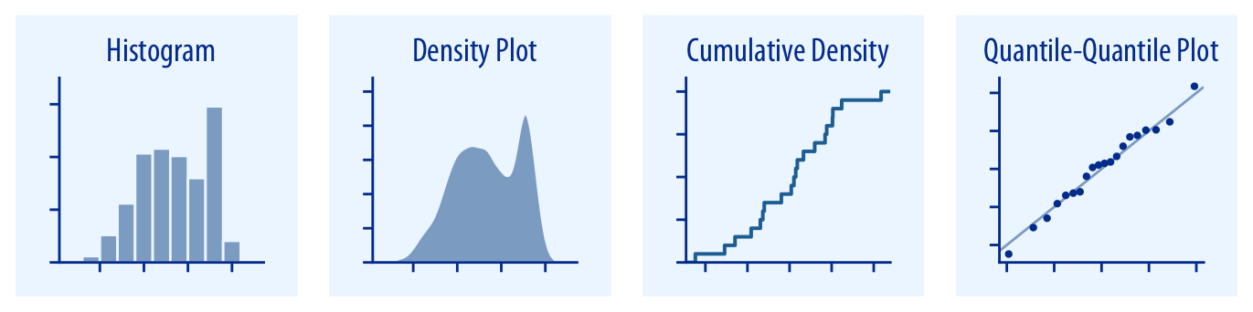
我想从分布中制作一个密度图,例如第二个子图如下:
”
unset key

set yrange [0:]
set ytics 5

set print $data
do for [i = 1:100] { print rand(0)*10 }
unset print

binwidth = 1
set boxwidth 0.8*binwidth
# set fill style of bins
set style fill solid 0.5
# define macro for plotting the histogram
hist = 'u (binwidth*(floor(($1)/binwidth)+0.5)):(1.0) smooth freq w boxes'

density = 'u (binwidth*(floor(($1)/binwidth)+0.5)):(1.0) smooth freq with filledcurves y=0'

plot $data @density
example ://i.sstatic.net/yl4tm.png“ rel =“ nofollow noreferrer”>
它主要基于直方图,通过填充曲线添加,但一个明显的区别是,结果图根本不是平滑的。
那么,如何从分布中产生光滑的密度图?是否可以在GNUPLOT中使用任何插值函数?
I would like to make a density plot from a distribution like the second subfigure in the following:
Here is what I tried:
unset key

set yrange [0:]
set ytics 5

set print $data
do for [i = 1:100] { print rand(0)*10 }
unset print

binwidth = 1
set boxwidth 0.8*binwidth
# set fill style of bins
set style fill solid 0.5
# define macro for plotting the histogram
hist = 'u (binwidth*(floor(($1)/binwidth)+0.5)):(1.0) smooth freq w boxes'

density = 'u (binwidth*(floor(($1)/binwidth)+0.5)):(1.0) smooth freq with filledcurves y=0'

plot $data @density

It is mainly based on a histogram by adding with filledcurves, but a clear difference is that the resulting figure is not smooth at all.
So, how can I generate smooth density plots from a distribution? Is there any interpolation function that can be used in gnuplot?
如果你对这篇内容有疑问,欢迎到本站社区发帖提问 参与讨论,获取更多帮助,或者扫码二维码加入 Web 技术交流群。

绑定邮箱获取回复消息
由于您还没有绑定你的真实邮箱,如果其他用户或者作者回复了您的评论,将不能在第一时间通知您!


发布评论
评论(1)
我在gnuplot中发现
内核密度估计在这里很有帮助。I found
kernel density estimatein gnuplot can be helpful here.