gnuplot:如何绘制每个月温度的颜色平方?

发布于 2025-01-29 13:32:50 字数 1297 浏览 1 评论 0 原文

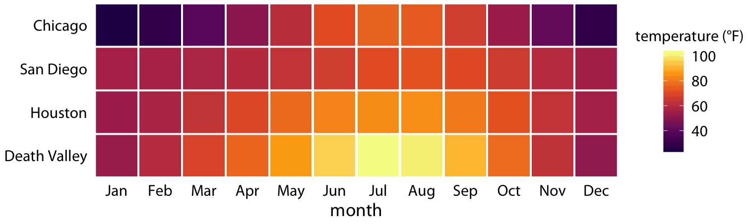
我想绘制以下图(来自)使用GNUPLOT:

“

我希望每个位置的数据类似:

# month temperature
01 60.0
02 78.0
03 90.0
...
12 78.0

这是我尝试的。为简单起见,我将数据转移到矩阵中。

$data << EOD
1.50 1.57 1.85 2.15 1.87 1.05 1.70 1.65 1.97 1.71 1.53 1.15
4.44 4.71 4.74 3.50 3.43 4.98 4.29 4.55 3.93 3.34 3.74 4.88
8.55 9.59 5.65 0.13 9.33 4.70 8.94 7.74 4.49 6.26 0.96 1.20
EOD

unset border
unset ytics
set xlabel 'month'

set palette rgbformula -7,2,-7
set cbrange [0:10]
set cblabel "precipitation"
set xrange [-0.5:11.5]
set yrange [-0.5:2.5]
set xtics ("Jan" 0, "Feb" 1, "Mar" 2, "Apr" 3, "May" 4, \
"Jun" 5, "Jul" 6, "Aug" 7, "Sep" 8, "Oct" 9, "Nov" 10, "Dec" 11)
plot $data matrix with image

但是效果远非令人满意。例如,如何在正方形之间产生清晰的边界?

I would like to plot the following figure (from Fundamentals of Data Visualization) using gnuplot:

color

I expect the data for each location is something like:

# month temperature
01 60.0
02 78.0
03 90.0
...
12 78.0

Here is what I tried. For simplicity, I have transposed the data into a matrix.

$data << EOD
1.50 1.57 1.85 2.15 1.87 1.05 1.70 1.65 1.97 1.71 1.53 1.15
4.44 4.71 4.74 3.50 3.43 4.98 4.29 4.55 3.93 3.34 3.74 4.88
8.55 9.59 5.65 0.13 9.33 4.70 8.94 7.74 4.49 6.26 0.96 1.20
EOD

unset border
unset ytics
set xlabel 'month'

set palette rgbformula -7,2,-7
set cbrange [0:10]
set cblabel "precipitation"
set xrange [-0.5:11.5]
set yrange [-0.5:2.5]
set xtics ("Jan" 0, "Feb" 1, "Mar" 2, "Apr" 3, "May" 4, \
"Jun" 5, "Jul" 6, "Aug" 7, "Sep" 8, "Oct" 9, "Nov" 10, "Dec" 11)
plot $data matrix with image

But the effect is far from satisfactory. For example, How to generate clear borders between squares?

enter image description here

如果你对这篇内容有疑问,欢迎到本站社区发帖提问 参与讨论,获取更多帮助,或者扫码二维码加入 Web 技术交流群。

扫码二维码加入Web技术交流群

发布评论

需要 登录 才能够评论, 你可以免费 注册 一个本站的账号。

评论(1

草莓味的萝莉 2025-02-05 13:32:50

带有图像的绘图样式可能没有边界。因此,我将使用boxxyerror 使用多功能样式
此外,代替矩阵格式,我会添加一个线标头并循环通过列(因为总会有12个月)
检查以下示例以及帮助BoxXyError 帮助大小帮助Xticlabels help strftime 以获取进一步的阅读。

如果您在单独的文件中有数据,则必须相应地修改脚本。

脚本:

### plotting style boxxyerror as replacement for "with image"
reset session

$Data << EOD
# location  Jan   Feb   Mar   Apr   May   Jun   Jul   Aug   Sep   Oct   Nov   Dec
Atlantis    1.50  1.57  1.85  2.15  1.87  1.05  1.70  1.65  1.97  1.71  1.53  1.15
Mordor      4.44  4.71  4.74  3.50  3.43  4.98  4.29  4.55  3.93  3.34  3.74  4.88
Wonderland  8.55  9.59  5.65  0.13  9.33  4.70  8.94  7.74  4.49  6.26  0.96  1.20
EOD

unset border
set xlabel 'month'
set xrange [0.5:12.5]

set yrange [:] reverse
set ytics

set palette rgbformula -7,2,-7
set cbrange [0:10]
set cblabel "precipitation"

MonthName(n) = strftime("%b",24*3600*28*n)      # get the month name from 1..12
set key noautotitle
set style fill solid 1.0 border rgb "white"
set size ratio -1       # make the boxes squares

plot for [i=1:12] $Data u (i):0:(0.5):(0.5):i+1:  \
        xtic(MonthName(i)):ytic(1) w boxxy fc palette lw 2
### end of code

结果:

”在此处输入图像描述”

The plotting style with image probably cannot have borders. So, I would use the versatile style with boxxyerror.
Furthermore, instead of matrix format I would add a line header and loop through the columns (since there will be always 12 months)
Check the following example as well as help boxxyerror, help size, help xticlabels and help strftime for further reading.

If you have your data in separate files you would have to modify the script accordingly.

Script:

### plotting style boxxyerror as replacement for "with image"
reset session

$Data << EOD
# location  Jan   Feb   Mar   Apr   May   Jun   Jul   Aug   Sep   Oct   Nov   Dec
Atlantis    1.50  1.57  1.85  2.15  1.87  1.05  1.70  1.65  1.97  1.71  1.53  1.15
Mordor      4.44  4.71  4.74  3.50  3.43  4.98  4.29  4.55  3.93  3.34  3.74  4.88
Wonderland  8.55  9.59  5.65  0.13  9.33  4.70  8.94  7.74  4.49  6.26  0.96  1.20
EOD

unset border
set xlabel 'month'
set xrange [0.5:12.5]

set yrange [:] reverse
set ytics

set palette rgbformula -7,2,-7
set cbrange [0:10]
set cblabel "precipitation"

MonthName(n) = strftime("%b",24*3600*28*n)      # get the month name from 1..12
set key noautotitle
set style fill solid 1.0 border rgb "white"
set size ratio -1       # make the boxes squares

plot for [i=1:12] $Data u (i):0:(0.5):(0.5):i+1:  \
        xtic(MonthName(i)):ytic(1) w boxxy fc palette lw 2
### end of code

Result:

enter image description here

~没有更多了~
我们使用 Cookies 和其他技术来定制您的体验包括您的登录状态等。通过阅读我们的 隐私政策 了解更多相关信息。 单击 接受 或继续使用网站,即表示您同意使用 Cookies 和您的相关数据。
原文