同一图表上的多条频率线,其中 y 是字符值
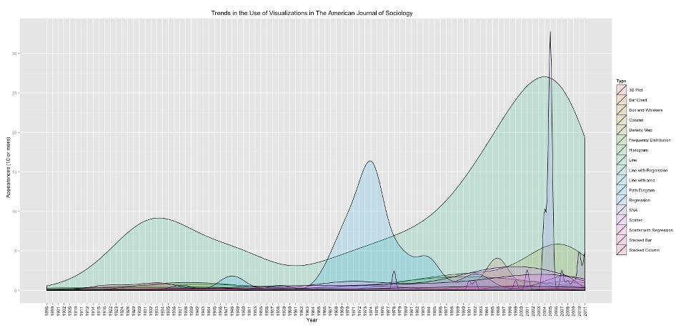
我正在尝试创建图表类型按年份出现次数的频率图。 我已经使用 ggplot2 一段时间了,但我认为这超出了我的能力范围(我刚刚开始使用 R)
我附上了我希望结果是什么样子的示意图。我遇到的其他问题之一是,图形类型很多年都没有出现。如果该图表类型当年没有出现,是否有办法排除该图表类型?
例如,在 1940 年,没有“社会图”,我不想在 0 处有一堆线...
year <- c("1940","1940","1940","1940","1940","1940","1940","1940","1940","1940","1940","1941","1941","1941","1941","1941","1941","1941","1941","1941","1941","1941","1941","1941","1941")
type <- c("Line","Column", "Stacked Column", "Scatter with line", "Scatter with line", "Scatter with line", "Scatter with line", "Map with distribution","Line","Line","Line","Bar","Bar","Stacked bar","Column","Column","Sociogram","Sociogram","Column","Column","Column","Line","Line","Line","Line")
ytmatrix <- cbind(as.Date(as.character(year), "%Y", type))
如果有些事情没有意义,请告诉我。 StackOverflow 正迅速成为我最喜欢的网站之一!
感谢, Jon
 这是我到目前为止所拥有的...... 再次感谢您的所有帮助!
这就是我的做法(我还不能共享数据文件,因为我们希望将其用于出版物,但 ggplot 区域可能更有趣,尽管我并没有真正做任何新的事情/帖子中没有讨论):
AJS = read.csv(data) #read in file
Type = AJS[,17] #select and name "Type" column from csv
Year = AJS[,13] #select and name "Year" column from csv
Year = substr(Year,9,12) #get rid of junk from year column
Year = as.Date(Year, "%Y") #convert the year character to a date
Year = format(Year, "%Y") #get rid of the dummy month and day
Type = as.data.frame(Type) #create data frame
yt <- cbind(Year,Type) #bind the year and type together
library(ggplot2)

trial <- ggplot(yt, aes(Year,..count.., group= Type)) + #plot the data followed by aes(x-  axis, y-axis, group the lines)
geom_density(alpha = 0.25, aes(fill=Type)) +
opts(axis.text.x = theme_text(angle = 90, hjust = 0)) + #adjust the x axis ticks to horizontal
opts(title = expression("Trends in the Use of Visualizations in The American Journal of Sociology")) + #Add title
scale_y_continuous('Appearances (10 or more)') #change Y-axis label
trial
I'm trying to create a frequency plot of number of appearances of a graph type by year.
I have played around with ggplot2 for a while, but I think this is over my head (I'm just getting started with R)
I attached a schematic of what I would like the result to look like. One of the other issues I'm running into is that there are many years that the graph types don't appear. Is there a way to exclude the graph type if it does not appear that year?
e.g. in 1940 there is no "sociogram" I don't want to have a bunch of lines at 0...
year <- c("1940","1940","1940","1940","1940","1940","1940","1940","1940","1940","1940","1941","1941","1941","1941","1941","1941","1941","1941","1941","1941","1941","1941","1941","1941")
type <- c("Line","Column", "Stacked Column", "Scatter with line", "Scatter with line", "Scatter with line", "Scatter with line", "Map with distribution","Line","Line","Line","Bar","Bar","Stacked bar","Column","Column","Sociogram","Sociogram","Column","Column","Column","Line","Line","Line","Line")
ytmatrix <- cbind(as.Date(as.character(year), "%Y", type))
Please let me know if something doesn't make sense. StackOverflow is quickly becoming one of my favorite sites!
Thank,
Jon

Here's what I have so far...
Thank you again for all your help!
And here's how I did it (I can't share the data file yet, since it's something we're hoping to use it for a publication, but the ggplot area is probably the more interesting, though I didn't really do anything new/that wasn't discussed in the post):
AJS = read.csv(data) #read in file
Type = AJS[,17] #select and name "Type" column from csv
Year = AJS[,13] #select and name "Year" column from csv
Year = substr(Year,9,12) #get rid of junk from year column
Year = as.Date(Year, "%Y") #convert the year character to a date
Year = format(Year, "%Y") #get rid of the dummy month and day
Type = as.data.frame(Type) #create data frame
yt <- cbind(Year,Type) #bind the year and type together
library(ggplot2)

trial <- ggplot(yt, aes(Year,..count.., group= Type)) + #plot the data followed by aes(x-  axis, y-axis, group the lines)
geom_density(alpha = 0.25, aes(fill=Type)) +
opts(axis.text.x = theme_text(angle = 90, hjust = 0)) + #adjust the x axis ticks to horizontal
opts(title = expression("Trends in the Use of Visualizations in The American Journal of Sociology")) + #Add title
scale_y_continuous('Appearances (10 or more)') #change Y-axis label
trial
如果你对这篇内容有疑问,欢迎到本站社区发帖提问 参与讨论,获取更多帮助,或者扫码二维码加入 Web 技术交流群。

绑定邮箱获取回复消息
由于您还没有绑定你的真实邮箱,如果其他用户或者作者回复了您的评论,将不能在第一时间通知您!

发布评论
评论(1)
这可能是一个更有趣的数据框来进行实验:
我认为使用帮助(stat_密度)页面中的示例可以工作,但事实并非如此:
但是,我在搜索 hte 档案中找到的一个示例发现了 @Hadley Wickham 的帖子确实有效:
This might be a more interesting dataframe to experiment with:
I thought working with an example in the help(stat_density) page would work, but it does not:
However an example I found in a search of hte archives found a posting by @Hadley Wickham that does work: