MATLAB - 绘制多个图形
我是 MATLAB 新手,在绘制多个图形时遇到困难。以下是我要绘制的向量:
S = [1.2421
     2.3348
     0.1326
     2.3470
     6.7389
     3.7089
     11.8534
     -1.8708
     ...]

Y = [1.1718
     1.8824
     0.3428
     2.1057
     1.6477
     2.3624
     2.1212
    -0.7971
    ...]

w = [0.1753
     0.3277]
S 是我的训练数据,Y 是我的输出向量。然后,我向训练数据添加一个列向量:
O = ones(length(S), 1)
X = [S 0]

w = inv(X'*X)*X'*Y
因此,我尝试在同一个图表上绘制 X、Y 和 w。我首先绘制 w,然后按住 X,这就是我迷路的地方。基本上它们不在同一尺度上,因为 x 的大小远小于 X (X 和 Y 都是大小为 100 的向量, w 的大小为 2)。
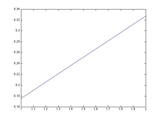
plot(w)

然后我这样做:
hold
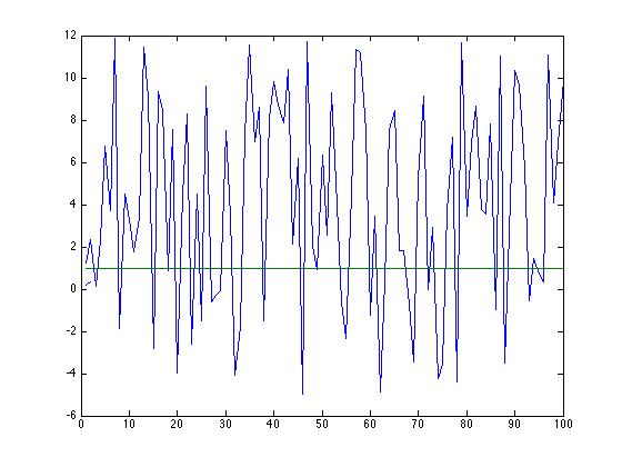
plot(X)

现在我绘制的 w 与 X 的图相比是如此之小>。我怎样才能使它们具有相同的比例?也可能让它们有不同的颜色?
I am new to MATLAB and am having difficulty plotting multiple graphs. Here are my vectors to graph:
S = [1.2421
     2.3348
     0.1326
     2.3470
     6.7389
     3.7089
     11.8534
     -1.8708
     ...]

Y = [1.1718
     1.8824
     0.3428
     2.1057
     1.6477
     2.3624
     2.1212
    -0.7971
    ...]

w = [0.1753
     0.3277]
S is my training data and Y is my output vector. Then I add a column vector to my training data:
O = ones(length(S), 1)
X = [S 0]

w = inv(X'*X)*X'*Y
So I am trying to plot X, Y and w on the same graph. I plot w first, hold, X and this is where I get lost. Basically they are not on the same scale because the size of x is much less than X (X and Y are both vectors of size 100 and w is of size 2).
plot(w)

Then I do:
hold
plot(X)

Now the w that I plotted is so small compared to the plot of X. How would I make them the same scale? Also maybe making them a different color?
如果你对这篇内容有疑问,欢迎到本站社区发帖提问 参与讨论,获取更多帮助,或者扫码二维码加入 Web 技术交流群。

绑定邮箱获取回复消息
由于您还没有绑定你的真实邮箱,如果其他用户或者作者回复了您的评论,将不能在第一时间通知您!

发布评论
评论(2)
plotyy 将创建您正在寻找的图形。请参阅链接中的示例以进行进一步的绘图自定义。
plotyy will create the figure you are looking for. See the examples in the link for further plot customization.
我只是发表评论,但我没有足够的声誉......如果您的目的不是呈现数据,而只是能够将其可视化,您可以重新调整数据集并避免不太容易的情况-work-with
plotyy(尽管它是最好的答案):有关绘图的其他格式,请参阅 mathworks polt。在那里你可以改变颜色、线宽等等。
I'd just comment, but I don't have enough reputation... If you are not aiming to present the data, but just be able to visualize it, you can rescale your datasets and avoid the not-so-easy-to-work-with
plotyy(although it is the best answer):For additional formating of the plots, see mathworks polt. There you can change color, linewidth and whatnot.