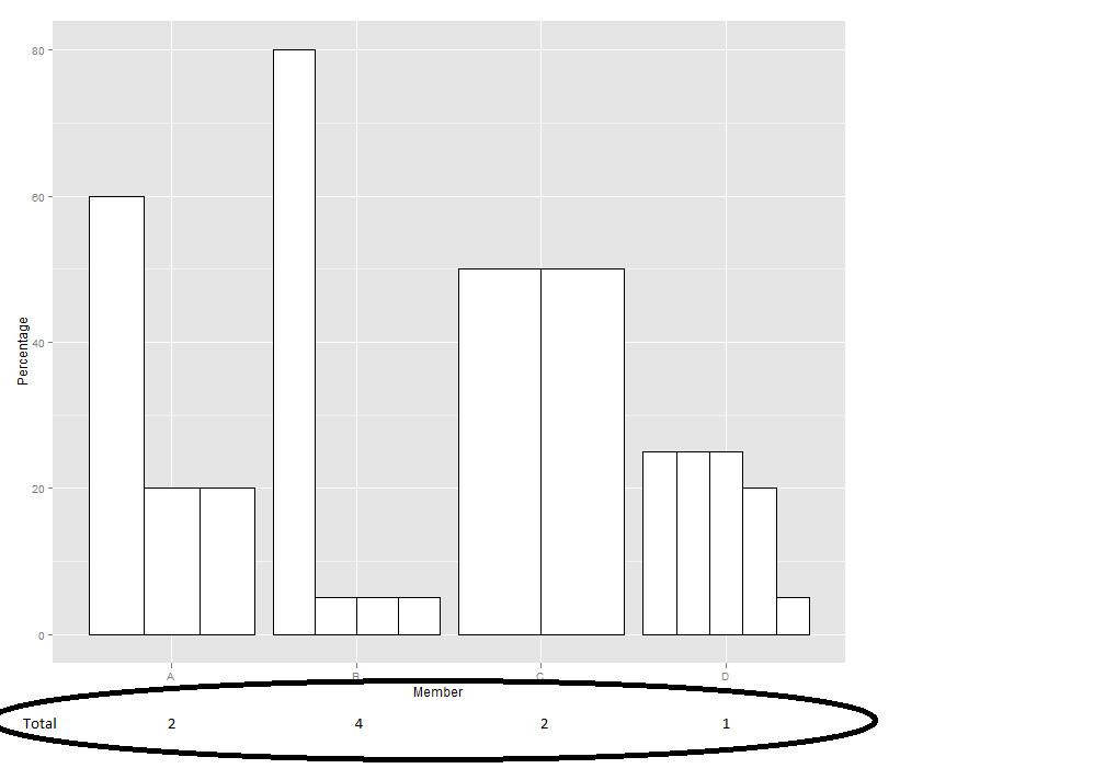
如何将表格添加到图表中?
我使用以下命令创建了躲避条形图:
a = c(1,1,1,1,1,1,1,2,2,2,2,2,2,2)
b = c("A","A","A","B","B","B","B","C","C","D","D","D","D","D")
c = c(60,20,20,80,5,5,5,50,50,25,25,25,20,5)
dat = data.frame(Group=a, Member=b, Percentage=c)
ggplot(dat, aes(x=Member, y=Percentage)) + geom_bar(stat="identity", position="dodge", fill="white", colour="black")
如果我有一组值:
table_values = c("2", "4", "2", "1")
table_total = c("A", "B", "C", "D")
tab = data.frame(Type=table_total, Value=table_values)
如何将其作为表格添加到我的图表中以使其对齐?像这样的东西:

我可以手动执行此操作,但我有很多图表要生成,所以我想知道如果这可以自动化。关于如何执行此操作有什么建议吗?
I have created a dodged bar chart using the following commands:
a = c(1,1,1,1,1,1,1,2,2,2,2,2,2,2)
b = c("A","A","A","B","B","B","B","C","C","D","D","D","D","D")
c = c(60,20,20,80,5,5,5,50,50,25,25,25,20,5)
dat = data.frame(Group=a, Member=b, Percentage=c)
ggplot(dat, aes(x=Member, y=Percentage)) + geom_bar(stat="identity", position="dodge", fill="white", colour="black")
If I have a set of values:
table_values = c("2", "4", "2", "1")
table_total = c("A", "B", "C", "D")
tab = data.frame(Type=table_total, Value=table_values)
How can I add this as a table to my graph so that it is aligned? Something like this:

I can do this manually but I have a lot of graphs to generate so I was wondering if this can be automated. Any suggestions on how to do this?
如果你对这篇内容有疑问,欢迎到本站社区发帖提问 参与讨论,获取更多帮助,或者扫码二维码加入 Web 技术交流群。

绑定邮箱获取回复消息
由于您还没有绑定你的真实邮箱,如果其他用户或者作者回复了您的评论,将不能在第一时间通知您!

发布评论
评论(1)
这有点麻烦,但您可以使用 geom_text 进行注释,将文本放置为稍微负的 y 值。这会将其放入绘图区域而不是轴下方。
我更复杂的方法是创建两个单独的图,一个是条形图,即“表格”(关闭几乎所有主题元素),并在 ggExtra 中使用诸如
align.plots(不确定这是否是正确的名称)之类的东西 包。It's a bit of a hack, but you can annotate with geom_text, placing the text as a slightly negative y value. This puts it into the plot area rather than below the axis.
I more involved approach would be to create two separate plots, one that is the bar chart, one that is the "table" (turning off almost all the theme elements) and using something like
align.plots(not sure if that is the right name) in theggExtrapackage.