有没有比“彩虹”更好的色标?色彩图?
我在 x、y 空间中绘制一系列曲线,其中每条曲线都由标量值 z 标识。我希望将 z 值映射到每条线的颜色,但大多数颜色图/颜色表都是根据图像构建的(例如,在白色背景上,灰度颜色图隐藏了 z 的一个极端)。
彩虹/光谱/喷射颜色图(许多绘图程序中的默认设置)更好,但白色背景上的黄色/青色线的可见性较差,并且蓝色/青色/绿色之间的颜色对比度较差。 Borland 和 Taylor 进一步讨论了彩虹色彩图的这个问题和其他问题:
有人可以推荐更好的东西吗?我正在寻找的一些方面:
- 白色背景下所有颜色的高可见度
- 直观的感知排序(红-黄-蓝比红-蓝-黄更有意义)
- 好色度 颜色之间的对比
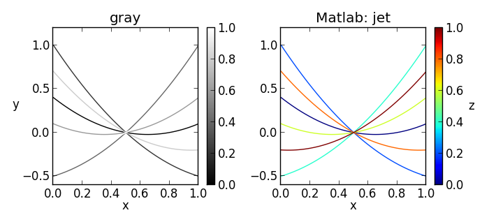
编辑/更新:根据内石的要求,这里是一个简化的示例图:  “灰色”颜色图及其亲戚(从黑色开始到白色结束)是为图像设计的,但是当用于在白色背景上绘制线条或点时,有些将很难看到或不可见。 “jet”颜色图及其相关光谱通常还具有黄色、绿色或其他在白色背景上很难看到的颜色。
I am plotting a series of curves in x, y space, where each curve is identified by a scalar value z. I wish to map the z value to color for each line, but most colormaps / color tables are constructed with images in mind (e.g. on a white backround, the grayscale colormap hides one extreme of z).
The rainbow/spectral/jet colormap - which is the default in many plotting programs - is better, but suffers from poor visibility for the yellow/cyan lines on white backgrounds, and poor color contrast among the blue/cyan/green colors. Borland and Taylor further discuss this and other problems with the rainbow colormap:
Can someone recommend something better? Some aspects I'm looking for:
- High visibility for all colors against a white background
- Intuitive perceptual ordering (red-yellow-blue makes more sense than red-blue-yellow)
- Good chromaticity contrast between colors
Edit/update: per endolith's request, here's a simplified sample plot:
The "gray" colormap and it's relatives (starting at black and ending at white) are designed for images, however when used to plot lines or points on a white background, some will be hard to see or invisible. The "jet" colormap and it's spectral relatives typically also have a yellow, green, or other color that is hard to see on a white background.
如果你对这篇内容有疑问,欢迎到本站社区发帖提问 参与讨论,获取更多帮助,或者扫码二维码加入 Web 技术交流群。

绑定邮箱获取回复消息
由于您还没有绑定你的真实邮箱,如果其他用户或者作者回复了您的评论,将不能在第一时间通知您!

发布评论
评论(6)
我发现 Paul Tol 的笔记是一个很好的资源,可以在这里找到: http://www.sron.nl /~pault/
在该网站上,您可以找到一些很好的调色板,用于绘制无序、不同的数据集以及用于有序数据的发散和彩虹颜色图。
A good resource I found are the notes by Paul Tol, found here: http://www.sron.nl/~pault/
On that site you can find a few good colour palettes for plotting unordered, distinct datasets as well as diverging and rainbow colour maps for ordered data.
我一直有这个问题。我通常最终做的是采用两种颜色顺序方案并剪掉饱和度过低的部分。只要只有几行,这个方法就有效。但是,我不喜欢这种方法,我很想听到更好的建议......
I have this problem all the time. What I usually end up doing is taking a two color sequential scheme and cutting off the excessively low saturation portion. This works as long as there are only a few lines. However, I don't love this method and I would love to hear a better suggestion...
感知改进的颜色图有多种变体具有恒定亮度或单调增加的亮度的彩虹色彩图,一些文档位于 彩虹死了…彩虹万岁!:
Dave Green 的 `cubehelix' 配色方案 是一个彩虹色彩图“旨在被感知为强度增加..从黑色到白色,使用颜色立方体中的锥形螺旋偏离纯灰度(即颜色立方体中从黑色到白色的对角线),同时确保感知的连续增加 强度”。您可以剪掉白色末端以使其适合白色背景。
CMRmap.m "我们设计了一个保留颜色的颜色图,但混合了颜色分量,以便颜色图的黑白渲染产生与强度单调的灰度表示”。同样,您必须剪掉白色末端:
Perceptually improved colormaps has several variations of rainbow colormaps with constant luminance or luminance that increases monotonically, with some documentation at The rainbow is dead…long live the rainbow!:
Dave Green's `cubehelix' colour scheme is a rainbow colormap "intended to be perceived as increasing in intensity .. from black to white, deviating away from a pure greyscale (i.e. the diagonal from black to white in a colour cube) using a tapered helix in the colour cube, while ensuring a continuous increase in perceived intensity". You could cut off the white end to make it suitable for a white background.
CMRmap.m "we devised a colormap that preserves colors, but mixes the color components so that the black and white rendering of the colormap produces a grayscale representation that is monotonic with intensity". Again, you'd have to clip off the white end:
这是我最终使用的解决方案:
Kindlmann 等人识别了几种等亮度颜色基于基于面部的亮度匹配研究(可作为html 谈话 或 pdf 论文)。 他们发现的颜色和 RGB 三元组是如下:
这些点之间的线性插值创建修改后的“等亮彩虹”颜色图,与使用的典型彩虹颜色图相比,该颜色图与白色背景的对比度更高完全饱和的黄色和青色。在某些情况下,我仅使用这些点的子集来插入颜色图(例如通过删除绿色或青色)。
Here's the solution that I eventually used:
Kindlmann et al identified several isoluminant colors based on a face-based luminance matching study (available as html talk or pdf paper). The colors and RGB triples they found are as follows:
Linear interpolation between these points creates a modified "isoluminant rainbow" colormap that provides better contrast with a white background than the typical rainbow colormap using fully saturated yellow and cyan. In some cases, I use only a subset of these points to interpolate the colormap (for example by dropping the green or cyan).
事实证明,对于定量任务来说,彩虹/分类颜色图比发散颜色图要差得多。请参阅 InfoVis '11 的最新论文:
如果您需要分类比例,请查看 CHI '12 的这篇优秀论文,该论文使用 XKCD 调查数据集讨论我们如何感知颜色差异。它允许您根据人类感知差异的程度来评估色标。他们基于网络的调色板分析器也可以让您评估自己的色标!
Rainbow/categorical color maps have been shown to be substantially worse than diverging ones for quantitative tasks. See this recent paper from InfoVis '11:
If you need a categorical scale, check out this excellent paper from CHI '12 that uses the XKCD survey dataset that talks about how we perceive differences in color. It allows you to rate a color scale by how well humans perceive the differences. Their web-based Color Palette Analyzer will let you evaluate your own color scale, too!
我会使用 Color Brewer 来选择颜色。它根据您的要求提供了各种地图调色板。相同的调色板可用于其他可视化。
编辑:
下面是更多资源,但推荐的连续颜色从较浅的颜色开始,这就是您在评论中指出的。另一种选择是复制别人正在做的事情。例如, 多眼可能会起作用。
I would use Color Brewer for choosing colors. It gives various color palettes for maps depending on what your requirements are. The same palettes can be used for other visualizations.
Edit:
Below are some more resources, but the recommended sequential colors start from a lighter color which is what you pointed out in your comment. Another option is to just copy what others are doing. For instance, the colors used in Many Eyes would probably work.