使用 WPF 获取工具包样式窗口

发布于 2024-12-01 16:25:43 字数 427 浏览 1 评论 0原文

我正在使用 WPF 工具包和 WPF 工具包扩展,并注意到当我通过以下方式显示消息框时:

MessageBox.Show("...");

我得到以下内容...
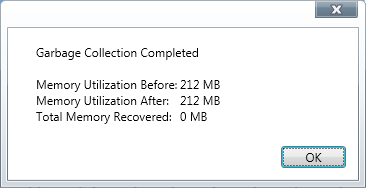
“在此处输入图像描述”

我想让我的主应用程序窗口也使用这种样式。有办法做到吗?

编辑:我尝试过 WindowStyle="ToolWindow" 但它不起作用。

编辑:为了回应下面的答案,请参见下图:
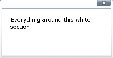
在此处输入图像描述

另外,我希望它有最大化和最小化按钮,但与关闭按钮具有相同的样式。

谢谢你!

I am using the WPF toolkit and the WPF toolkit extended and notice that when I display a message box via:

MessageBox.Show("...");

I get the following...

enter image description here

I would like to make my main application window use this styling as well. Is there a way to do it?

EDIT: I've tried WindowStyle="ToolWindow" and it doesn't work.

Edit: In response to the answer below, please see picture below:

enter image description here

Also, I would like it to have a maximize and minimize button but with the same style as the button for close.

Thank you!

如果你对这篇内容有疑问,欢迎到本站社区发帖提问 参与讨论,获取更多帮助,或者扫码二维码加入 Web 技术交流群。

扫码二维码加入Web技术交流群

发布评论

需要 登录 才能够评论, 你可以免费 注册 一个本站的账号。

评论(4

那请放手 2024-12-08 16:25:43

我想在这里添加一个免责声明,我出于好奇而很快将这些内容放在一起,这比什么都重要。我还没有测试这么多,除了在那里放置一些控件并运行它之外。它可以工作,但不应被视为完全完整。我还认为可能有更好的方法来做到这一点,但我认为这至少会给你一个良好的起点。

将新的 ResourceDictionary 添加到您的项目,并添加以下 XAML:

<ResourceDictionary
  x:Class="CustomWindow.BaseResource"
  xmlns="http://schemas.microsoft.com/winfx/2006/xaml/presentation"
  xmlns:x="http://schemas.microsoft.com/winfx/2006/xaml">
  <Style x:Key="WindowStyle" TargetType="{x:Type Window}">
    <Setter Property="BorderThickness" Value="0" />
    <Setter Property="WindowStyle" Value="None" />
    <Setter Property="ResizeMode" Value="NoResize" />
    <Setter Property="Background" Value="White" />
    <Setter Property="Template">
      <Setter.Value>
        <ControlTemplate TargetType="{x:Type Window}">
          <Border
            x:Name="WindowBorder"
            BorderBrush="Black"
            BorderThickness="1">
            <Border.Background>
              <LinearGradientBrush StartPoint="0,0" EndPoint="0,1">
                <GradientStop Offset="0" Color="White" />
                <GradientStop Offset="1" Color="#FFDADADA" />
              </LinearGradientBrush>
            </Border.Background>
            <Grid
              Width="{TemplateBinding Width}"
              Height="{TemplateBinding Height}"
              MinWidth="{TemplateBinding MinWidth}"
              MinHeight="{TemplateBinding MinHeight}"
              HorizontalAlignment="Left"
              VerticalAlignment="Top"
              Cursor="Arrow">
              <Grid.RowDefinitions>
                <RowDefinition Height="25" />
                <RowDefinition Height="*" />
              </Grid.RowDefinitions>
              <TextBlock
                Width="500"
                Height="23"
                Margin="11,2,0,0"
                HorizontalAlignment="Left"
                VerticalAlignment="Top"
                Text="{TemplateBinding Title}" />
              <Rectangle
                x:Name="TitleBar"
                Fill="Transparent"
                MouseDown="TitleBar_MouseDown" />
              <Rectangle
                Grid.RowSpan="2"
                Width="10"
                HorizontalAlignment="Left"
                Cursor="SizeWE"
                Fill="Transparent"
                MouseDown="Border_MouseDown"
                Tag="Left" />
              <Rectangle
                Grid.RowSpan="2"
                Width="10"
                HorizontalAlignment="Right"
                Cursor="SizeWE"
                Fill="Transparent"
                MouseDown="Border_MouseDown"
                Tag="Right" />
              <Rectangle
                Height="5"
                VerticalAlignment="Top"
                Cursor="SizeNS"
                Fill="Transparent"
                MouseDown="Border_MouseDown"
                Tag="Top" />
              <Rectangle
                Grid.Row="1"
                Height="10"
                VerticalAlignment="Bottom"
                Cursor="SizeNS"
                Fill="Transparent"
                MouseDown="Border_MouseDown"
                Tag="Bottom" />
              <StackPanel
                Margin="10,0"
                HorizontalAlignment="Right"
                VerticalAlignment="Top"
                Orientation="Horizontal">
                <Button
                  x:Name="MinimizeButton"
                  Width="43"
                  Height="17"
                  Click="MinimizeButton_Click"
                  IsTabStop="False">
                  min
                </Button>
                <Button
                  x:Name="MaximizeButton"
                  Width="43"
                  Height="17"
                  Margin="5,0"
                  Click="MaximizeButton_Click"
                  IsTabStop="False">
                  max
                </Button>
                <Button
                  x:Name="CloseButton"
                  Width="43"
                  Height="17"
                  Click="CloseButton_Click"
                  IsTabStop="False">
                  <Path
                    Width="12"
                    Height="10"
                    HorizontalAlignment="Center"
                    VerticalAlignment="Center"
                    Data="M0.5,0.5L4.5178828,0.5 6.0620003,3.125 7.4936447,
                      0.5 11.5,0.5 11.5,1.5476431 8.7425003,6.1201854 11.5,
                      10.359666 11.5,11.5 7.4941902,11.5 6.0620003,8.8740005 
                      4.5172949,11.5 0.5,11.5 0.5,10.43379 3.3059995,
                      6.1201582 0.5,1.4676378 0.5,0.5z"
                    Fill="#E4FFFFFF"
                    Stretch="Fill"
                    Stroke="#FF535666" />
                </Button>
              </StackPanel>
              <Border
                Grid.Row="1"
                Margin="10,0,10,10"
                BorderBrush="Black"
                BorderThickness="1">
                <Grid>
                  <Rectangle Fill="White" />
                  <ContentPresenter Content="{TemplateBinding Content}" />
                </Grid>
              </Border>
            </Grid>
          </Border>
        </ControlTemplate>
      </Setter.Value>
    </Setter>
  </Style>
</ResourceDictionary>

出于说明目的,假设我们将 ResourceDictionary 命名为 BaseResource.xaml

接下来,将一个新类添加到添加资源的同一目录中,并将该文件命名为 BaseResource.xaml.cs,替换 XAML 文件的实际名称。

返回 BaseResource.xaml 并将 x:Class="CustomWindow.BaseResource" 属性更改为 ResourceDictionary 的完整类型名称。如果更改正确,Visual Studio 应该抱怨 BaseResource.xaml.cs 中存在重复的定义。通过将 partial 关键字修饰符添加到 .cs 文件中的类来修复此问题。

最后,将以下代码添加到代码文件中:

using System;
using System.Runtime.InteropServices;
using System.Windows;
using System.Windows.Input;
using System.Windows.Interop;
using System.Windows.Media;

namespace CustomWindow
{
    public partial class BaseResource
    {
        private const uint WM_SYSCOMMAND = 0x112;

        [DllImport("user32.dll", CharSet = CharSet.Auto)]
        private static extern IntPtr 
            SendMessage(IntPtr hWnd, uint Msg, int wParam, int lParam);

        private void CloseButton_Click(object sender, RoutedEventArgs e)
        {
            e.Handled = true;
            Window.GetWindow((DependencyObject) sender).Close();
        }

        private void MinimizeButton_Click(object sender, RoutedEventArgs e)
        {
            e.Handled = true;
            Window.GetWindow((DependencyObject) sender).WindowState = WindowState.Minimized;
        }

        private void MaximizeButton_Click(object sender, RoutedEventArgs e)
        {
            e.Handled = true;
            var window = Window.GetWindow((DependencyObject) sender);
            window.WindowState = 
              (window.WindowState == WindowState.Maximized) ? WindowState.Normal : WindowState.Maximized;
        }

        private void TitleBar_MouseDown(object sender, MouseButtonEventArgs e)
        {
            e.Handled = true;
            Window.GetWindow((DependencyObject) sender).DragMove();
        }

        private void Border_MouseDown(object sender, MouseButtonEventArgs e)
        {
            e.Handled = true;
            var direction = (Direction)Enum.Parse(typeof(Direction), ((FrameworkElement)sender).Tag.ToString());
            ResizeWindow(PresentationSource.FromVisual((Visual)sender) as HwndSource, direction);
        }

        private void ResizeWindow(HwndSource hwndSource, Direction direction)
        {
            SendMessage(hwndSource.Handle, WM_SYSCOMMAND, (int)(61440 + direction), 0);
        }

        private enum Direction
        {
            Left = 1,
            Right = 2,
            Top = 3,
            TopLeft = 4,
            TopRight = 5,
            Bottom = 6,
            BottomLeft = 7,
            BottomRight = 8,
        }
    }
}

接下来将 ResourceDictionary 添加到全局应用程序资源中。再次,如果 BaseResource.xaml 不同,则将其替换为文件名。

<Application.Resources>
    <ResourceDictionary>
        <ResourceDictionary.MergedDictionaries>
            <ResourceDictionary Source="/BaseResource.xaml" />
        </ResourceDictionary.MergedDictionaries>
    </ResourceDictionary>
</Application.Resources>

将样式添加到目标窗口。

<Window
  ...
  Style="{StaticResource WindowStyle}">

有几件事......

当没有内容时,设计师会搞乱风格。这可能是因为我放置了高度和宽度的 TemplateBinding 的位置,但它在运行时看起来很好,所以我没有进一步搞乱它。我也没有实现角部的调整大小夹点,但它很容易添加到模板中。

最后,我没有为最小化和最大化按钮绘制图标。我不擅长在 Blend 中创建路径。

希望有帮助。

I want to add a disclaimer here that I threw this together pretty quickly out of curiosity, more than anything. I haven't tested this much, other than dropping a few controls on there and running it. It works, but is shouldn't be considered fully complete. I also think there are probably better ways to do this, but I figured this would at least give you a good starting place.

Add a new ResourceDictionary to your project, and add the following XAML:

<ResourceDictionary
  x:Class="CustomWindow.BaseResource"
  xmlns="http://schemas.microsoft.com/winfx/2006/xaml/presentation"
  xmlns:x="http://schemas.microsoft.com/winfx/2006/xaml">
  <Style x:Key="WindowStyle" TargetType="{x:Type Window}">
    <Setter Property="BorderThickness" Value="0" />
    <Setter Property="WindowStyle" Value="None" />
    <Setter Property="ResizeMode" Value="NoResize" />
    <Setter Property="Background" Value="White" />
    <Setter Property="Template">
      <Setter.Value>
        <ControlTemplate TargetType="{x:Type Window}">
          <Border
            x:Name="WindowBorder"
            BorderBrush="Black"
            BorderThickness="1">
            <Border.Background>
              <LinearGradientBrush StartPoint="0,0" EndPoint="0,1">
                <GradientStop Offset="0" Color="White" />
                <GradientStop Offset="1" Color="#FFDADADA" />
              </LinearGradientBrush>
            </Border.Background>
            <Grid
              Width="{TemplateBinding Width}"
              Height="{TemplateBinding Height}"
              MinWidth="{TemplateBinding MinWidth}"
              MinHeight="{TemplateBinding MinHeight}"
              HorizontalAlignment="Left"
              VerticalAlignment="Top"
              Cursor="Arrow">
              <Grid.RowDefinitions>
                <RowDefinition Height="25" />
                <RowDefinition Height="*" />
              </Grid.RowDefinitions>
              <TextBlock
                Width="500"
                Height="23"
                Margin="11,2,0,0"
                HorizontalAlignment="Left"
                VerticalAlignment="Top"
                Text="{TemplateBinding Title}" />
              <Rectangle
                x:Name="TitleBar"
                Fill="Transparent"
                MouseDown="TitleBar_MouseDown" />
              <Rectangle
                Grid.RowSpan="2"
                Width="10"
                HorizontalAlignment="Left"
                Cursor="SizeWE"
                Fill="Transparent"
                MouseDown="Border_MouseDown"
                Tag="Left" />
              <Rectangle
                Grid.RowSpan="2"
                Width="10"
                HorizontalAlignment="Right"
                Cursor="SizeWE"
                Fill="Transparent"
                MouseDown="Border_MouseDown"
                Tag="Right" />
              <Rectangle
                Height="5"
                VerticalAlignment="Top"
                Cursor="SizeNS"
                Fill="Transparent"
                MouseDown="Border_MouseDown"
                Tag="Top" />
              <Rectangle
                Grid.Row="1"
                Height="10"
                VerticalAlignment="Bottom"
                Cursor="SizeNS"
                Fill="Transparent"
                MouseDown="Border_MouseDown"
                Tag="Bottom" />
              <StackPanel
                Margin="10,0"
                HorizontalAlignment="Right"
                VerticalAlignment="Top"
                Orientation="Horizontal">
                <Button
                  x:Name="MinimizeButton"
                  Width="43"
                  Height="17"
                  Click="MinimizeButton_Click"
                  IsTabStop="False">
                  min
                </Button>
                <Button
                  x:Name="MaximizeButton"
                  Width="43"
                  Height="17"
                  Margin="5,0"
                  Click="MaximizeButton_Click"
                  IsTabStop="False">
                  max
                </Button>
                <Button
                  x:Name="CloseButton"
                  Width="43"
                  Height="17"
                  Click="CloseButton_Click"
                  IsTabStop="False">
                  <Path
                    Width="12"
                    Height="10"
                    HorizontalAlignment="Center"
                    VerticalAlignment="Center"
                    Data="M0.5,0.5L4.5178828,0.5 6.0620003,3.125 7.4936447,
                      0.5 11.5,0.5 11.5,1.5476431 8.7425003,6.1201854 11.5,
                      10.359666 11.5,11.5 7.4941902,11.5 6.0620003,8.8740005 
                      4.5172949,11.5 0.5,11.5 0.5,10.43379 3.3059995,
                      6.1201582 0.5,1.4676378 0.5,0.5z"
                    Fill="#E4FFFFFF"
                    Stretch="Fill"
                    Stroke="#FF535666" />
                </Button>
              </StackPanel>
              <Border
                Grid.Row="1"
                Margin="10,0,10,10"
                BorderBrush="Black"
                BorderThickness="1">
                <Grid>
                  <Rectangle Fill="White" />
                  <ContentPresenter Content="{TemplateBinding Content}" />
                </Grid>
              </Border>
            </Grid>
          </Border>
        </ControlTemplate>
      </Setter.Value>
    </Setter>
  </Style>
</ResourceDictionary>

For illustrative purposes, let's say we named the ResourceDictionary, BaseResource.xaml.

Next add a new Class to the same directory where you added the resource, and name the file BaseResource.xaml.cs, substituting the actual name of your XAML file.

Go back to BaseResource.xaml and change the x:Class="CustomWindow.BaseResource" property to the full type name of the ResourceDictionary. If changed correctly, Visual Studio should complain that there is a duplicate definition in BaseResource.xaml.cs. Fix that by adding the partial keyword modifier to the class in the .cs file.

Finally, add the following code to the code file:

using System;
using System.Runtime.InteropServices;
using System.Windows;
using System.Windows.Input;
using System.Windows.Interop;
using System.Windows.Media;

namespace CustomWindow
{
    public partial class BaseResource
    {
        private const uint WM_SYSCOMMAND = 0x112;

        [DllImport("user32.dll", CharSet = CharSet.Auto)]
        private static extern IntPtr 
            SendMessage(IntPtr hWnd, uint Msg, int wParam, int lParam);

        private void CloseButton_Click(object sender, RoutedEventArgs e)
        {
            e.Handled = true;
            Window.GetWindow((DependencyObject) sender).Close();
        }

        private void MinimizeButton_Click(object sender, RoutedEventArgs e)
        {
            e.Handled = true;
            Window.GetWindow((DependencyObject) sender).WindowState = WindowState.Minimized;
        }

        private void MaximizeButton_Click(object sender, RoutedEventArgs e)
        {
            e.Handled = true;
            var window = Window.GetWindow((DependencyObject) sender);
            window.WindowState = 
              (window.WindowState == WindowState.Maximized) ? WindowState.Normal : WindowState.Maximized;
        }

        private void TitleBar_MouseDown(object sender, MouseButtonEventArgs e)
        {
            e.Handled = true;
            Window.GetWindow((DependencyObject) sender).DragMove();
        }

        private void Border_MouseDown(object sender, MouseButtonEventArgs e)
        {
            e.Handled = true;
            var direction = (Direction)Enum.Parse(typeof(Direction), ((FrameworkElement)sender).Tag.ToString());
            ResizeWindow(PresentationSource.FromVisual((Visual)sender) as HwndSource, direction);
        }

        private void ResizeWindow(HwndSource hwndSource, Direction direction)
        {
            SendMessage(hwndSource.Handle, WM_SYSCOMMAND, (int)(61440 + direction), 0);
        }

        private enum Direction
        {
            Left = 1,
            Right = 2,
            Top = 3,
            TopLeft = 4,
            TopRight = 5,
            Bottom = 6,
            BottomLeft = 7,
            BottomRight = 8,
        }
    }
}

Next add the ResourceDictionary to global Application resources. Again, substituting BaseResource.xaml with the name of your file, if it is different.

<Application.Resources>
    <ResourceDictionary>
        <ResourceDictionary.MergedDictionaries>
            <ResourceDictionary Source="/BaseResource.xaml" />
        </ResourceDictionary.MergedDictionaries>
    </ResourceDictionary>
</Application.Resources>

Add the style to the target Window.

<Window
  ...
  Style="{StaticResource WindowStyle}">

A few things...

The designer messes with the style when there is no content. It is probably because of where I placed the TemplateBinding for Height and Width, but it looks fine at runtime, so I didn't mess with it further. I also didn't implement the resize grip for the corners, but it is easy enough to add to the template.

Finally, I didn't draw icons for the Minimize and Maximize buttons. I suck at creating Paths in Blend.

Hope it helps.

燃情 2024-12-08 16:25:43

你的问题很模糊。您没有在任何地方说出您想要 MessageBox 样式的哪一部分,但我想我知道您在问什么(相同的颜色和窗口镶边)。

由于您使用的是 MessageBox 的扩展工具包版本,因此您有两个选择。

首先,您可以切换 Xaml 中的每个 Window 实例,并将其替换为 extToolkit:ChildWindow (extToolkit 的命名空间位于 xmlns:extToolkit="http: //schemas.microsoft.com/winfx/2006/xaml/presentation/toolkit/extended”)。

这是一个快速的选择,但会让您陷入困境。 ChildWindow 中缺少一个 Title,而是使用 Caption。如果您不对 Windows 本身进行太多操作,这对您来说可能就足够了。

您的第二个选择是使用 MessageBox 或 ChildWindow 模板中的相同样式信息来模板 Window 本身。扩展工具包 ChildWindow 的模板位于本答案的底部,但需要进行一些修改才能与 Window 的属性保持一致。您还必须隐藏窗口镶边并具有无边框表单,因为镶边是在模板中实现的。

这不是最好的情况,说实话,扩展工具包应该有它自己的 Window 实现。

如果我是您,我会尝试将 Windows 切换为 ChildWindows 来启动。

HTH。

这是该模板 -

<ControlTemplate x:Key="ChildWindowControlTemplate1" TargetType="{x:Type extToolkit:ChildWindow}">
        <Grid x:Name="Root">
            <Grid.Resources>
                <Style x:Key="FocusVisualStyle" TargetType="{x:Type Control}">
                    <Setter Property="BorderBrush" Value="Black"/>
                    <Setter Property="Background" Value="Transparent"/>
                    <Setter Property="Margin" Value="-1"/>
                    <Setter Property="Template">
                        <Setter.Value>
                            <ControlTemplate>
                                <Rectangle Fill="{TemplateBinding Background}" Margin="{TemplateBinding Margin}" Stroke="{TemplateBinding BorderBrush}" StrokeThickness="0.5" StrokeDashArray="4 3">
                                    <Rectangle.RenderTransform>
                                        <TranslateTransform X="{Binding Left}" Y="{Binding Top}"/>
                                    </Rectangle.RenderTransform>
                                </Rectangle>
                            </ControlTemplate>
                        </Setter.Value>
                    </Setter>
                </Style>
                <BooleanToVisibilityConverter x:Key="BooleanToVisibilityConverter"/>
            </Grid.Resources>
            <Grid x:Name="PART_WindowRoot" HorizontalAlignment="Left" Height="{TemplateBinding Height}" MinWidth="{TemplateBinding MinWidth}" MinHeight="{TemplateBinding MinHeight}" VerticalAlignment="Top" Width="{TemplateBinding Width}">
                <Grid.RenderTransform>
                    <TransformGroup>
                        <ScaleTransform/>
                        <SkewTransform/>
                        <RotateTransform/>
                        <TranslateTransform/>
                    </TransformGroup>
                </Grid.RenderTransform>
                <Grid x:Name="WindowGrid">
                    <Border BorderBrush="{TemplateBinding WindowBorderBrush}" BorderThickness="{TemplateBinding BorderThickness}" CornerRadius="5,5,0,0" Opacity="{TemplateBinding WindowOpacity}"/>
                    <Grid Background="{x:Null}" Margin="0">
                        <Border x:Name="WindowBorder" Background="{TemplateBinding WindowBackground}" CornerRadius="4,4,0,0" Margin="1" Opacity="{TemplateBinding WindowOpacity}"/>
                        <Border BorderBrush="White" BorderThickness="1" CornerRadius="4,4,0,0" Margin="1" Opacity="0.7"/>
                    </Grid>
                </Grid>
                <Grid>
                    <Grid.RowDefinitions>
                        <RowDefinition Height="Auto" MinHeight="26"/>
                        <RowDefinition/>
                    </Grid.RowDefinitions>
                    <Grid x:Name="ContentGrid" Margin="6,0,6,6" Grid.Row="1">
                        <Grid.RowDefinitions>
                            <RowDefinition/>
                            <RowDefinition Height="Auto"/>
                        </Grid.RowDefinitions>
                        <Border BorderBrush="White" BorderThickness="1" CornerRadius="1"/>
                        <Border BorderBrush="{TemplateBinding BorderBrush}" BorderThickness="{TemplateBinding BorderThickness}" Background="{TemplateBinding Background}" CornerRadius="0.1" Margin="1">
                            <ContentPresenter x:Name="Content" ContentTemplate="{TemplateBinding ContentTemplate}" Content="{TemplateBinding Content}"/>
                        </Border>
                    </Grid>
                    <Border x:Name="PART_DragWidget" Background="Transparent" Grid.Column="1" CornerRadius="5,5,0,0" Margin="1,1,1,0">
                        <Grid>
                            <Grid x:Name="CaptionHeader" Margin="1,1,105,0" VerticalAlignment="Center">
                                <ContentControl x:Name="Caption" Content="{TemplateBinding Caption}" Foreground="{TemplateBinding CaptionForeground}" HorizontalAlignment="Stretch" IsTabStop="False" Margin="5,0,0,0"/>
                            </Grid>
                        </Grid>
                    </Border>
                </Grid>
                <Border BorderBrush="#A5FFFFFF" BorderThickness="1,0,1,1" CornerRadius="0,0,3,3" HorizontalAlignment="Right" Margin="0,1,7,0" VerticalAlignment="Top">
                    <Button x:Name="PART_CloseButton" Height="17" IsTabStop="False" Style="{TemplateBinding CloseButtonStyle}" Visibility="{TemplateBinding CloseButtonVisibility}" Width="43">
                        <Path Data="M0.5,0.5L4.5178828,0.5 6.0620003,3.125 7.4936447,0.5 11.5,0.5 11.5,1.5476431 8.7425003,6.1201854 11.5,10.359666 11.5,11.5 7.4941902,11.5 6.0620003,8.8740005 4.5172949,11.5 0.5,11.5 0.5,10.43379 3.3059995,6.1201582 0.5,1.4676378 0.5,0.5z" Fill="#E4FFFFFF" HorizontalAlignment="Center" Height="10" Stretch="Fill" Stroke="#FF535666" VerticalAlignment="Center" Width="12"/>
                    </Button>
                </Border>
            </Grid>
        </Grid>
        <ControlTemplate.Triggers>
            <Trigger Property="WindowState" Value="Closed">
                <Setter Property="Visibility" Value="Collapsed"/>
            </Trigger>
        </ControlTemplate.Triggers>
    </ControlTemplate>

Your question is pretty vague. You don't say anywhere what part of the MessageBox's style you want but I think I know what you're asking (same colours and window chrome).

Since you're using the Extended Toolkit version of MessageBox you have two options.

Firstly, you could switch out every instance of Window that you have in your Xaml and replace it with extToolkit:ChildWindow (extToolkit being the namespaced at xmlns:extToolkit="http://schemas.microsoft.com/winfx/2006/xaml/presentation/toolkit/extended").

This is the quick option but leaves you in the lurch with a couple of things. Title for one is missing from ChildWindow and Caption is used instead. That might be enough for you if you don't do too much with your Windows themselves.

Your second option is to Template Window itself by using the same style info from the MessageBox or ChildWindow templates. The Template for the extended toolkit ChildWindow is at the bottom of this answer but it will take some reworking to fall into line with the properties of Window. You'd have to hide the Window chrome too and have a borderless form since the chrome is implemented in the Template.

It's not the best situation to be in and the extended toolkit ought to have it's own Window implementation to be honest.

If I were you I'd try to switch your Windows for ChildWindows to start off.

HTH.

Here's that Template -

<ControlTemplate x:Key="ChildWindowControlTemplate1" TargetType="{x:Type extToolkit:ChildWindow}">
        <Grid x:Name="Root">
            <Grid.Resources>
                <Style x:Key="FocusVisualStyle" TargetType="{x:Type Control}">
                    <Setter Property="BorderBrush" Value="Black"/>
                    <Setter Property="Background" Value="Transparent"/>
                    <Setter Property="Margin" Value="-1"/>
                    <Setter Property="Template">
                        <Setter.Value>
                            <ControlTemplate>
                                <Rectangle Fill="{TemplateBinding Background}" Margin="{TemplateBinding Margin}" Stroke="{TemplateBinding BorderBrush}" StrokeThickness="0.5" StrokeDashArray="4 3">
                                    <Rectangle.RenderTransform>
                                        <TranslateTransform X="{Binding Left}" Y="{Binding Top}"/>
                                    </Rectangle.RenderTransform>
                                </Rectangle>
                            </ControlTemplate>
                        </Setter.Value>
                    </Setter>
                </Style>
                <BooleanToVisibilityConverter x:Key="BooleanToVisibilityConverter"/>
            </Grid.Resources>
            <Grid x:Name="PART_WindowRoot" HorizontalAlignment="Left" Height="{TemplateBinding Height}" MinWidth="{TemplateBinding MinWidth}" MinHeight="{TemplateBinding MinHeight}" VerticalAlignment="Top" Width="{TemplateBinding Width}">
                <Grid.RenderTransform>
                    <TransformGroup>
                        <ScaleTransform/>
                        <SkewTransform/>
                        <RotateTransform/>
                        <TranslateTransform/>
                    </TransformGroup>
                </Grid.RenderTransform>
                <Grid x:Name="WindowGrid">
                    <Border BorderBrush="{TemplateBinding WindowBorderBrush}" BorderThickness="{TemplateBinding BorderThickness}" CornerRadius="5,5,0,0" Opacity="{TemplateBinding WindowOpacity}"/>
                    <Grid Background="{x:Null}" Margin="0">
                        <Border x:Name="WindowBorder" Background="{TemplateBinding WindowBackground}" CornerRadius="4,4,0,0" Margin="1" Opacity="{TemplateBinding WindowOpacity}"/>
                        <Border BorderBrush="White" BorderThickness="1" CornerRadius="4,4,0,0" Margin="1" Opacity="0.7"/>
                    </Grid>
                </Grid>
                <Grid>
                    <Grid.RowDefinitions>
                        <RowDefinition Height="Auto" MinHeight="26"/>
                        <RowDefinition/>
                    </Grid.RowDefinitions>
                    <Grid x:Name="ContentGrid" Margin="6,0,6,6" Grid.Row="1">
                        <Grid.RowDefinitions>
                            <RowDefinition/>
                            <RowDefinition Height="Auto"/>
                        </Grid.RowDefinitions>
                        <Border BorderBrush="White" BorderThickness="1" CornerRadius="1"/>
                        <Border BorderBrush="{TemplateBinding BorderBrush}" BorderThickness="{TemplateBinding BorderThickness}" Background="{TemplateBinding Background}" CornerRadius="0.1" Margin="1">
                            <ContentPresenter x:Name="Content" ContentTemplate="{TemplateBinding ContentTemplate}" Content="{TemplateBinding Content}"/>
                        </Border>
                    </Grid>
                    <Border x:Name="PART_DragWidget" Background="Transparent" Grid.Column="1" CornerRadius="5,5,0,0" Margin="1,1,1,0">
                        <Grid>
                            <Grid x:Name="CaptionHeader" Margin="1,1,105,0" VerticalAlignment="Center">
                                <ContentControl x:Name="Caption" Content="{TemplateBinding Caption}" Foreground="{TemplateBinding CaptionForeground}" HorizontalAlignment="Stretch" IsTabStop="False" Margin="5,0,0,0"/>
                            </Grid>
                        </Grid>
                    </Border>
                </Grid>
                <Border BorderBrush="#A5FFFFFF" BorderThickness="1,0,1,1" CornerRadius="0,0,3,3" HorizontalAlignment="Right" Margin="0,1,7,0" VerticalAlignment="Top">
                    <Button x:Name="PART_CloseButton" Height="17" IsTabStop="False" Style="{TemplateBinding CloseButtonStyle}" Visibility="{TemplateBinding CloseButtonVisibility}" Width="43">
                        <Path Data="M0.5,0.5L4.5178828,0.5 6.0620003,3.125 7.4936447,0.5 11.5,0.5 11.5,1.5476431 8.7425003,6.1201854 11.5,10.359666 11.5,11.5 7.4941902,11.5 6.0620003,8.8740005 4.5172949,11.5 0.5,11.5 0.5,10.43379 3.3059995,6.1201582 0.5,1.4676378 0.5,0.5z" Fill="#E4FFFFFF" HorizontalAlignment="Center" Height="10" Stretch="Fill" Stroke="#FF535666" VerticalAlignment="Center" Width="12"/>
                    </Button>
                </Border>
            </Grid>
        </Grid>
        <ControlTemplate.Triggers>
            <Trigger Property="WindowState" Value="Closed">
                <Setter Property="Visibility" Value="Collapsed"/>
            </Trigger>
        </ControlTemplate.Triggers>
    </ControlTemplate>
澜川若宁 2024-12-08 16:25:43

将其添加到 xaml 编辑器中的窗口标记

WindowStyle="ToolWindow"

add this to your window tag in the xaml editor

WindowStyle="ToolWindow"

水染的天色ゝ 2024-12-08 16:25:43

您可以使用 WPF Shell 集成库 来完全控制窗口的镶边。下载包含一个示例。

附言。一个常见的误解是,您可以通过将 WindowStyle 设置为 None 来提供自定义镶边。虽然这确实删除了默认镶边,但它有几个缺点,包括您渲染的任何镶边都需要处理调整大小/移动,并且您的窗口将在用户任务栏上最大化,这是不可接受的行为。

You can use the WPF Shell Integration Library to take complete control over the chrome of your window. The download includes a sample.

PS. A common misconception is that you can provide a custom chrome by setting your WindowStyle to None. Whilst this does remove the default chrome, it has several drawbacks, including that any chrome you do render will need to handle resizing/moving, and that your window will maximize over the user's task bar, which is not acceptable behavior.

~没有更多了~
我们使用 Cookies 和其他技术来定制您的体验包括您的登录状态等。通过阅读我们的 隐私政策 了解更多相关信息。 单击 接受 或继续使用网站,即表示您同意使用 Cookies 和您的相关数据。
原文