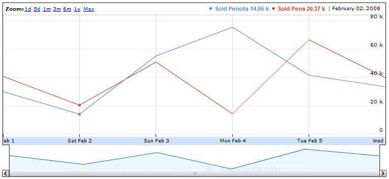
谷歌可视化注释时间线的替代品? (图形库)
除了 Google 的带注释的时间轴可视化 API 之外,还有其他选择吗?

带注释的时间轴中存在一些错误,而且这些错误似乎不会得到解决。
它也是一个基于 Flash 的图表。 Canvas+Javascript 实现会更便携。
使带注释的时间线有价值的品质(与我迄今为止发现的所有其他图表库相反)是:
- 支持多行
- 缩放;钻取和钻出日期范围
- 在时间上来回平移
- 支持数千个数据点
- 能够动态提供新数据
据我所知 Google Annotated Timeline 是唯一的交互式折线图库。
Is there any alternative to Google's Annotated Timeline Visualization API?

There's some bugs in the Annotated Timeline, and it doesn't appear they will be addressed.
Also it is a Flash based chart. A Canvas+Javascript implementation would be more portable.
The qualities that make the Annotated Timeline valuable (as opposed to every other charting library i've found so far) are:
- supports multiple lines
- zooming; to drill in and out of a date range
- panning back and forth through time
- supports thousands of data points
- ability to be fed new data on the fly
As far as i can tell Google's Annotated Timeline is the only interactive line graph library.
如果你对这篇内容有疑问,欢迎到本站社区发帖提问 参与讨论,获取更多帮助,或者扫码二维码加入 Web 技术交流群。

绑定邮箱获取回复消息
由于您还没有绑定你的真实邮箱,如果其他用户或者作者回复了您的评论,将不能在第一时间通知您!

发布评论
评论(9)
Dygraphs 应该完全符合您的要求,并且是一个完整的 js 实现。它是免费的,并且已经与 gviz 集成 (示例),因此您几乎不需要更改任何内容。它还具有其他 gviz 图表上没有的其他有用功能(例如滚动平均值计算)。
希望有帮助。
Dygraphs should do exactly what you want, and is a full js implementation. It's free, and already integrates with gviz (sample here), so you should barely need to change anything. It also has a bunch of other useful functionality not found on other gviz charts (like rolling average calculation).
Hope that helps.
我知道这个问题已经很老了,但如果我知道有一个新的
ChartRangeFilterapi,它会节省我很多时间。https://google-developers.appspot.com/chart/interactive/docs/gallery/controls#chartrangefilter
I know this question is pretty old but it would save me a lot of time if I knew there was a new
ChartRangeFilterapi.https://google-developers.appspot.com/chart/interactive/docs/gallery/controls#chartrangefilter
Google 于 2014 年 1 月 29 日发布了此类的新版本名为
Annotation 的图表图表。确实很酷!最重要的是,它可以免费供您随时随地使用。样本:
On January 29, 2014 Google has made available a new version of such a chart called
Annotation Chart. It's pretty cool indeed! Best of all it's free to user wherever you want.Sample:
我刚刚遇到这个:
http://www.highcharts.com/demo/dynamic-master -detail
它不是免费的,但看起来很有趣。
I just ran into this:
http://www.highcharts.com/demo/dynamic-master-detail
It's not free but it looks interesting.
这个线程有点旧,但 MIT 的 SIMILE 小部件很棒。他们也有一个时间表。
SIMILE 时间轴小部件
This thread is little old, but SIMILE widgets by MIT are great. They have one for timeline as well.
SIMILE Timeline Widget
院子里有一个新项目(是的,我是那里的开发人员之一),它可能非常适合您的需求:
数据可视化软件实验室
该库完全基于 HTML5,并且交互性很强 - 尝试演示。它还针对移动设备进行了优化,因此您可以在任何设备上使用它。
库目前处于测试阶段并正在积极开发中。更多功能即将推出。强烈推荐任何反馈。还有大量的文档和使用示例。还提供用于外部控制的 API。
提供双重许可。
快照:
There is a new project in the yard (yep, I'm one of developers there), which might be the perfect fit for your needs:
Data Visualization Software Lab
That library is purely HTML5 based and very interactive - try the demo. It's also Mobile optimised, so you can use it on any device.
Library is in beta and active development at the moment. Many more features to come soon. Any feedback would be highly recommended. There is also extensive documentation and examples of usage. API for external control is present as well.
Dual licensing to be provided.
Snapshot:
经过广泛研究以取代 Google Annotated Timeline,我认为 HighChart StockChart 是最全面的。
如上所述,它不是开源的,也不是免费的,但我认为它是负担得起的。
After extensive research to replace Google Annotated Timeline, I think that HighChart StockChart is the most comprehensive.
As mentioned above, it is not open source nor free, but affordable according to me.
如果您不需要注释而只需要取景器功能,请尝试 NVD3.js。
Try NVD3.js if you don't need the annotation but only the viewfinder feature.
尝试 c3js
.它完全免费、轻便且易于使用。
Try c3js
.Its completely free, light and easy to use.