使用 Statsd & 组合图表石墨
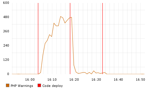
在 Statsd 客户端中,如何组合两个图表以将其显示为一个图表? 
喜欢这个吗?
In Statsd client, how do I combine two graphs to show it as a single one?
Like this?
如果你对这篇内容有疑问,欢迎到本站社区发帖提问 参与讨论,获取更多帮助,或者扫码二维码加入 Web 技术交流群。

绑定邮箱获取回复消息
由于您还没有绑定你的真实邮箱,如果其他用户或者作者回复了您的评论,将不能在第一时间通知您!

发布评论
评论(2)
我现在只是在玩石墨和 statsd,所以我不是专家,但我可能在这里遗漏了一些东西......为什么你要把它结合在 statsd 中?您似乎希望将其合并到 Graphite UI 中,这样您就可以将多个统计数据合并到一个图表中。事实上,我认为您可以创建一个包含这两个指标的图表,然后将该图表保存到“我的图表”以便稍后提取。
就 statsd 而言,您只需编写两个单独的指标,一个是称为 NumWarnings 的计数器,另一个称为 Deployed。要获得像上面这样的图表,我认为您需要为 Deployed 分配一个任意值作为每个部署的计数器(100 似乎是一个不错的数字)。
I'm just playing around with graphite and statsd right now, so I am no expert, but I might be missing something here...why would you combine it in statsd? It seems you would want it to be combined in the Graphite UI, which will let you combine multiple stats onto a single graph. In fact, I think you could create a graph with both of these metrics present and then save the graph to "My Graphs" to pull up later.
As far as statsd is concerned, you are just writing out two separate metrics, one being a counter called NumWarnings and another called Deployed. To get a graph like the one above, I supposed you'd need to assign an arbitrary value to Deployed as a counter for each deployment (100 seems like a good number).
对于后来发现这一点的人来说:使用石墨,如果用鼠标拖动一个图形并将其放在另一个图形上几秒钟,就会出现一个绿色框,显示“放置到合并”。当出现该图形时,将其放下,它将把两个图形合并为一个。
For people discovering this later: with graphite if you drag a graph with the mouse and hold it over another one for a few seconds, a green box will appear saying "Drop to Merge". Drop the graph when that appears and it will merge the two graphs into one.