求两个直方图的卷积
两个随机变量 x 和 y 之和的概率分布由各个分布的卷积给出。我在进行数值计算时遇到了一些麻烦。在下面的示例中,x 和 y 是均匀分布的,它们各自的分布近似为直方图。我的推理是,应该对直方图进行卷积以给出 x+y 的分布。
from numpy.random import uniform
from numpy import ceil,convolve,histogram,sqrt
from pylab import hist,plot,show

n = 10**2

x,y = uniform(-0.5,0.5,n),uniform(-0.5,0.5,n)

bins = ceil(sqrt(n))

pdf_x = histogram(x,bins=bins,normed=True)
pdf_y = histogram(y,bins=bins,normed=True)

s = convolve(pdf_x[0],pdf_y[0])

plot(s)
show()
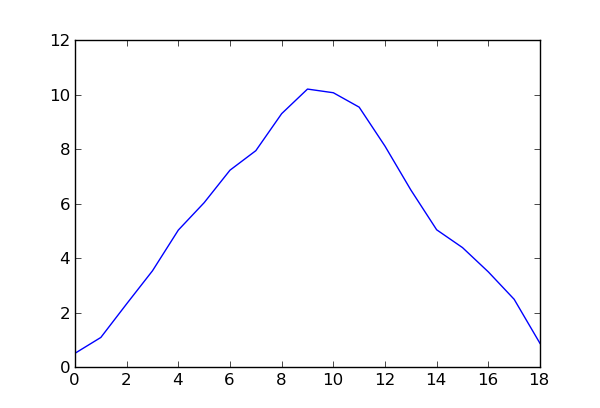
给出以下内容,

换句话说,如预期的那样,是三角形分布。但是,我不知道如何找到 x 值。如果有人能在这里纠正我,我将不胜感激。
The probability distribution of the sum of two random variables, x and y, is given by the convolution of the individual distributions. I'm having some trouble doing this numerically. In the following example, x and y are uniformly distributed, with their respective distributions approximated as histograms. My reasoning says that the histograms should be convoluted to give the distribution of, x+y.
from numpy.random import uniform
from numpy import ceil,convolve,histogram,sqrt
from pylab import hist,plot,show

n = 10**2

x,y = uniform(-0.5,0.5,n),uniform(-0.5,0.5,n)

bins = ceil(sqrt(n))

pdf_x = histogram(x,bins=bins,normed=True)
pdf_y = histogram(y,bins=bins,normed=True)

s = convolve(pdf_x[0],pdf_y[0])

plot(s)
show()
which gives the following,

In other words, a triangular distribution, as expected. However, I have no idea how to find the x-values. I would appreciate it if someone could correct me here.
如果你对这篇内容有疑问,欢迎到本站社区发帖提问 参与讨论,获取更多帮助,或者扫码二维码加入 Web 技术交流群。

绑定邮箱获取回复消息
由于您还没有绑定你的真实邮箱,如果其他用户或者作者回复了您的评论,将不能在第一时间通知您!

发布评论
评论(1)
为了继续前进(朝着更模糊的细节),我进一步调整了您的代码,如下所示:
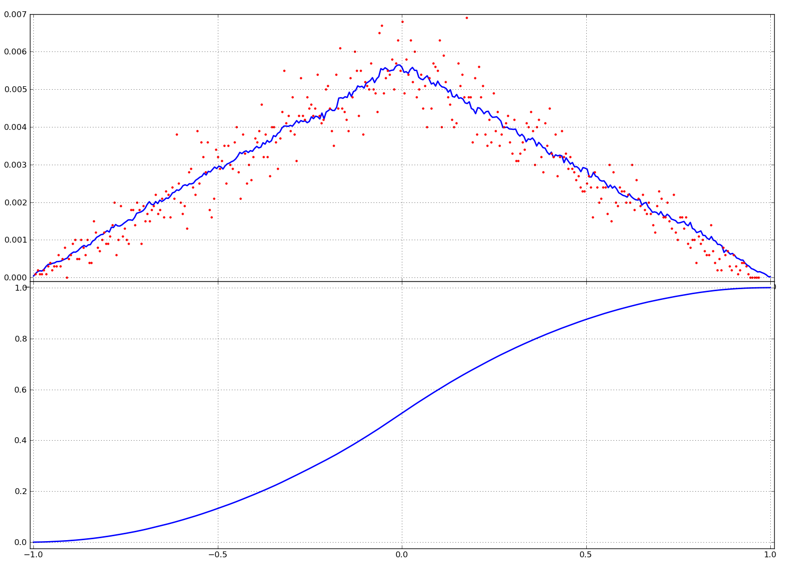
因此,给出如下图:

其中上部代表
PDF(蓝线),它确实看起来很三角形,而模拟(红点)则反映了三角形形状。下半部分代表CDF,它看起来也很好地遵循预期的S曲线。In order to still move on (towards more murky details), I further adapted your code like this:
Thus, giving plots something like this:

Where the upper part represents the
PDF(blue line), which indeed looks quite triangular and the simulation (red dots), which reflects the triangular shape. Lower part represents theCDF, which also looks to follow nicely the expectedS-curve.