如何更改简单格子图中面板的顺序
您好,我正在使用以下代码使用点阵生成 xyplot
xyplot(Rate~Weight|Temp, groups=Week, rate,
 pch=c(15,16,17,3), col=c("blue","red","green","purple"),
 as.table=TRUE,
 xlab="Weight (gr)", ylab="Rate (umol/L*gr)",
 main="All individuals and Treatments at all times",
 strip=strip.custom(strip.names=1),
 key=
 list(text=list(c("Week","1","2","6","8")),
 points=list(pch=c(NA,15,16,17,3),col=c(NA,"blue","red","green","purple")),
 space="right")
 )
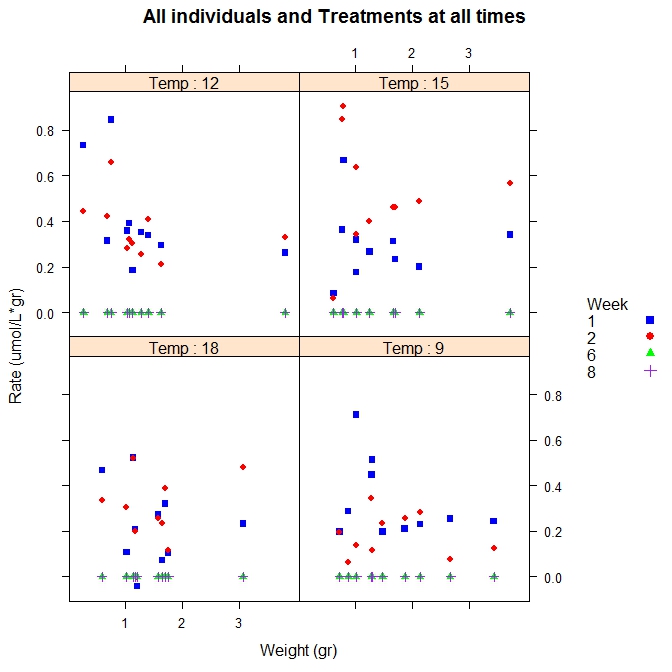
这给出了以下图: 
现在,按照建议更改代码以包含面板顺序后:
xyplot(Rate~Weight|Temp, groups=Week, rate,
 index.cond=list(c(4,1,2,3)),#this provides the order of the panels
 pch=c(15,16,17,3), col=c("blue","red","green","purple"),
 as.table=TRUE,
 xlab="Weight (gr)", ylab="Rate (umol/L*gr)",
 main="All individuals and Treatments at all times",
 strip=strip.custom(strip.names=1),
 key=
 list(text=list(c("Week","1","2","6","8")),
 points=list(pch=c(NA,15,16,17,3),col=c(NA,"blue","red","green","purple")),
 space="right")
 )
我们得到了正确的顺序 
感谢您的帮助
Hi I am using the following code to generate an xyplot using lattice
xyplot(Rate~Weight|Temp, groups=Week, rate,
 pch=c(15,16,17,3), col=c("blue","red","green","purple"),
 as.table=TRUE,
 xlab="Weight (gr)", ylab="Rate (umol/L*gr)",
 main="All individuals and Treatments at all times",
 strip=strip.custom(strip.names=1),
 key=
 list(text=list(c("Week","1","2","6","8")),
 points=list(pch=c(NA,15,16,17,3),col=c(NA,"blue","red","green","purple")),
 space="right")
 )
This gives me the following plot:
Now after changing the code to include panel order as suggested:
xyplot(Rate~Weight|Temp, groups=Week, rate,
 index.cond=list(c(4,1,2,3)),#this provides the order of the panels
 pch=c(15,16,17,3), col=c("blue","red","green","purple"),
 as.table=TRUE,
 xlab="Weight (gr)", ylab="Rate (umol/L*gr)",
 main="All individuals and Treatments at all times",
 strip=strip.custom(strip.names=1),
 key=
 list(text=list(c("Week","1","2","6","8")),
 points=list(pch=c(NA,15,16,17,3),col=c(NA,"blue","red","green","purple")),
 space="right")
 )
and we get the correct order
Thanks for the help
如果你对这篇内容有疑问,欢迎到本站社区发帖提问 参与讨论,获取更多帮助,或者扫码二维码加入 Web 技术交流群。

绑定邮箱获取回复消息
由于您还没有绑定你的真实邮箱,如果其他用户或者作者回复了您的评论,将不能在第一时间通知您!

发布评论
评论(1)
我将
Temp转换为因子并得到:您可以调整因子顺序像这样:
I converted
Tempto factor and got this:You can temper with factor order like so: