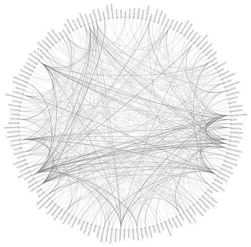
绘制圆形节点网络,并在节点之间建立链接
我想绘制一个节点的圆形图,其中某些节点之间有链接。以下是社交网络图表中的一些示例:

(来源:wrightresult.com)


(来源:twit88.com< /a>)
如何使用 MATLAB 完成此操作?是否可以不安装单独的软件包?
如果你对这篇内容有疑问,欢迎到本站社区发帖提问 参与讨论,获取更多帮助,或者扫码二维码加入 Web 技术交流群。

绑定邮箱获取回复消息
由于您还没有绑定你的真实邮箱,如果其他用户或者作者回复了您的评论,将不能在第一时间通知您!


发布评论
评论(2)
这是您可以做您想做的事情的一种方法。首先,在圆上生成您感兴趣的点
,然后,如果您知道连接的节点对,则可以跳过此步骤。但在许多情况下,您可以从其他计算中获得连接矩阵,并从中找到连接节点的索引。在这里,我创建了一个布尔连接矩阵。因此,如果有 N 个节点,则连接矩阵是一个 NxN 对称矩阵,其中第 i,j 个元素是1,这意味着您有从节点
i到节点j的连接,否则为0。然后可以提取非零对的下标来获取节点连接(只需要上三角形)。这是我用上面的代码生成的连接矩阵。
现在我们只需绘制连接,一次一个,
这将为您提供类似于您的图示例
Here is one way you can do what you want. First, generate points on the circle that you are interested in
Next, if you know the pairs of nodes that are connected, you can skip this step. But in many cases, you get a connectivity matrix from other computations, and you find the indices of the connected nodes from that. Here, I've created a Boolean matrix of connections. So, if there are
Nnodes, the connectivity matrix is anNxNsymmetric matrix, where if thei,jth element is1, it means you have a connection from nodeito nodejand0otherwise. You can then extract the subscripts of the non-zero pairs to get node connections (only the upper triangle is needed).This is the connectivity matrix I generated with the code above.
Now we just need to plot the connections, one at a time
which will give you a figure similar to your examples
受到 Cleve 最新博文的启发莫勒,您还可以使用
gplot函数在给定邻接矩阵和节点坐标的情况下绘制图形。这是一个使用 < 的示例代码>巴基; MATLAB 的演示函数部分,用于生成截断二十面体的图形(看起来像足球)。在本例中,我们仅使用其邻接矩阵,因为我们将顶点布置为圆形:
我们可以采用更进一步,尝试尽量减少边缘交叉。也就是说,我们要重新排列节点,使边缘尽可能接近圆的圆周。
这可以通过找到矩阵的对称排列来最小化其矩阵带宽(非零更接近对角线)
本例中的结果:
其他改进包括用曲线样条线替换直线来绘制边缘,(这样你就可以获得与第二个类似的更好的图形)你已经展示过),或者使用不同的颜色来显示顶点簇及其边缘(显然你需要进行图聚类)。我将把这些步骤留给你:)
Inspired by the latest blog post by Cleve Moler, you could also use the
gplotfunction to draw a graph given an adjacency matrix and node coordinates.Here is an example using
bucky; a demo function part of MATLAB that generates the graph of a truncated icosahedron (looks like a soccer ball). We will only use its adjacency matrix for this example since we are laying out the vertices in a circular shape:We can take this a step further and try to minimize edge crossings. That is we want to rearrange the nodes so that the edges are as close as possible to the circumference of the circle.
This can be done by finding a symmetric permutation of the matrix that minimizes its bandwidth (non-zeros are closer to the diagonal)
The result in this case:
Other improvements include replacing straight lines with curved splines to draw the edges, (that way you get a nicer graph similar to the second one you've shown), or using different colors to show clusters of vertices and their edges (obviously you'll need to do graph clustering). I will leave those steps to you :)