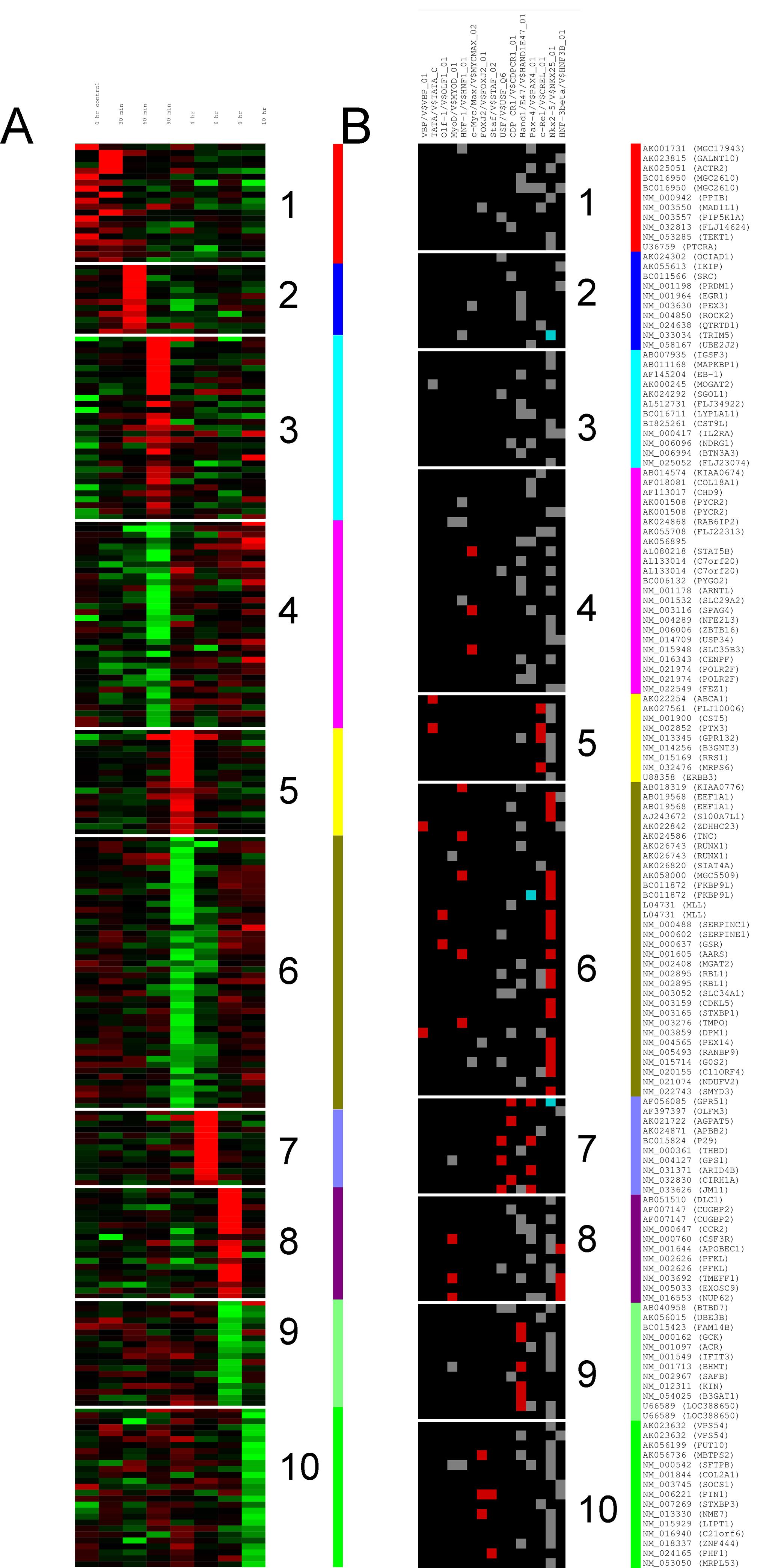
R 用热图绘制 kmeans 聚类
我想用 kmeans 对矩阵进行聚类,并能够将其绘制为热图。听起来挺琐碎的,这样的情节我见过很多。我尝试用谷歌搜索周围,但找不到解决方法。
我希望能够在此图上绘制类似面板 A 或 B 的内容。 假设我有一个 250 行 5 列的矩阵。我不想聚集列,只想聚集行。
m = matrix(rnorm(25), 250, 5)

km = kmeans(m, 10)
那么如何将这 10 个集群绘制为热图?非常欢迎您的评论和帮助。
谢谢。

I would like to cluster a matrix with kmeans, and be able to plot it as heatmap. It sounds quite trivial, and I have seen many plots like this. I have tried to google atround, but can't find a way round it.
I'd like to be able to plot something like panel A or B on this figure.
Let say I have a matrix with 250 rows and 5 columns. I don't want to cluster the columns, just the rows.
m = matrix(rnorm(25), 250, 5)

km = kmeans(m, 10)
Then how do I plot those 10 clusters as a heatmap ? You comments and helps is more than welcome.
Thanks.

如果你对这篇内容有疑问,欢迎到本站社区发帖提问 参与讨论,获取更多帮助,或者扫码二维码加入 Web 技术交流群。

绑定邮箱获取回复消息
由于您还没有绑定你的真实邮箱,如果其他用户或者作者回复了您的评论,将不能在第一时间通知您!


发布评论
评论(2)
类似以下内容应该有效:
Something like the following should work:
我认为这两个数字应该来自两个数字的总和。左边是热图,右边是根据聚类结果着色的。当然,数据应该根据聚类的结果重新排序。顺便说一句,这个问题与问题下面评论的两个问题不相似。
I think both the two figures should come from two figures combined. the left one is heatmap and the right is colored based on the cluster results. Of course, the data should be reordered by the result of cluster. BTW, the question is not similar with the two questions as commented below the question.