使用模糊效果使标签/文本块在玻璃上可读

发布于 2024-10-17 07:09:39 字数 1442 浏览 4 评论 0原文

我正在使用 WPF 3.5 SP1,我想实现这样的目标(玻璃部分已经完成):


(来源:ggpht.com

(来源 )


来源

您可以看到文本周围有很好的模糊,这使得它非常容易阅读。我还发现正确的方法是使用 API DrawThemeTextEx,它使用推荐的系统选项渲染模糊。但是,如何使用WPF达到同样的效果呢?

我找到了这些包含有用资源的链接:
如何使 Aero 玻璃背景上的 WPF 文本可读?< /a>
玻璃表面上的发光标签控件

他们通过复制 TextBlock 来实现这一点,并为其设置模糊效果。然而,这并不是一个真正的解决方案。其外观如下:

将结果效果与上图对比,你会发现解法还差得很远。那么如何使用WPF才能正确获得想要的效果呢?我对模拟很满意(不使用 DrawThemeTextEx API),因为结果非常相似。

谢谢。

I'm using WPF 3.5 SP1 and I want to achieve something like this (the glass-part is already done):


(source: ggpht.com)

(Source)
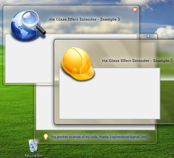

(Source)

You can see nice blur around the text, which makes it very well readable. I also found out that correct approach is to use API DrawThemeTextEx, which renders the blur using recommended system options. However, how can I achieve the same effect using WPF?

I was able to find these links which contain helpful resources:
How to make WPF text on Aero glass background readable?
Glowing Label Controls On A Glass Surface

They do it by duplicating the TextBlock, and setting a Blur effect on it. However, this is not a real solution. Here is how it looks like:

Compare the result effect with the images above, and you will see the solution is still far away. So how can I properly get the desired effect using WPF? I'm fine with emulation (no use of DrawThemeTextEx API), as far as the result is pretty similar.

Thank you.

如果你对这篇内容有疑问,欢迎到本站社区发帖提问 参与讨论,获取更多帮助,或者扫码二维码加入 Web 技术交流群。

扫码二维码加入Web技术交流群

发布评论

需要 登录 才能够评论, 你可以免费 注册 一个本站的账号。

评论(4

蓝颜夕 2024-10-24 07:09:39
    <TextBlock ...>
        <TextBlock.Effect>
            <DropShadowEffect BlurRadius="10" Color="White" ShadowDepth="0" />
        </TextBlock.Effect>
    </TextBlock>
    <TextBlock ...>
        <TextBlock.Effect>
            <DropShadowEffect BlurRadius="10" Color="White" ShadowDepth="0" />
        </TextBlock.Effect>
    </TextBlock>
小…楫夜泊 2024-10-24 07:09:39

根据 Luke 的请求,我包含了 DecoratorXAML >s:

<Decorator>
    <Decorator.Effect>
        <DropShadowEffect BlurRadius="7" Color="White" ShadowDepth="0" />
    </Decorator.Effect>
    <Decorator>
        <Decorator.Effect>
            <DropShadowEffect BlurRadius="7" Color="White" ShadowDepth="0" />
        </Decorator.Effect>
        <Decorator>
            <Decorator.Effect>
                <DropShadowEffect BlurRadius="7" Color="White" ShadowDepth="0" />
            </Decorator.Effect>

            <ContentPresenter ContentTemplate="{TemplateBinding ContentTemplate}"
                    Content="{TemplateBinding Content}" ContentStringFormat="{TemplateBinding ContentStringFormat}" 
                    HorizontalAlignment="{TemplateBinding HorizontalContentAlignment}" RecognizesAccessKey="True" 
                    VerticalAlignment="{TemplateBinding VerticalContentAlignment}" />
        </Decorator>
    </Decorator>
</Decorator>

我使用前面提到的 XAML 为 Label 创建了一个 ControlTemplate,并在需要文本发光的任何地方使用了它。

As per Luke's request, I include the XAML for Decorators:

<Decorator>
    <Decorator.Effect>
        <DropShadowEffect BlurRadius="7" Color="White" ShadowDepth="0" />
    </Decorator.Effect>
    <Decorator>
        <Decorator.Effect>
            <DropShadowEffect BlurRadius="7" Color="White" ShadowDepth="0" />
        </Decorator.Effect>
        <Decorator>
            <Decorator.Effect>
                <DropShadowEffect BlurRadius="7" Color="White" ShadowDepth="0" />
            </Decorator.Effect>

            <ContentPresenter ContentTemplate="{TemplateBinding ContentTemplate}"
                    Content="{TemplateBinding Content}" ContentStringFormat="{TemplateBinding ContentStringFormat}" 
                    HorizontalAlignment="{TemplateBinding HorizontalContentAlignment}" RecognizesAccessKey="True" 
                    VerticalAlignment="{TemplateBinding VerticalContentAlignment}" />
        </Decorator>
    </Decorator>
</Decorator>

I created a ControlTemplate for a Label with the before-mentioned XAML, and used it everywhere I needed the text to glow.

〆凄凉。 2024-10-24 07:09:39

沿着这些思路,在文本后面有一个稍微模糊的矩形怎么样,我已经使用过几次了。我发现它更具可读性,因为模糊覆盖了更大的区域。

            <Grid>
                <Rectangle Fill="#8FFFFFFF"
                           Stroke="{x:Null}"
                           StrokeThickness="0"
                           VerticalAlignment="Center"
                           Width="{Binding ActualWidth, ElementName=PART_Title, Mode=Default}"
                           Height="{Binding ActualHeight, ElementName=PART_Title, Mode=Default}"
                           RadiusX="2"
                           RadiusY="2">
                    <Rectangle.Effect>
                        <BlurEffect Radius="10" />
                    </Rectangle.Effect>
                </Rectangle>

                <TextBlock x:Name="PART_Title"
                           Text="{Binding Title}"
                           Foreground="Black"
                           TextWrapping="NoWrap"
                           TextTrimming="CharacterEllipsis" />
            </Grid>

How about something along these lines where you have a rectangle behind your text that blurs slightly, I have used this a few times. I find it makes it more readable because the blur covers a bigger area.

            <Grid>
                <Rectangle Fill="#8FFFFFFF"
                           Stroke="{x:Null}"
                           StrokeThickness="0"
                           VerticalAlignment="Center"
                           Width="{Binding ActualWidth, ElementName=PART_Title, Mode=Default}"
                           Height="{Binding ActualHeight, ElementName=PART_Title, Mode=Default}"
                           RadiusX="2"
                           RadiusY="2">
                    <Rectangle.Effect>
                        <BlurEffect Radius="10" />
                    </Rectangle.Effect>
                </Rectangle>

                <TextBlock x:Name="PART_Title"
                           Text="{Binding Title}"
                           Foreground="Black"
                           TextWrapping="NoWrap"
                           TextTrimming="CharacterEllipsis" />
            </Grid>
九公里浅绿 2024-10-24 07:09:39

我在实现装饰器时遇到了麻烦,因为它代表了 Paya 的答案,所以我展示了如何将它包装在一个完整的、随时可用的样式资源中,该资源可以应用于任何标签,这将显示玻璃效果,并且将禁用时还会使标签变暗并保留对齐、边框等:

<Style x:Key="GlassLabelStyle" TargetType="{x:Type Label}">
    <Setter Property="Template">
        <Setter.Value>
            <ControlTemplate TargetType="{x:Type Label}">
                <Border BorderBrush="{TemplateBinding BorderBrush}" 
                BorderThickness="{TemplateBinding BorderThickness}" 
                Background="{TemplateBinding Background}" 
                Padding="{TemplateBinding Padding}" SnapsToDevicePixels="True">
                    <Grid>
                        <Decorator>
                            <Decorator.Effect>
                                <DropShadowEffect BlurRadius="7" Color="White" ShadowDepth="0" />
                            </Decorator.Effect>
                            <Decorator>
                                <Decorator.Effect>
                                    <DropShadowEffect BlurRadius="7" Color="White" ShadowDepth="0" />
                                </Decorator.Effect>
                                <Decorator>
                                    <Decorator.Effect>
                                        <DropShadowEffect BlurRadius="7" Color="White" ShadowDepth="0" />
                                    </Decorator.Effect>
                                    <ContentPresenter ContentTemplate="{TemplateBinding ContentTemplate}" 
                    Content="{TemplateBinding Content}" ContentStringFormat="{TemplateBinding ContentStringFormat}" 
                    HorizontalAlignment="{TemplateBinding HorizontalContentAlignment}" RecognizesAccessKey="True" 
                    SnapsToDevicePixels="{TemplateBinding SnapsToDevicePixels}" 
                    VerticalAlignment="{TemplateBinding VerticalContentAlignment}">
                                    </ContentPresenter>
                                </Decorator>
                            </Decorator>
                        </Decorator>
                    </Grid>
                </Border>
                <ControlTemplate.Triggers>
                    <Trigger Property="IsEnabled" Value="False">
                        <Setter Property="Foreground" Value="{DynamicResource {x:Static SystemColors.GrayTextBrushKey}}"/>
                        <Setter Property="Opacity" Value="0.5"/>
                    </Trigger>
                </ControlTemplate.Triggers>
            </ControlTemplate>
        </Setter.Value>
    </Setter>
</Style>

如果样式位于您的窗口或应用程序资源中,那么您可以像这样应用它:

<Label Style="{StaticResource GlassLabelStyle}"

当我这样做时,我也遇到了 TextBox 的问题,当控件被禁用时,您根本无法更改背景颜色(它只是不断恢复为白色),因此有人发现您必须覆盖整个模板!请参阅(https://stackoverflow.com/a/3752517/88409)。因此,这里有一个即用型样式,在禁用时将使文本框半透明(在玻璃上看起来很棒),并在启用时使其背景成为半透明白色,并具有更明显的边框:

<SolidColorBrush x:Key="DisabledBackgroundBrush" Color="#01000000" />
<SolidColorBrush x:Key="DisabledBorderBrush" Color="#40000000" />
<SolidColorBrush x:Key="DisabledForegroundBrush" Color="#88ffffff" />

<Style x:Key="TextBoxStyle" TargetType="{x:Type TextBox}">
    <Setter Property="Background" Value="#88ffffff"/>
    <Setter Property="BorderBrush" Value="Black"/>
    <Setter Property="Template">
        <Setter.Value>
            <ControlTemplate TargetType="TextBox">
                <Border Name="Bd" BorderThickness="{TemplateBinding BorderThickness}" 
                                    BorderBrush="{TemplateBinding BorderBrush}" 
                                    Background="{TemplateBinding Background}" 
                                    SnapsToDevicePixels="true">
                    <ScrollViewer Name="PART_ContentHost" Background="{TemplateBinding Background}" 
                                SnapsToDevicePixels="{TemplateBinding SnapsToDevicePixels}" />
                </Border>
                <ControlTemplate.Triggers>
                    <Trigger Property="IsEnabled" Value="False">
                        <Setter Value="{StaticResource DisabledBackgroundBrush}" Property="Background" />
                        <Setter Value="{StaticResource DisabledBorderBrush}" Property="BorderBrush"/>
                        <Setter Value="{StaticResource DisabledForegroundBrush}" Property="Foreground" />
                        <Setter TargetName="PART_ContentHost" Property="Background" Value="{StaticResource DisabledBackgroundBrush}"/>
                        <Setter TargetName="PART_ContentHost" Property="BorderBrush" Value="{StaticResource DisabledBackgroundBrush}"/>
                    </Trigger>
                </ControlTemplate.Triggers>
            </ControlTemplate>
        </Setter.Value>
    </Setter>
</Style>

I was having trouble implementing the decorator as it stood in Paya's answer, so I show how it can be wrapped in a complete, ready-to-use style resource that can be applied to any label, which will display the glass effect, and will also dim the label when disabled and preserve the alignment, border, etc.:

<Style x:Key="GlassLabelStyle" TargetType="{x:Type Label}">
    <Setter Property="Template">
        <Setter.Value>
            <ControlTemplate TargetType="{x:Type Label}">
                <Border BorderBrush="{TemplateBinding BorderBrush}" 
                BorderThickness="{TemplateBinding BorderThickness}" 
                Background="{TemplateBinding Background}" 
                Padding="{TemplateBinding Padding}" SnapsToDevicePixels="True">
                    <Grid>
                        <Decorator>
                            <Decorator.Effect>
                                <DropShadowEffect BlurRadius="7" Color="White" ShadowDepth="0" />
                            </Decorator.Effect>
                            <Decorator>
                                <Decorator.Effect>
                                    <DropShadowEffect BlurRadius="7" Color="White" ShadowDepth="0" />
                                </Decorator.Effect>
                                <Decorator>
                                    <Decorator.Effect>
                                        <DropShadowEffect BlurRadius="7" Color="White" ShadowDepth="0" />
                                    </Decorator.Effect>
                                    <ContentPresenter ContentTemplate="{TemplateBinding ContentTemplate}" 
                    Content="{TemplateBinding Content}" ContentStringFormat="{TemplateBinding ContentStringFormat}" 
                    HorizontalAlignment="{TemplateBinding HorizontalContentAlignment}" RecognizesAccessKey="True" 
                    SnapsToDevicePixels="{TemplateBinding SnapsToDevicePixels}" 
                    VerticalAlignment="{TemplateBinding VerticalContentAlignment}">
                                    </ContentPresenter>
                                </Decorator>
                            </Decorator>
                        </Decorator>
                    </Grid>
                </Border>
                <ControlTemplate.Triggers>
                    <Trigger Property="IsEnabled" Value="False">
                        <Setter Property="Foreground" Value="{DynamicResource {x:Static SystemColors.GrayTextBrushKey}}"/>
                        <Setter Property="Opacity" Value="0.5"/>
                    </Trigger>
                </ControlTemplate.Triggers>
            </ControlTemplate>
        </Setter.Value>
    </Setter>
</Style>

If the style is in your window or app resources, then you can apply it like so:

<Label Style="{StaticResource GlassLabelStyle}"

And while I'm at it, I encountered an issue with TextBox's too, where you simply cannot alter the background color when the control is disabled (it just keeps reverting to white) so someone figured out that you have to override the entire template! See (https://stackoverflow.com/a/3752517/88409). So here is a ready-to-use style that will make a text box translucent when disabled (looks great on glass) and will make its background a semi-translucent white with a more visible border when enabled:

<SolidColorBrush x:Key="DisabledBackgroundBrush" Color="#01000000" />
<SolidColorBrush x:Key="DisabledBorderBrush" Color="#40000000" />
<SolidColorBrush x:Key="DisabledForegroundBrush" Color="#88ffffff" />

<Style x:Key="TextBoxStyle" TargetType="{x:Type TextBox}">
    <Setter Property="Background" Value="#88ffffff"/>
    <Setter Property="BorderBrush" Value="Black"/>
    <Setter Property="Template">
        <Setter.Value>
            <ControlTemplate TargetType="TextBox">
                <Border Name="Bd" BorderThickness="{TemplateBinding BorderThickness}" 
                                    BorderBrush="{TemplateBinding BorderBrush}" 
                                    Background="{TemplateBinding Background}" 
                                    SnapsToDevicePixels="true">
                    <ScrollViewer Name="PART_ContentHost" Background="{TemplateBinding Background}" 
                                SnapsToDevicePixels="{TemplateBinding SnapsToDevicePixels}" />
                </Border>
                <ControlTemplate.Triggers>
                    <Trigger Property="IsEnabled" Value="False">
                        <Setter Value="{StaticResource DisabledBackgroundBrush}" Property="Background" />
                        <Setter Value="{StaticResource DisabledBorderBrush}" Property="BorderBrush"/>
                        <Setter Value="{StaticResource DisabledForegroundBrush}" Property="Foreground" />
                        <Setter TargetName="PART_ContentHost" Property="Background" Value="{StaticResource DisabledBackgroundBrush}"/>
                        <Setter TargetName="PART_ContentHost" Property="BorderBrush" Value="{StaticResource DisabledBackgroundBrush}"/>
                    </Trigger>
                </ControlTemplate.Triggers>
            </ControlTemplate>
        </Setter.Value>
    </Setter>
</Style>
~没有更多了~
我们使用 Cookies 和其他技术来定制您的体验包括您的登录状态等。通过阅读我们的 隐私政策 了解更多相关信息。 单击 接受 或继续使用网站,即表示您同意使用 Cookies 和您的相关数据。
原文