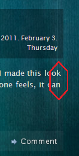
不应该证明平均像素完美是合理的吗?
到目前为止,我认为 justify 意味着文本将以同一像素开始和结束,但几个小时前,当我看到这个时,我感到很惊讶:

我在两台电脑(win7+chrome、ubuntu+firefox)中得到了类似的结果,而且不仅仅是在这个地方,在同一台电脑上还有更多类似的错误网站。
在我第二次检查后,我认为这是普遍现象,我只是还没有注意到,但其他网站没有表现出这种奇怪的行为。刷新网站并重新启动浏览器也没有解决问题。
还有其他人注意到这一点吗?是什么原因造成的?
Until now I thought justify meant that the text will start and end at the same pixel, but i was surprised a few hours ago, when I saw this:

I got similar results in 2 computers (win7+chrome, ubuntu+firefox), and not just at this place, there are more similar bugs on the same site.
After my second chec I thought this is general and I just haven't noticed yet, but other sites don't show this strange behaviour. Also refreshing the site and restarting the browser didn't solved it.
Has anybody else noticed this? What causes this?
如果你对这篇内容有疑问,欢迎到本站社区发帖提问 参与讨论,获取更多帮助,或者扫码二维码加入 Web 技术交流群。

绑定邮箱获取回复消息
由于您还没有绑定你的真实邮箱,如果其他用户或者作者回复了您的评论,将不能在第一时间通知您!

发布评论
评论(3)
事实上,这很可能是有意的行为。与字距调整一样,它与外观有关,而不是像素完美。有理由认为,试图实现的外观是文本列两侧的直边。
让右边缘不平坦的字母(例如“k”)突出到字母(例如“n”)的直边缘之外,有助于在视觉上呈现出这种外观。这是因为格式塔心理学,它涉及我们如何感知形状,你可以看到它也发生在行首:
如果 Webkit 处理文本的细微差别,我不会感到惊讶这样的再现比 IE 引擎更好 - 这是桌面出版中的一项功能 Adobe InDesign 等软件。
Actually that could well be intended behaviour. As with kerning it's about the appearance, rather than being pixel perfect. With justification the appearance that's trying to be achieved is of a straight edge on both sides of the text column.
Letting a letterform with an uneven right edge like "k" stick out past the straight edge of a letter like "n" helps to give that appearance visually. This is because of Gestalt psychology, which deals with how we perceive shapes, and you can see it happening at the start of lines as well:
It wouldn't surprise me if Webkit handles the nuances of text reproduction like this better than IE's engine—it's a feature in desktop publishing software like Adobe InDesign.
应该是因为字符宽度是可变的,这里像素是最小单位,用空格填充,空格有时可以计算出一个四舍五入的浮点数。
无论如何,你真的不应该担心这一点,因为主要原因是可读性而不是设计的变幻莫测。
It should be because of the character width is variable, a pixel is the smallest unit here, and fill the spaces, with, spaces can sometimes compute a float which is rounded.
Anyway, you should really not worry about this as the main reason would readability and not a design vagary.
之前关于这是一个感知问题的观点是有效的,但也有点接受最好的情况,即首先就正确/很好地进行了论证。毫无意义的是,正确的文本对齐实际上相当困难,而且浏览器使用的算法也不是那么好。 此黑客新闻帖子有一堆应该感兴趣的注释和链接。
The points previously made about this being a perceptual issue are valid, but also a bit accepting of a best-case scenario where the justification is being done right/well in the first place. It's worth nothing that proper text justification is actually rather hard, and the algorithms used by browsers just aren't that great. This Hacker News thread has a bunch of notes and links that should be of interest.