更改 TabControl 中选定 tabItem 的文本颜色?
在第二个代码中,有一个文本块,其中包含文本“Mina övningar” 选择 tabItem 时如何将文本颜色更改为黑色?
样式:
 <Style TargetType="{x:Type TabItem}">
        <Setter Property="Template">
            <Setter.Value>
                <ControlTemplate TargetType="{x:Type TabItem}">
                    <Grid>
                        <Border Name="Border" Background="Transparent" BorderBrush="Transparent"  BorderThickness="0"  Margin="0,0,0,13" CornerRadius="5" >

                            <ContentPresenter x:Name="ContentSite" VerticalAlignment="Top"  HorizontalAlignment="Center" ContentSource="Header" Margin="9"/>

                        </Border>
                    </Grid>

                    <ControlTemplate.Triggers>
                        <Trigger Property="IsSelected" Value="True">
                            <Setter Property="Foreground" Value="Black"/>
                            <Setter TargetName="Border" Property="Background">
                                <Setter.Value>
                                        <LinearGradientBrush EndPoint="0.5,1" StartPoint="0.5,0">
                                            <GradientStop Color="#FFF9F7FD" Offset="0.432" />
                                            <GradientStop Color="#FFECF7FD" Offset="0.433" />
                                        </LinearGradientBrush>
                                </Setter.Value>
                                </Setter>
                            <Setter TargetName="ContentSite" Property="Margin" Value="9,12,9,9" />
                        </Trigger>

                        <Trigger Property="IsSelected" Value="False">
                            <Setter TargetName="Border" Property="Background" Value="Transparent" />
                        </Trigger>
                    </ControlTemplate.Triggers>
                </ControlTemplate>
            </Setter.Value>
        </Setter>
    </Style>
tabitem:
<TabItem Background="White">
<TabItem.Header>
<StackPanel Orientation="Vertical">
<Image Height="32" Source="/Glosboken;component/Images/library bookmarked.png" />
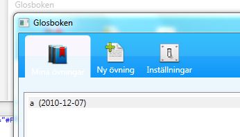
<TextBlock Text="Mina övningar" Margin="0,0,0,0" VerticalAlignment="Center" Foreground="White" />
</StackPanel>
</TabItem.Header>
<Grid>
<ListBox Height="216" Name="bookslist" VerticalAlignment="Top" Background="White" BorderBrush="White" Foreground="White" SelectedIndex="0" Margin="0,0,129,0" />
</Grid>
</TabItem>

如果你对这篇内容有疑问,欢迎到本站社区发帖提问 参与讨论,获取更多帮助,或者扫码二维码加入 Web 技术交流群。

绑定邮箱获取回复消息
由于您还没有绑定你的真实邮箱,如果其他用户或者作者回复了您的评论,将不能在第一时间通知您!


发布评论
评论(3)
一种解决方案是针对这种情况使用单独的样式:
,然后
:替换为: 。
在 TextBlock 中将
One solution is to use a separate style for this situation:
and then replace:
with:
in the TextBlock.
我通过命名 ContentPresenter 并将其定位到触发器中来完成此操作。
这样,它将 TabItem 样式的所有内容保留在一处。
完整示例:
I did this by naming the ContentPresenter and targeting it in the trigger.
This way it keeps everything for the TabItem style in one place.
Complete Example:
我通过使其成为资源字典来扩展 Scott Solmer 的优秀代码,因为我需要这个 TabItem 样式应用程序。
因此,在名为“Resources”的资源字典文件夹下添加新的 TabItemStyles.xaml :
我更改了 app.xaml 以了解新的资源字典。警告 - 调整应用程序的源和组件位置:
然后我在实际屏幕中我需要的应用程序的任何位置都使用了样式。与 Scott 不同,我更喜欢使用 StaticResource 而不是 DynamicResource,除非必须这样做。:
I extended Scott Solmer's great code by making it a resource dictionary because I needed this TabItem styling application wide.
So add new TabItemStyles.xaml under the Resources Dictionary folder which was called "Resources" :
I changed my app.xaml to know about the new resource dictionary. WARNING - adjust the source and component locations for your application:
Then I used style in the actual screen everywhere in the application I needed. Unlike Scott, I prefer using StaticResource rather than DynamicResource unless I have to.: