CSS - “反向”元素浮动 - 如何将它们保持在底部?
我目前面临一个有趣的 CSS 问题,我在网络上找不到任何相关内容。我知道它一定是可以解决的,也许你们能解决这个问题..(?)
以下问题: 我需要在位于左下角的图像前面显示一些图标。 由于图标的数量可能会有所不同,因此图标会彼此相邻浮动(每行最多三个 - 由宽度属性定义)。
这是我的 HTML 代码(包含图标的 div 绝对定位在图像上):
<div class="labels">
<ul>
    <li><img src="image1.png" /></li>
    <li><img src="image1.png" /></li>
    <li><img src="image1.png" /></li>
    <li><img src="image1.png" /></li>
    <li><img src="image1.png" /></li>
</ul>
以及相关的 CSS:
.labels { position: absolute; bottom: 20px; left: 5px; z-index: 50; }
.labels ul { display: block; min-height: 20px; overflow: auto; width:210px; }
.labels ul li { float: left; list-style-type: none; margin: 0 5px 3px 0; }
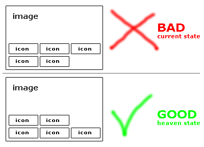
为了让您了解它的外观以及目标是什么,我已经为您准备好了: 请参阅此处(我不允许上传图片..):链接文本
正如您所看到的,图标向左浮动,但显然是从顶部开始的。这不太好,因为我想要从左下角开始反向浮动,填充 ul 元素的宽度,并继续在下一行上浮动。
知道如何解决这个问题吗?非常感谢任何帮助!
I'm currently facing an interesting CSS issue for which I couldn't find anything related on the web. I know it must be solvable, perhaps you guys crack the nut.. (?)
Following problem:
I need to display some icons in front of an image positioned at the bottom left.
As the number of icons can vary, the icons are floated next to each other (max. three per row - defined by the width properties).
Here's my HTML code (the div containing the icons is positioned absolute over an image):
<div class="labels">
<ul>
    <li><img src="image1.png" /></li>
    <li><img src="image1.png" /></li>
    <li><img src="image1.png" /></li>
    <li><img src="image1.png" /></li>
    <li><img src="image1.png" /></li>
</ul>
And the related CSS:
.labels { position: absolute; bottom: 20px; left: 5px; z-index: 50; }
.labels ul { display: block; min-height: 20px; overflow: auto; width:210px; }
.labels ul li { float: left; list-style-type: none; margin: 0 5px 3px 0; }
To get you a picture what it looks like and what the goal is i've scratched it up for you:
see here (I'm not allowed to upload images..): link text
As you can see the icons are floated left, but obviously starting at the top. That's not nice, because I want the floating kind of reverse starting from the bottom left, filling the width of the ul-element and continue the floating on the next row up.
Any idea how to solve this? Any help is highly appreciated!!
如果你对这篇内容有疑问,欢迎到本站社区发帖提问 参与讨论,获取更多帮助,或者扫码二维码加入 Web 技术交流群。

绑定邮箱获取回复消息
由于您还没有绑定你的真实邮箱,如果其他用户或者作者回复了您的评论,将不能在第一时间通知您!


发布评论
评论(4)
仅靠 CSS 无法实现这种效果,因为它违反了浮动规则。
您可以做的是插入空的
,我们将其称为“spacer”,它将填充第一行中第三个图标的空间并将剩余内容向下推。否则 - 您必须将
分成 2 个列表,然后再次对齐所有内容。You can't achieve this effect from CSS only because it is against the floating rules.
What you could do is to insert empty
<li>, let's call it 'spacer' that will fill the space of the 3rd icon in 1st row and push the remaining content down.Otherwise - you'd have to split your
<ul>into 2 lists, and again align everything.恐怕没有纯粹的 CSS 方法来完成这个任务。浮动总是从上到下,就像原则上的文档布局一样。
您可以编写一些辅助方法来为您生成这段标记。以块相反的顺序填充列表项并插入一些空项。或者,将多个列表一个接一个地渲染。
I'm afraid there is no pure CSS way to accomplish this. Floating always goes top to bottom just as the document layout in principle.
You could write some helper method to generate this piece of markup for you. Fill up list items in block-reversed order and insert some empty items. Alternatively, render several lists one under the other.
嗯..这很遗憾 - 但感谢您的良好提示和您对此的想法。
我会去检查是否可以用空项目(在我看来这不是最好的方式)或我将其一一放在彼此顶部的附加列表来处理它。但第二件事将会很困难,而且列表需要绝对定位!...
谢谢你们。
Hm.. that's a pitty - but thanks for the good hints and your thoughts about it.
I'll go and check if I can handle it with either empty items (which is in my point of view is not the very nicest way), or additional lists which I place one by one at the top of each other. But the second thing is going to be hard as well as the lists need to be positioned absolutely!..
Thank you guys.
我认为这会有所帮助。
I think this will help.