带渐变的 Silverlight 线图
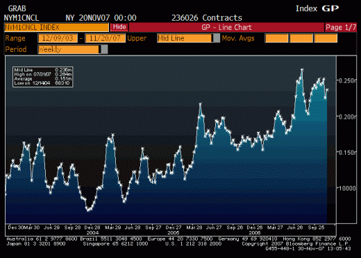
我有一系列的点,我将把它们变成图表上的一条线。我想要的是给图表下方的区域进行渐变填充。它看起来有点类似于这样的彭博图表;

我的问题实际上分为三个部分;
- 首先,我应该如何只填充图表下方的区域?
- 其次,如何用渐变填充它?
- 最后,如果我在同一张图表上有多条线,则多条线下的任何区域都应该有灰度渐变填充,您将如何设置?
我最大的问题是决定使用的数据结构,我可以使用许多多边形状(每条线/数据系列一个),然后告诉画笔进行绘制;
- 如果它不是任何形状,则为透明 如果
- 它是一种形状,则一个系列的颜色(相对于高度的 Alpha 给出梯度)
- 如果它是多个形状,则为黑色(相对于高度的 Alpha 给出梯度)
然后我会绘制形状的边界之后变成白色。
谢谢,
加夫
I have a series of points which I will turn into a line on a graph. What I want is to give the area under the graph a gradient fill. It would look somewhat similar to a Bloomberg graph like this;

My question really has three parts;
- First, how should I fill only the area under the graph?
- Second, how do I fill that with a gradient?
- Finally, if I have multiple lines on the same graph any area under more than one line should have a greyscale gradient fill, how would you set this up?
My biggest problem is deciding on the data structures to use, I could use many multiple sided shapes (One for each line/ data series) and then tell the brush to draw;
- Transparent if it's not in any shape
- The colour of one series if it's in one shape (Alpha relative to height to give grad)
- Black if it's in multiple shapes (Alpha relative to height to give grad)
Then I'd draw the shapes' boundaries in white afterwards.
Thanks,
Gav
如果你对这篇内容有疑问,欢迎到本站社区发帖提问 参与讨论,获取更多帮助,或者扫码二维码加入 Web 技术交流群。

绑定邮箱获取回复消息
由于您还没有绑定你的真实邮箱,如果其他用户或者作者回复了您的评论,将不能在第一时间通知您!

发布评论
评论(1)
使用免费版本的 Visiblox Silverlight 图表 可以实现渐变效果。请参阅示例应用程序“Hindsight”,了解如何将 Visiblox 图表应用于此上下文的应用程序。
我附上了关于如何实现此效果的 XAML 粗略代码片段:
就我个人而言,我会采取事后诸葛亮的做法,当绘图区域上有多个系列时,删除线条下的区域。我认为此时梯度会妨碍数据,正如您上面提到的,对此采取一些措施会产生计算成本。这也可能导致对数据的误解,因此要小心。
在将数据获取到图表方面,您可以使用 Visiblox BindableDataSeries 将业务对象直接绑定到图表上。 :)
披露:我之前曾担任 Visiblox Charts 的开发人员。
希望这有帮助!
The gradient effect is possible using the free version of Visiblox Silverlight Charts. See the example application 'Hindsight' to see how Visiblox charts can be applied to an application of this context.
I've attached a crude code snippet of the XAML on how to achieve this effect:
Personally, I would take the action that Hindsight does, removing the area under lines when there are multiple series on the plot area. I think at that point the gradients get in the way of the data, and as you mentioned above, to do something about this incurs a computational cost. This could also lead to misinterpretations of the data so be wary.
In terms of getting your data to the chart, you can use the Visiblox BindableDataSeries to bind your business objects directly onto the chart. :)
Disclosure: I have previously worked as a developer on Visiblox Charts.
Hope this helps!