WPF - 如何设置菜单控件的样式以删除左边距?

发布于 2024-09-04 11:53:42 字数 452 浏览 3 评论 0原文

我已将默认菜单控件添加到我的用户控件中。我需要设置菜单样式以删除包含图标或复选框空间的左边距。我该怎么做?

XAML:

<Menu>
    <MenuItem Header="MyMenu" FontSize="10">
        <MenuItem Header="Options..." />
        <MenuItem Header="About" />
    </MenuItem>
</Menu>  

它目前像任何其他开箱即用的菜单控件一样呈现:

alt text

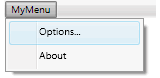
我不想要菜单项左侧的边距或栏。这通常用于图标等。

I have added a default menu control to my user control. I need to style the menu to remove the left margin containing the space for the icon or checkbox. How can I do this?

XAML:

<Menu>
    <MenuItem Header="MyMenu" FontSize="10">
        <MenuItem Header="Options..." />
        <MenuItem Header="About" />
    </MenuItem>
</Menu>  

It currently renders like any other Menu control out of the box:

alt text

I don't want the margin or column to the left of the menu items. This is typically used for icons etc.

如果你对这篇内容有疑问,欢迎到本站社区发帖提问 参与讨论,获取更多帮助,或者扫码二维码加入 Web 技术交流群。

扫码二维码加入Web技术交流群

发布评论

需要 登录 才能够评论, 你可以免费 注册 一个本站的账号。

评论(9

诗化ㄋ丶相逢 2024-09-11 11:53:42

我认为这就是你所追求的(再次,使用 Expression Blend 来解决它,但就其显示的内容而言,它是我能得到的最简约的......并且花了很多时间来玩弄)......您可以将以下内容放入空白 WPF 应用程序中作为示例:

<Window x:Class="MenuItemWithNoIcon.MainWindow"
        xmlns="http://schemas.microsoft.com/winfx/2006/xaml/presentation"
        xmlns:x="http://schemas.microsoft.com/winfx/2006/xaml"
        Title="MainWindow" Height="350" Width="525">
    <Window.Resources>
        <SolidColorBrush x:Key="MenuItem.Highlight.Background" Color="#3D26A0DA"/>
        <SolidColorBrush x:Key="MenuItem.Highlight.Border" Color="#FF26A0DA"/>
        <SolidColorBrush x:Key="Menu.Disabled.Foreground" Color="#FF707070"/>
        <SolidColorBrush x:Key="MenuItem.Highlight.Disabled.Background" Color="#0A000000"/>
        <SolidColorBrush x:Key="MenuItem.Highlight.Disabled.Border" Color="#21000000"/>
        <SolidColorBrush x:Key="MenuItem.Selected.Border" Color="#FF26A0DA"/>
        <SolidColorBrush x:Key="MenuItem.Selected.Background" Color="#3D26A0DA"/>
        <Geometry x:Key="Checkmark">F1 M 10.0,1.2 L 4.7,9.1 L 4.5,9.1 L 0,5.2 L 1.3,3.5 L 4.3,6.1L 8.3,0 L 10.0,1.2 Z</Geometry>
        <SolidColorBrush x:Key="Menu.Static.Foreground" Color="#FF212121"/>
        <ControlTemplate x:Key="{ComponentResourceKey ResourceId=SubmenuItemTemplateKey, TypeInTargetAssembly={x:Type MenuItem}}" TargetType="{x:Type MenuItem}">
            <Border x:Name="templateRoot" BorderBrush="{TemplateBinding BorderBrush}" BorderThickness="{TemplateBinding BorderThickness}" Background="{TemplateBinding Background}" Height="22" SnapsToDevicePixels="true">
                <Grid Margin="0">
                    <Grid.ColumnDefinitions>
                        <ColumnDefinition Width="*"/>
                    </Grid.ColumnDefinitions>
                    <ContentPresenter x:Name="menuHeaderContainer" ContentSource="Header" HorizontalAlignment="Stretch" Margin="{TemplateBinding Padding}" RecognizesAccessKey="True" SnapsToDevicePixels="{TemplateBinding SnapsToDevicePixels}" VerticalAlignment="Stretch"/>
                </Grid>
            </Border>
            <ControlTemplate.Triggers>
                <Trigger Property="Icon" Value="{x:Null}"/>
                <Trigger Property="IsChecked" Value="True"/>
                <Trigger Property="IsHighlighted" Value="True">
                    <Setter Property="Background" TargetName="templateRoot" Value="{StaticResource MenuItem.Highlight.Background}"/>
                    <Setter Property="BorderBrush" TargetName="templateRoot" Value="{StaticResource MenuItem.Highlight.Border}"/>
                </Trigger>
                <Trigger Property="IsEnabled" Value="False">
                    <Setter Property="TextElement.Foreground" TargetName="templateRoot" Value="{StaticResource Menu.Disabled.Foreground}"/>
                </Trigger>
                <MultiTrigger>
                    <MultiTrigger.Conditions>
                        <Condition Property="IsHighlighted" Value="True"/>
                        <Condition Property="IsEnabled" Value="False"/>
                    </MultiTrigger.Conditions>
                    <Setter Property="Background" TargetName="templateRoot" Value="{StaticResource MenuItem.Highlight.Disabled.Background}"/>
                    <Setter Property="BorderBrush" TargetName="templateRoot" Value="{StaticResource MenuItem.Highlight.Disabled.Border}"/>
                </MultiTrigger>
            </ControlTemplate.Triggers>
        </ControlTemplate>
        <SolidColorBrush x:Key="Menu.Static.Border" Color="#FF999999"/>
        <SolidColorBrush x:Key="Menu.Static.Background" Color="#FFF0F0F0"/>
        <SolidColorBrush x:Key="Menu.Static.Separator" Color="#FFD7D7D7"/>
        <Geometry x:Key="UpArrow">M 0,4 L 3.5,0 L 7,4 Z</Geometry>
        <Style x:Key="MenuScrollButton" BasedOn="{x:Null}" TargetType="{x:Type RepeatButton}">
            <Setter Property="ClickMode" Value="Hover"/>
            <Setter Property="Template">
                <Setter.Value>
                    <ControlTemplate TargetType="{x:Type RepeatButton}">
                        <Border x:Name="templateRoot" BorderBrush="Transparent" BorderThickness="1" Background="Transparent" SnapsToDevicePixels="true">
                            <ContentPresenter HorizontalAlignment="Center" Margin="6" VerticalAlignment="Center"/>
                        </Border>
                    </ControlTemplate>
                </Setter.Value>
            </Setter>
        </Style>
        <MenuScrollingVisibilityConverter x:Key="MenuScrollingVisibilityConverter"/>
        <Geometry x:Key="DownArrow">M 0,0 L 3.5,4 L 7,0 Z</Geometry>
        <Style x:Key="{ComponentResourceKey ResourceId=MenuScrollViewer, TypeInTargetAssembly={x:Type FrameworkElement}}" BasedOn="{x:Null}" TargetType="{x:Type ScrollViewer}">
            <Setter Property="HorizontalScrollBarVisibility" Value="Hidden"/>
            <Setter Property="VerticalScrollBarVisibility" Value="Auto"/>
            <Setter Property="Template">
                <Setter.Value>
                    <ControlTemplate TargetType="{x:Type ScrollViewer}">
                        <Grid SnapsToDevicePixels="true">
                            <Grid.ColumnDefinitions>
                                <ColumnDefinition Width="*"/>
                            </Grid.ColumnDefinitions>
                            <Grid.RowDefinitions>
                                <RowDefinition Height="Auto"/>
                                <RowDefinition Height="*"/>
                                <RowDefinition Height="Auto"/>
                            </Grid.RowDefinitions>
                            <Border Grid.Column="0" Grid.Row="1">
                                <ScrollContentPresenter CanContentScroll="{TemplateBinding CanContentScroll}" Margin="{TemplateBinding Padding}"/>
                            </Border>
                            <RepeatButton Grid.Column="0" CommandTarget="{Binding RelativeSource={RelativeSource TemplatedParent}}" Command="{x:Static ScrollBar.LineUpCommand}" Focusable="false" Grid.Row="0" Style="{StaticResource MenuScrollButton}">
                                <RepeatButton.Visibility>
                                    <MultiBinding ConverterParameter="0" Converter="{StaticResource MenuScrollingVisibilityConverter}" FallbackValue="Visibility.Collapsed">
                                        <Binding Path="ComputedVerticalScrollBarVisibility" RelativeSource="{RelativeSource TemplatedParent}"/>
                                        <Binding Path="VerticalOffset" RelativeSource="{RelativeSource TemplatedParent}"/>
                                        <Binding Path="ExtentHeight" RelativeSource="{RelativeSource TemplatedParent}"/>
                                        <Binding Path="ViewportHeight" RelativeSource="{RelativeSource TemplatedParent}"/>
                                    </MultiBinding>
                                </RepeatButton.Visibility>
                                <Path Data="{StaticResource UpArrow}" Fill="{StaticResource Menu.Static.Foreground}"/>
                            </RepeatButton>
                            <RepeatButton Grid.Column="0" CommandTarget="{Binding RelativeSource={RelativeSource TemplatedParent}}" Command="{x:Static ScrollBar.LineDownCommand}" Focusable="false" Grid.Row="2" Style="{StaticResource MenuScrollButton}">
                                <RepeatButton.Visibility>
                                    <MultiBinding ConverterParameter="100" Converter="{StaticResource MenuScrollingVisibilityConverter}" FallbackValue="Visibility.Collapsed">
                                        <Binding Path="ComputedVerticalScrollBarVisibility" RelativeSource="{RelativeSource TemplatedParent}"/>
                                        <Binding Path="VerticalOffset" RelativeSource="{RelativeSource TemplatedParent}"/>
                                        <Binding Path="ExtentHeight" RelativeSource="{RelativeSource TemplatedParent}"/>
                                        <Binding Path="ViewportHeight" RelativeSource="{RelativeSource TemplatedParent}"/>
                                    </MultiBinding>
                                </RepeatButton.Visibility>
                                <Path Data="{StaticResource DownArrow}" Fill="{StaticResource Menu.Static.Foreground}"/>
                            </RepeatButton>
                        </Grid>
                    </ControlTemplate>
                </Setter.Value>
            </Setter>
        </Style>
        <ControlTemplate x:Key="{ComponentResourceKey ResourceId=TopLevelHeaderTemplateKey, TypeInTargetAssembly={x:Type MenuItem}}" TargetType="{x:Type MenuItem}">
            <Border x:Name="templateRoot" BorderBrush="{TemplateBinding BorderBrush}" BorderThickness="{TemplateBinding BorderThickness}" Background="{TemplateBinding Background}" SnapsToDevicePixels="true">
                <Grid VerticalAlignment="Center">
                    <Grid.ColumnDefinitions>
                        <ColumnDefinition Width="Auto"/>
                        <ColumnDefinition Width="Auto"/>
                    </Grid.ColumnDefinitions>
                    <Path x:Name="GlyphPanel" Data="{StaticResource Checkmark}" Fill="{TemplateBinding Foreground}" FlowDirection="LeftToRight" Margin="3" Visibility="Collapsed" VerticalAlignment="Center"/>
                    <ContentPresenter Grid.Column="1" ContentSource="Header" Margin="{TemplateBinding Padding}" RecognizesAccessKey="True" SnapsToDevicePixels="{TemplateBinding SnapsToDevicePixels}"/>
                    <Popup x:Name="PART_Popup" AllowsTransparency="true" Focusable="false" IsOpen="{Binding IsSubmenuOpen, RelativeSource={RelativeSource TemplatedParent}}" PopupAnimation="{DynamicResource {x:Static SystemParameters.MenuPopupAnimationKey}}" Placement="Bottom" PlacementTarget="{Binding ElementName=templateRoot}">
                        <Border x:Name="SubMenuBorder" BorderBrush="{StaticResource Menu.Static.Border}" BorderThickness="1" Background="{StaticResource Menu.Static.Background}" Padding="0">
                            <ScrollViewer x:Name="SubMenuScrollViewer" Style="{DynamicResource {ComponentResourceKey ResourceId=MenuScrollViewer, TypeInTargetAssembly={x:Type FrameworkElement}}}">
                                <Grid RenderOptions.ClearTypeHint="Enabled">
                                    <Canvas HorizontalAlignment="Left" Height="0" VerticalAlignment="Top" Width="0">
                                        <Rectangle x:Name="OpaqueRect" Fill="{Binding Background, ElementName=SubMenuBorder}" Height="{Binding ActualHeight, ElementName=SubMenuBorder}" Width="{Binding ActualWidth, ElementName=SubMenuBorder}"/>
                                    </Canvas>
                                    <Rectangle Fill="{StaticResource Menu.Static.Separator}" HorizontalAlignment="Left" Margin="0" Width="1"/>
                                    <ItemsPresenter x:Name="ItemsPresenter" KeyboardNavigation.DirectionalNavigation="Cycle" Grid.IsSharedSizeScope="true" SnapsToDevicePixels="{TemplateBinding SnapsToDevicePixels}" KeyboardNavigation.TabNavigation="Cycle"/>
                                </Grid>
                            </ScrollViewer>
                        </Border>
                    </Popup>
                </Grid>
            </Border>
            <ControlTemplate.Triggers>
                <Trigger Property="IsSuspendingPopupAnimation" Value="true">
                    <Setter Property="PopupAnimation" TargetName="PART_Popup" Value="None"/>
                </Trigger>
                <Trigger Property="Icon" Value="{x:Null}"/>
                <Trigger Property="IsChecked" Value="true">
                    <Setter Property="Visibility" TargetName="GlyphPanel" Value="Visible"/>
                </Trigger>
                <Trigger Property="IsHighlighted" Value="True">
                    <Setter Property="Background" TargetName="templateRoot" Value="{StaticResource MenuItem.Highlight.Background}"/>
                    <Setter Property="BorderBrush" TargetName="templateRoot" Value="{StaticResource MenuItem.Highlight.Border}"/>
                </Trigger>
                <Trigger Property="IsEnabled" Value="False">
                    <Setter Property="TextElement.Foreground" TargetName="templateRoot" Value="{StaticResource Menu.Disabled.Foreground}"/>
                    <Setter Property="Fill" TargetName="GlyphPanel" Value="{StaticResource Menu.Disabled.Foreground}"/>
                </Trigger>
                <Trigger Property="ScrollViewer.CanContentScroll" SourceName="SubMenuScrollViewer" Value="false">
                    <Setter Property="Canvas.Top" TargetName="OpaqueRect" Value="{Binding VerticalOffset, ElementName=SubMenuScrollViewer}"/>
                    <Setter Property="Canvas.Left" TargetName="OpaqueRect" Value="{Binding HorizontalOffset, ElementName=SubMenuScrollViewer}"/>
                </Trigger>
            </ControlTemplate.Triggers>
        </ControlTemplate>
        <ControlTemplate x:Key="{ComponentResourceKey ResourceId=TopLevelItemTemplateKey, TypeInTargetAssembly={x:Type MenuItem}}" TargetType="{x:Type MenuItem}">
            <Border x:Name="templateRoot" BorderBrush="{TemplateBinding BorderBrush}" BorderThickness="{TemplateBinding BorderThickness}" Background="{TemplateBinding Background}" SnapsToDevicePixels="true">
                <Grid VerticalAlignment="Center">
                    <Grid.ColumnDefinitions>
                        <ColumnDefinition Width="Auto"/>
                        <ColumnDefinition Width="Auto"/>
                    </Grid.ColumnDefinitions>
                    <ContentPresenter x:Name="Icon" ContentSource="Icon" HorizontalAlignment="Center" Height="16" Margin="3" SnapsToDevicePixels="{TemplateBinding SnapsToDevicePixels}" VerticalAlignment="Center" Width="16"/>
                    <Path x:Name="GlyphPanel" Data="{StaticResource Checkmark}" Fill="{StaticResource Menu.Static.Foreground}" FlowDirection="LeftToRight" Margin="3" Visibility="Collapsed" VerticalAlignment="Center"/>
                    <ContentPresenter Grid.Column="1" ContentSource="Header" Margin="{TemplateBinding Padding}" RecognizesAccessKey="True" SnapsToDevicePixels="{TemplateBinding SnapsToDevicePixels}"/>
                </Grid>
            </Border>
            <ControlTemplate.Triggers>
                <Trigger Property="Icon" Value="{x:Null}">
                    <Setter Property="Visibility" TargetName="Icon" Value="Collapsed"/>
                </Trigger>
                <Trigger Property="IsChecked" Value="true">
                    <Setter Property="Visibility" TargetName="GlyphPanel" Value="Visible"/>
                    <Setter Property="Visibility" TargetName="Icon" Value="Collapsed"/>
                </Trigger>
                <Trigger Property="IsHighlighted" Value="True">
                    <Setter Property="Background" TargetName="templateRoot" Value="{StaticResource MenuItem.Highlight.Background}"/>
                    <Setter Property="BorderBrush" TargetName="templateRoot" Value="{StaticResource MenuItem.Highlight.Border}"/>
                </Trigger>
                <Trigger Property="IsEnabled" Value="False">
                    <Setter Property="TextElement.Foreground" TargetName="templateRoot" Value="{StaticResource Menu.Disabled.Foreground}"/>
                    <Setter Property="Fill" TargetName="GlyphPanel" Value="{StaticResource Menu.Disabled.Foreground}"/>
                </Trigger>
                <MultiTrigger>
                    <MultiTrigger.Conditions>
                        <Condition Property="IsHighlighted" Value="True"/>
                        <Condition Property="IsEnabled" Value="False"/>
                    </MultiTrigger.Conditions>
                    <Setter Property="Background" TargetName="templateRoot" Value="{StaticResource MenuItem.Highlight.Disabled.Background}"/>
                    <Setter Property="BorderBrush" TargetName="templateRoot" Value="{StaticResource MenuItem.Highlight.Disabled.Border}"/>
                </MultiTrigger>
            </ControlTemplate.Triggers>
        </ControlTemplate>
        <Geometry x:Key="RightArrow">M 0,0 L 4,3.5 L 0,7 Z</Geometry>
        <ControlTemplate x:Key="{ComponentResourceKey ResourceId=SubmenuHeaderTemplateKey, TypeInTargetAssembly={x:Type MenuItem}}" TargetType="{x:Type MenuItem}">
            <Border x:Name="templateRoot" BorderBrush="{TemplateBinding BorderBrush}" BorderThickness="{TemplateBinding BorderThickness}" Background="{TemplateBinding Background}" Height="22" SnapsToDevicePixels="true">
                <Grid Margin="-1">
                    <Grid.ColumnDefinitions>
                        <ColumnDefinition MinWidth="22" SharedSizeGroup="MenuItemIconColumnGroup" Width="Auto"/>
                        <ColumnDefinition Width="13"/>
                        <ColumnDefinition Width="*"/>
                        <ColumnDefinition Width="30"/>
                        <ColumnDefinition SharedSizeGroup="MenuItemIGTColumnGroup" Width="Auto"/>
                        <ColumnDefinition Width="20"/>
                    </Grid.ColumnDefinitions>
                    <ContentPresenter x:Name="Icon" ContentSource="Icon" HorizontalAlignment="Center" Height="16" Margin="3" SnapsToDevicePixels="{TemplateBinding SnapsToDevicePixels}" VerticalAlignment="Center" Width="16"/>
                    <Border x:Name="GlyphPanel" BorderBrush="{StaticResource MenuItem.Highlight.Border}" BorderThickness="1" Background="{StaticResource MenuItem.Highlight.Background}" Height="22" Margin="-1,0,0,0" Visibility="Hidden" VerticalAlignment="Center" Width="22">
                        <Path x:Name="Glyph" Data="{DynamicResource Checkmark}" Fill="{StaticResource Menu.Static.Foreground}" FlowDirection="LeftToRight" Height="11" Width="9"/>
                    </Border>
                    <ContentPresenter Grid.Column="2" ContentSource="Header" HorizontalAlignment="Left" Margin="{TemplateBinding Padding}" RecognizesAccessKey="True" SnapsToDevicePixels="{TemplateBinding SnapsToDevicePixels}" VerticalAlignment="Center"/>
                    <TextBlock Grid.Column="4" Margin="{TemplateBinding Padding}" Opacity="0.7" Text="{TemplateBinding InputGestureText}" VerticalAlignment="Center"/>
                    <Path x:Name="RightArrow" Grid.Column="5" Data="{StaticResource RightArrow}" Fill="{StaticResource Menu.Static.Foreground}" HorizontalAlignment="Left" Margin="10,0,0,0" VerticalAlignment="Center"/>
                    <Popup x:Name="PART_Popup" AllowsTransparency="true" Focusable="false" HorizontalOffset="-2" IsOpen="{Binding IsSubmenuOpen, RelativeSource={RelativeSource TemplatedParent}}" PopupAnimation="{DynamicResource {x:Static SystemParameters.MenuPopupAnimationKey}}" Placement="Right" VerticalOffset="-3">
                        <Border x:Name="SubMenuBorder" BorderBrush="{StaticResource Menu.Static.Border}" BorderThickness="1" Background="{StaticResource Menu.Static.Background}" Padding="2">
                            <ScrollViewer x:Name="SubMenuScrollViewer" Style="{DynamicResource {ComponentResourceKey ResourceId=MenuScrollViewer, TypeInTargetAssembly={x:Type FrameworkElement}}}">
                                <Grid RenderOptions.ClearTypeHint="Enabled">
                                    <Canvas HorizontalAlignment="Left" Height="0" VerticalAlignment="Top" Width="0">
                                        <Rectangle x:Name="OpaqueRect" Fill="{Binding Background, ElementName=SubMenuBorder}" Height="{Binding ActualHeight, ElementName=SubMenuBorder}" Width="{Binding ActualWidth, ElementName=SubMenuBorder}"/>
                                    </Canvas>
                                    <Rectangle Fill="{DynamicResource {x:Static SystemColors.ControlDarkBrushKey}}" HorizontalAlignment="Left" Margin="29,2,0,2" Width="1"/>
                                    <ItemsPresenter x:Name="ItemsPresenter" KeyboardNavigation.DirectionalNavigation="Cycle" Grid.IsSharedSizeScope="true" SnapsToDevicePixels="{TemplateBinding SnapsToDevicePixels}" KeyboardNavigation.TabNavigation="Cycle"/>
                                </Grid>
                            </ScrollViewer>
                        </Border>
                    </Popup>
                </Grid>
            </Border>
            <ControlTemplate.Triggers>
                <Trigger Property="IsSuspendingPopupAnimation" Value="true">
                    <Setter Property="PopupAnimation" TargetName="PART_Popup" Value="None"/>
                </Trigger>
                <Trigger Property="Icon" Value="{x:Null}">
                    <Setter Property="Visibility" TargetName="Icon" Value="Collapsed"/>
                </Trigger>
                <Trigger Property="IsChecked" Value="True">
                    <Setter Property="Visibility" TargetName="GlyphPanel" Value="Visible"/>
                    <Setter Property="Visibility" TargetName="Icon" Value="Collapsed"/>
                </Trigger>
                <Trigger Property="IsHighlighted" Value="True">
                    <Setter Property="Background" TargetName="templateRoot" Value="Transparent"/>
                    <Setter Property="BorderBrush" TargetName="templateRoot" Value="{StaticResource MenuItem.Highlight.Border}"/>
                </Trigger>
                <Trigger Property="IsEnabled" Value="False">
                    <Setter Property="TextElement.Foreground" TargetName="templateRoot" Value="{StaticResource Menu.Disabled.Foreground}"/>
                    <Setter Property="Fill" TargetName="Glyph" Value="{StaticResource Menu.Disabled.Foreground}"/>
                    <Setter Property="Fill" TargetName="RightArrow" Value="{StaticResource Menu.Disabled.Foreground}"/>
                </Trigger>
                <Trigger Property="ScrollViewer.CanContentScroll" SourceName="SubMenuScrollViewer" Value="false">
                    <Setter Property="Canvas.Top" TargetName="OpaqueRect" Value="{Binding VerticalOffset, ElementName=SubMenuScrollViewer}"/>
                    <Setter Property="Canvas.Left" TargetName="OpaqueRect" Value="{Binding HorizontalOffset, ElementName=SubMenuScrollViewer}"/>
                </Trigger>
            </ControlTemplate.Triggers>
        </ControlTemplate>
        <Style x:Key="MenuItemStyle1" TargetType="{x:Type MenuItem}">
            <Setter Property="HorizontalContentAlignment" Value="{Binding HorizontalContentAlignment, RelativeSource={RelativeSource AncestorType={x:Type ItemsControl}}}"/>
            <Setter Property="VerticalContentAlignment" Value="{Binding VerticalContentAlignment, RelativeSource={RelativeSource AncestorType={x:Type ItemsControl}}}"/>
            <Setter Property="Background" Value="Transparent"/>
            <Setter Property="BorderBrush" Value="Transparent"/>
            <Setter Property="BorderThickness" Value="1"/>
            <Setter Property="ScrollViewer.PanningMode" Value="Both"/>
            <Setter Property="Stylus.IsFlicksEnabled" Value="False"/>
            <Setter Property="Template" Value="{DynamicResource {ComponentResourceKey ResourceId=SubmenuItemTemplateKey, TypeInTargetAssembly={x:Type MenuItem}}}"/>
            <Style.Triggers>
                <Trigger Property="Role" Value="TopLevelHeader">
                    <Setter Property="Background" Value="Transparent"/>
                    <Setter Property="BorderBrush" Value="Transparent"/>
                    <Setter Property="Foreground" Value="{StaticResource Menu.Static.Foreground}"/>
                    <Setter Property="Template" Value="{DynamicResource {ComponentResourceKey ResourceId=TopLevelHeaderTemplateKey, TypeInTargetAssembly={x:Type MenuItem}}}"/>
                    <Setter Property="Padding" Value="6,0"/>
                </Trigger>
                <Trigger Property="Role" Value="TopLevelItem">
                    <Setter Property="Background" Value="{StaticResource Menu.Static.Background}"/>
                    <Setter Property="BorderBrush" Value="{StaticResource Menu.Static.Border}"/>
                    <Setter Property="Foreground" Value="{StaticResource Menu.Static.Foreground}"/>
                    <Setter Property="Template" Value="{DynamicResource {ComponentResourceKey ResourceId=TopLevelItemTemplateKey, TypeInTargetAssembly={x:Type MenuItem}}}"/>
                    <Setter Property="Padding" Value="6,0"/>
                </Trigger>
                <Trigger Property="Role" Value="SubmenuHeader">
                    <Setter Property="Template" Value="{DynamicResource {ComponentResourceKey ResourceId=SubmenuHeaderTemplateKey, TypeInTargetAssembly={x:Type MenuItem}}}"/>
                </Trigger>
            </Style.Triggers>
        </Style>
    </Window.Resources>
    <Grid>
        <Menu>
            <MenuItem Header="File" Style="{DynamicResource MenuItemStyle1}">
                <MenuItem Header="Exit" Style="{DynamicResource MenuItemStyle1}"/>
            </MenuItem>
        </Menu>
    </Grid>
</Window>

I think this is what you're after (again, got around to it using Expression Blend, but its the most minimalist I could get in terms of what it displays...and it took a lot of playing around with)...you can just drop the following in a blank WPF application as an example:

<Window x:Class="MenuItemWithNoIcon.MainWindow"
        xmlns="http://schemas.microsoft.com/winfx/2006/xaml/presentation"
        xmlns:x="http://schemas.microsoft.com/winfx/2006/xaml"
        Title="MainWindow" Height="350" Width="525">
    <Window.Resources>
        <SolidColorBrush x:Key="MenuItem.Highlight.Background" Color="#3D26A0DA"/>
        <SolidColorBrush x:Key="MenuItem.Highlight.Border" Color="#FF26A0DA"/>
        <SolidColorBrush x:Key="Menu.Disabled.Foreground" Color="#FF707070"/>
        <SolidColorBrush x:Key="MenuItem.Highlight.Disabled.Background" Color="#0A000000"/>
        <SolidColorBrush x:Key="MenuItem.Highlight.Disabled.Border" Color="#21000000"/>
        <SolidColorBrush x:Key="MenuItem.Selected.Border" Color="#FF26A0DA"/>
        <SolidColorBrush x:Key="MenuItem.Selected.Background" Color="#3D26A0DA"/>
        <Geometry x:Key="Checkmark">F1 M 10.0,1.2 L 4.7,9.1 L 4.5,9.1 L 0,5.2 L 1.3,3.5 L 4.3,6.1L 8.3,0 L 10.0,1.2 Z</Geometry>
        <SolidColorBrush x:Key="Menu.Static.Foreground" Color="#FF212121"/>
        <ControlTemplate x:Key="{ComponentResourceKey ResourceId=SubmenuItemTemplateKey, TypeInTargetAssembly={x:Type MenuItem}}" TargetType="{x:Type MenuItem}">
            <Border x:Name="templateRoot" BorderBrush="{TemplateBinding BorderBrush}" BorderThickness="{TemplateBinding BorderThickness}" Background="{TemplateBinding Background}" Height="22" SnapsToDevicePixels="true">
                <Grid Margin="0">
                    <Grid.ColumnDefinitions>
                        <ColumnDefinition Width="*"/>
                    </Grid.ColumnDefinitions>
                    <ContentPresenter x:Name="menuHeaderContainer" ContentSource="Header" HorizontalAlignment="Stretch" Margin="{TemplateBinding Padding}" RecognizesAccessKey="True" SnapsToDevicePixels="{TemplateBinding SnapsToDevicePixels}" VerticalAlignment="Stretch"/>
                </Grid>
            </Border>
            <ControlTemplate.Triggers>
                <Trigger Property="Icon" Value="{x:Null}"/>
                <Trigger Property="IsChecked" Value="True"/>
                <Trigger Property="IsHighlighted" Value="True">
                    <Setter Property="Background" TargetName="templateRoot" Value="{StaticResource MenuItem.Highlight.Background}"/>
                    <Setter Property="BorderBrush" TargetName="templateRoot" Value="{StaticResource MenuItem.Highlight.Border}"/>
                </Trigger>
                <Trigger Property="IsEnabled" Value="False">
                    <Setter Property="TextElement.Foreground" TargetName="templateRoot" Value="{StaticResource Menu.Disabled.Foreground}"/>
                </Trigger>
                <MultiTrigger>
                    <MultiTrigger.Conditions>
                        <Condition Property="IsHighlighted" Value="True"/>
                        <Condition Property="IsEnabled" Value="False"/>
                    </MultiTrigger.Conditions>
                    <Setter Property="Background" TargetName="templateRoot" Value="{StaticResource MenuItem.Highlight.Disabled.Background}"/>
                    <Setter Property="BorderBrush" TargetName="templateRoot" Value="{StaticResource MenuItem.Highlight.Disabled.Border}"/>
                </MultiTrigger>
            </ControlTemplate.Triggers>
        </ControlTemplate>
        <SolidColorBrush x:Key="Menu.Static.Border" Color="#FF999999"/>
        <SolidColorBrush x:Key="Menu.Static.Background" Color="#FFF0F0F0"/>
        <SolidColorBrush x:Key="Menu.Static.Separator" Color="#FFD7D7D7"/>
        <Geometry x:Key="UpArrow">M 0,4 L 3.5,0 L 7,4 Z</Geometry>
        <Style x:Key="MenuScrollButton" BasedOn="{x:Null}" TargetType="{x:Type RepeatButton}">
            <Setter Property="ClickMode" Value="Hover"/>
            <Setter Property="Template">
                <Setter.Value>
                    <ControlTemplate TargetType="{x:Type RepeatButton}">
                        <Border x:Name="templateRoot" BorderBrush="Transparent" BorderThickness="1" Background="Transparent" SnapsToDevicePixels="true">
                            <ContentPresenter HorizontalAlignment="Center" Margin="6" VerticalAlignment="Center"/>
                        </Border>
                    </ControlTemplate>
                </Setter.Value>
            </Setter>
        </Style>
        <MenuScrollingVisibilityConverter x:Key="MenuScrollingVisibilityConverter"/>
        <Geometry x:Key="DownArrow">M 0,0 L 3.5,4 L 7,0 Z</Geometry>
        <Style x:Key="{ComponentResourceKey ResourceId=MenuScrollViewer, TypeInTargetAssembly={x:Type FrameworkElement}}" BasedOn="{x:Null}" TargetType="{x:Type ScrollViewer}">
            <Setter Property="HorizontalScrollBarVisibility" Value="Hidden"/>
            <Setter Property="VerticalScrollBarVisibility" Value="Auto"/>
            <Setter Property="Template">
                <Setter.Value>
                    <ControlTemplate TargetType="{x:Type ScrollViewer}">
                        <Grid SnapsToDevicePixels="true">
                            <Grid.ColumnDefinitions>
                                <ColumnDefinition Width="*"/>
                            </Grid.ColumnDefinitions>
                            <Grid.RowDefinitions>
                                <RowDefinition Height="Auto"/>
                                <RowDefinition Height="*"/>
                                <RowDefinition Height="Auto"/>
                            </Grid.RowDefinitions>
                            <Border Grid.Column="0" Grid.Row="1">
                                <ScrollContentPresenter CanContentScroll="{TemplateBinding CanContentScroll}" Margin="{TemplateBinding Padding}"/>
                            </Border>
                            <RepeatButton Grid.Column="0" CommandTarget="{Binding RelativeSource={RelativeSource TemplatedParent}}" Command="{x:Static ScrollBar.LineUpCommand}" Focusable="false" Grid.Row="0" Style="{StaticResource MenuScrollButton}">
                                <RepeatButton.Visibility>
                                    <MultiBinding ConverterParameter="0" Converter="{StaticResource MenuScrollingVisibilityConverter}" FallbackValue="Visibility.Collapsed">
                                        <Binding Path="ComputedVerticalScrollBarVisibility" RelativeSource="{RelativeSource TemplatedParent}"/>
                                        <Binding Path="VerticalOffset" RelativeSource="{RelativeSource TemplatedParent}"/>
                                        <Binding Path="ExtentHeight" RelativeSource="{RelativeSource TemplatedParent}"/>
                                        <Binding Path="ViewportHeight" RelativeSource="{RelativeSource TemplatedParent}"/>
                                    </MultiBinding>
                                </RepeatButton.Visibility>
                                <Path Data="{StaticResource UpArrow}" Fill="{StaticResource Menu.Static.Foreground}"/>
                            </RepeatButton>
                            <RepeatButton Grid.Column="0" CommandTarget="{Binding RelativeSource={RelativeSource TemplatedParent}}" Command="{x:Static ScrollBar.LineDownCommand}" Focusable="false" Grid.Row="2" Style="{StaticResource MenuScrollButton}">
                                <RepeatButton.Visibility>
                                    <MultiBinding ConverterParameter="100" Converter="{StaticResource MenuScrollingVisibilityConverter}" FallbackValue="Visibility.Collapsed">
                                        <Binding Path="ComputedVerticalScrollBarVisibility" RelativeSource="{RelativeSource TemplatedParent}"/>
                                        <Binding Path="VerticalOffset" RelativeSource="{RelativeSource TemplatedParent}"/>
                                        <Binding Path="ExtentHeight" RelativeSource="{RelativeSource TemplatedParent}"/>
                                        <Binding Path="ViewportHeight" RelativeSource="{RelativeSource TemplatedParent}"/>
                                    </MultiBinding>
                                </RepeatButton.Visibility>
                                <Path Data="{StaticResource DownArrow}" Fill="{StaticResource Menu.Static.Foreground}"/>
                            </RepeatButton>
                        </Grid>
                    </ControlTemplate>
                </Setter.Value>
            </Setter>
        </Style>
        <ControlTemplate x:Key="{ComponentResourceKey ResourceId=TopLevelHeaderTemplateKey, TypeInTargetAssembly={x:Type MenuItem}}" TargetType="{x:Type MenuItem}">
            <Border x:Name="templateRoot" BorderBrush="{TemplateBinding BorderBrush}" BorderThickness="{TemplateBinding BorderThickness}" Background="{TemplateBinding Background}" SnapsToDevicePixels="true">
                <Grid VerticalAlignment="Center">
                    <Grid.ColumnDefinitions>
                        <ColumnDefinition Width="Auto"/>
                        <ColumnDefinition Width="Auto"/>
                    </Grid.ColumnDefinitions>
                    <Path x:Name="GlyphPanel" Data="{StaticResource Checkmark}" Fill="{TemplateBinding Foreground}" FlowDirection="LeftToRight" Margin="3" Visibility="Collapsed" VerticalAlignment="Center"/>
                    <ContentPresenter Grid.Column="1" ContentSource="Header" Margin="{TemplateBinding Padding}" RecognizesAccessKey="True" SnapsToDevicePixels="{TemplateBinding SnapsToDevicePixels}"/>
                    <Popup x:Name="PART_Popup" AllowsTransparency="true" Focusable="false" IsOpen="{Binding IsSubmenuOpen, RelativeSource={RelativeSource TemplatedParent}}" PopupAnimation="{DynamicResource {x:Static SystemParameters.MenuPopupAnimationKey}}" Placement="Bottom" PlacementTarget="{Binding ElementName=templateRoot}">
                        <Border x:Name="SubMenuBorder" BorderBrush="{StaticResource Menu.Static.Border}" BorderThickness="1" Background="{StaticResource Menu.Static.Background}" Padding="0">
                            <ScrollViewer x:Name="SubMenuScrollViewer" Style="{DynamicResource {ComponentResourceKey ResourceId=MenuScrollViewer, TypeInTargetAssembly={x:Type FrameworkElement}}}">
                                <Grid RenderOptions.ClearTypeHint="Enabled">
                                    <Canvas HorizontalAlignment="Left" Height="0" VerticalAlignment="Top" Width="0">
                                        <Rectangle x:Name="OpaqueRect" Fill="{Binding Background, ElementName=SubMenuBorder}" Height="{Binding ActualHeight, ElementName=SubMenuBorder}" Width="{Binding ActualWidth, ElementName=SubMenuBorder}"/>
                                    </Canvas>
                                    <Rectangle Fill="{StaticResource Menu.Static.Separator}" HorizontalAlignment="Left" Margin="0" Width="1"/>
                                    <ItemsPresenter x:Name="ItemsPresenter" KeyboardNavigation.DirectionalNavigation="Cycle" Grid.IsSharedSizeScope="true" SnapsToDevicePixels="{TemplateBinding SnapsToDevicePixels}" KeyboardNavigation.TabNavigation="Cycle"/>
                                </Grid>
                            </ScrollViewer>
                        </Border>
                    </Popup>
                </Grid>
            </Border>
            <ControlTemplate.Triggers>
                <Trigger Property="IsSuspendingPopupAnimation" Value="true">
                    <Setter Property="PopupAnimation" TargetName="PART_Popup" Value="None"/>
                </Trigger>
                <Trigger Property="Icon" Value="{x:Null}"/>
                <Trigger Property="IsChecked" Value="true">
                    <Setter Property="Visibility" TargetName="GlyphPanel" Value="Visible"/>
                </Trigger>
                <Trigger Property="IsHighlighted" Value="True">
                    <Setter Property="Background" TargetName="templateRoot" Value="{StaticResource MenuItem.Highlight.Background}"/>
                    <Setter Property="BorderBrush" TargetName="templateRoot" Value="{StaticResource MenuItem.Highlight.Border}"/>
                </Trigger>
                <Trigger Property="IsEnabled" Value="False">
                    <Setter Property="TextElement.Foreground" TargetName="templateRoot" Value="{StaticResource Menu.Disabled.Foreground}"/>
                    <Setter Property="Fill" TargetName="GlyphPanel" Value="{StaticResource Menu.Disabled.Foreground}"/>
                </Trigger>
                <Trigger Property="ScrollViewer.CanContentScroll" SourceName="SubMenuScrollViewer" Value="false">
                    <Setter Property="Canvas.Top" TargetName="OpaqueRect" Value="{Binding VerticalOffset, ElementName=SubMenuScrollViewer}"/>
                    <Setter Property="Canvas.Left" TargetName="OpaqueRect" Value="{Binding HorizontalOffset, ElementName=SubMenuScrollViewer}"/>
                </Trigger>
            </ControlTemplate.Triggers>
        </ControlTemplate>
        <ControlTemplate x:Key="{ComponentResourceKey ResourceId=TopLevelItemTemplateKey, TypeInTargetAssembly={x:Type MenuItem}}" TargetType="{x:Type MenuItem}">
            <Border x:Name="templateRoot" BorderBrush="{TemplateBinding BorderBrush}" BorderThickness="{TemplateBinding BorderThickness}" Background="{TemplateBinding Background}" SnapsToDevicePixels="true">
                <Grid VerticalAlignment="Center">
                    <Grid.ColumnDefinitions>
                        <ColumnDefinition Width="Auto"/>
                        <ColumnDefinition Width="Auto"/>
                    </Grid.ColumnDefinitions>
                    <ContentPresenter x:Name="Icon" ContentSource="Icon" HorizontalAlignment="Center" Height="16" Margin="3" SnapsToDevicePixels="{TemplateBinding SnapsToDevicePixels}" VerticalAlignment="Center" Width="16"/>
                    <Path x:Name="GlyphPanel" Data="{StaticResource Checkmark}" Fill="{StaticResource Menu.Static.Foreground}" FlowDirection="LeftToRight" Margin="3" Visibility="Collapsed" VerticalAlignment="Center"/>
                    <ContentPresenter Grid.Column="1" ContentSource="Header" Margin="{TemplateBinding Padding}" RecognizesAccessKey="True" SnapsToDevicePixels="{TemplateBinding SnapsToDevicePixels}"/>
                </Grid>
            </Border>
            <ControlTemplate.Triggers>
                <Trigger Property="Icon" Value="{x:Null}">
                    <Setter Property="Visibility" TargetName="Icon" Value="Collapsed"/>
                </Trigger>
                <Trigger Property="IsChecked" Value="true">
                    <Setter Property="Visibility" TargetName="GlyphPanel" Value="Visible"/>
                    <Setter Property="Visibility" TargetName="Icon" Value="Collapsed"/>
                </Trigger>
                <Trigger Property="IsHighlighted" Value="True">
                    <Setter Property="Background" TargetName="templateRoot" Value="{StaticResource MenuItem.Highlight.Background}"/>
                    <Setter Property="BorderBrush" TargetName="templateRoot" Value="{StaticResource MenuItem.Highlight.Border}"/>
                </Trigger>
                <Trigger Property="IsEnabled" Value="False">
                    <Setter Property="TextElement.Foreground" TargetName="templateRoot" Value="{StaticResource Menu.Disabled.Foreground}"/>
                    <Setter Property="Fill" TargetName="GlyphPanel" Value="{StaticResource Menu.Disabled.Foreground}"/>
                </Trigger>
                <MultiTrigger>
                    <MultiTrigger.Conditions>
                        <Condition Property="IsHighlighted" Value="True"/>
                        <Condition Property="IsEnabled" Value="False"/>
                    </MultiTrigger.Conditions>
                    <Setter Property="Background" TargetName="templateRoot" Value="{StaticResource MenuItem.Highlight.Disabled.Background}"/>
                    <Setter Property="BorderBrush" TargetName="templateRoot" Value="{StaticResource MenuItem.Highlight.Disabled.Border}"/>
                </MultiTrigger>
            </ControlTemplate.Triggers>
        </ControlTemplate>
        <Geometry x:Key="RightArrow">M 0,0 L 4,3.5 L 0,7 Z</Geometry>
        <ControlTemplate x:Key="{ComponentResourceKey ResourceId=SubmenuHeaderTemplateKey, TypeInTargetAssembly={x:Type MenuItem}}" TargetType="{x:Type MenuItem}">
            <Border x:Name="templateRoot" BorderBrush="{TemplateBinding BorderBrush}" BorderThickness="{TemplateBinding BorderThickness}" Background="{TemplateBinding Background}" Height="22" SnapsToDevicePixels="true">
                <Grid Margin="-1">
                    <Grid.ColumnDefinitions>
                        <ColumnDefinition MinWidth="22" SharedSizeGroup="MenuItemIconColumnGroup" Width="Auto"/>
                        <ColumnDefinition Width="13"/>
                        <ColumnDefinition Width="*"/>
                        <ColumnDefinition Width="30"/>
                        <ColumnDefinition SharedSizeGroup="MenuItemIGTColumnGroup" Width="Auto"/>
                        <ColumnDefinition Width="20"/>
                    </Grid.ColumnDefinitions>
                    <ContentPresenter x:Name="Icon" ContentSource="Icon" HorizontalAlignment="Center" Height="16" Margin="3" SnapsToDevicePixels="{TemplateBinding SnapsToDevicePixels}" VerticalAlignment="Center" Width="16"/>
                    <Border x:Name="GlyphPanel" BorderBrush="{StaticResource MenuItem.Highlight.Border}" BorderThickness="1" Background="{StaticResource MenuItem.Highlight.Background}" Height="22" Margin="-1,0,0,0" Visibility="Hidden" VerticalAlignment="Center" Width="22">
                        <Path x:Name="Glyph" Data="{DynamicResource Checkmark}" Fill="{StaticResource Menu.Static.Foreground}" FlowDirection="LeftToRight" Height="11" Width="9"/>
                    </Border>
                    <ContentPresenter Grid.Column="2" ContentSource="Header" HorizontalAlignment="Left" Margin="{TemplateBinding Padding}" RecognizesAccessKey="True" SnapsToDevicePixels="{TemplateBinding SnapsToDevicePixels}" VerticalAlignment="Center"/>
                    <TextBlock Grid.Column="4" Margin="{TemplateBinding Padding}" Opacity="0.7" Text="{TemplateBinding InputGestureText}" VerticalAlignment="Center"/>
                    <Path x:Name="RightArrow" Grid.Column="5" Data="{StaticResource RightArrow}" Fill="{StaticResource Menu.Static.Foreground}" HorizontalAlignment="Left" Margin="10,0,0,0" VerticalAlignment="Center"/>
                    <Popup x:Name="PART_Popup" AllowsTransparency="true" Focusable="false" HorizontalOffset="-2" IsOpen="{Binding IsSubmenuOpen, RelativeSource={RelativeSource TemplatedParent}}" PopupAnimation="{DynamicResource {x:Static SystemParameters.MenuPopupAnimationKey}}" Placement="Right" VerticalOffset="-3">
                        <Border x:Name="SubMenuBorder" BorderBrush="{StaticResource Menu.Static.Border}" BorderThickness="1" Background="{StaticResource Menu.Static.Background}" Padding="2">
                            <ScrollViewer x:Name="SubMenuScrollViewer" Style="{DynamicResource {ComponentResourceKey ResourceId=MenuScrollViewer, TypeInTargetAssembly={x:Type FrameworkElement}}}">
                                <Grid RenderOptions.ClearTypeHint="Enabled">
                                    <Canvas HorizontalAlignment="Left" Height="0" VerticalAlignment="Top" Width="0">
                                        <Rectangle x:Name="OpaqueRect" Fill="{Binding Background, ElementName=SubMenuBorder}" Height="{Binding ActualHeight, ElementName=SubMenuBorder}" Width="{Binding ActualWidth, ElementName=SubMenuBorder}"/>
                                    </Canvas>
                                    <Rectangle Fill="{DynamicResource {x:Static SystemColors.ControlDarkBrushKey}}" HorizontalAlignment="Left" Margin="29,2,0,2" Width="1"/>
                                    <ItemsPresenter x:Name="ItemsPresenter" KeyboardNavigation.DirectionalNavigation="Cycle" Grid.IsSharedSizeScope="true" SnapsToDevicePixels="{TemplateBinding SnapsToDevicePixels}" KeyboardNavigation.TabNavigation="Cycle"/>
                                </Grid>
                            </ScrollViewer>
                        </Border>
                    </Popup>
                </Grid>
            </Border>
            <ControlTemplate.Triggers>
                <Trigger Property="IsSuspendingPopupAnimation" Value="true">
                    <Setter Property="PopupAnimation" TargetName="PART_Popup" Value="None"/>
                </Trigger>
                <Trigger Property="Icon" Value="{x:Null}">
                    <Setter Property="Visibility" TargetName="Icon" Value="Collapsed"/>
                </Trigger>
                <Trigger Property="IsChecked" Value="True">
                    <Setter Property="Visibility" TargetName="GlyphPanel" Value="Visible"/>
                    <Setter Property="Visibility" TargetName="Icon" Value="Collapsed"/>
                </Trigger>
                <Trigger Property="IsHighlighted" Value="True">
                    <Setter Property="Background" TargetName="templateRoot" Value="Transparent"/>
                    <Setter Property="BorderBrush" TargetName="templateRoot" Value="{StaticResource MenuItem.Highlight.Border}"/>
                </Trigger>
                <Trigger Property="IsEnabled" Value="False">
                    <Setter Property="TextElement.Foreground" TargetName="templateRoot" Value="{StaticResource Menu.Disabled.Foreground}"/>
                    <Setter Property="Fill" TargetName="Glyph" Value="{StaticResource Menu.Disabled.Foreground}"/>
                    <Setter Property="Fill" TargetName="RightArrow" Value="{StaticResource Menu.Disabled.Foreground}"/>
                </Trigger>
                <Trigger Property="ScrollViewer.CanContentScroll" SourceName="SubMenuScrollViewer" Value="false">
                    <Setter Property="Canvas.Top" TargetName="OpaqueRect" Value="{Binding VerticalOffset, ElementName=SubMenuScrollViewer}"/>
                    <Setter Property="Canvas.Left" TargetName="OpaqueRect" Value="{Binding HorizontalOffset, ElementName=SubMenuScrollViewer}"/>
                </Trigger>
            </ControlTemplate.Triggers>
        </ControlTemplate>
        <Style x:Key="MenuItemStyle1" TargetType="{x:Type MenuItem}">
            <Setter Property="HorizontalContentAlignment" Value="{Binding HorizontalContentAlignment, RelativeSource={RelativeSource AncestorType={x:Type ItemsControl}}}"/>
            <Setter Property="VerticalContentAlignment" Value="{Binding VerticalContentAlignment, RelativeSource={RelativeSource AncestorType={x:Type ItemsControl}}}"/>
            <Setter Property="Background" Value="Transparent"/>
            <Setter Property="BorderBrush" Value="Transparent"/>
            <Setter Property="BorderThickness" Value="1"/>
            <Setter Property="ScrollViewer.PanningMode" Value="Both"/>
            <Setter Property="Stylus.IsFlicksEnabled" Value="False"/>
            <Setter Property="Template" Value="{DynamicResource {ComponentResourceKey ResourceId=SubmenuItemTemplateKey, TypeInTargetAssembly={x:Type MenuItem}}}"/>
            <Style.Triggers>
                <Trigger Property="Role" Value="TopLevelHeader">
                    <Setter Property="Background" Value="Transparent"/>
                    <Setter Property="BorderBrush" Value="Transparent"/>
                    <Setter Property="Foreground" Value="{StaticResource Menu.Static.Foreground}"/>
                    <Setter Property="Template" Value="{DynamicResource {ComponentResourceKey ResourceId=TopLevelHeaderTemplateKey, TypeInTargetAssembly={x:Type MenuItem}}}"/>
                    <Setter Property="Padding" Value="6,0"/>
                </Trigger>
                <Trigger Property="Role" Value="TopLevelItem">
                    <Setter Property="Background" Value="{StaticResource Menu.Static.Background}"/>
                    <Setter Property="BorderBrush" Value="{StaticResource Menu.Static.Border}"/>
                    <Setter Property="Foreground" Value="{StaticResource Menu.Static.Foreground}"/>
                    <Setter Property="Template" Value="{DynamicResource {ComponentResourceKey ResourceId=TopLevelItemTemplateKey, TypeInTargetAssembly={x:Type MenuItem}}}"/>
                    <Setter Property="Padding" Value="6,0"/>
                </Trigger>
                <Trigger Property="Role" Value="SubmenuHeader">
                    <Setter Property="Template" Value="{DynamicResource {ComponentResourceKey ResourceId=SubmenuHeaderTemplateKey, TypeInTargetAssembly={x:Type MenuItem}}}"/>
                </Trigger>
            </Style.Triggers>
        </Style>
    </Window.Resources>
    <Grid>
        <Menu>
            <MenuItem Header="File" Style="{DynamicResource MenuItemStyle1}">
                <MenuItem Header="Exit" Style="{DynamicResource MenuItemStyle1}"/>
            </MenuItem>
        </Menu>
    </Grid>
</Window>
得不到的就毁灭 2024-09-11 11:53:42

简单而简短的方法如下。创建 ItemsPanelTemplate 资源:

<ItemsPanelTemplate x:Key="MenuItemPanelTemplate">
    <StackPanel  Background="White"/>
</ItemsPanelTemplate>

将以下 MenuItem 样式添加到资源中,即可完成。

<Style TargetType="{x:Type MenuItem}">
   <Setter Property="ItemsPanel" Value="{StaticResource MenuItemPanelTemplate}"/>
</Style>

要将相同的 Style 应用于 ContextMenu,您需要再创建一个 Style,如下所示:在

<Style TargetType="{x:Type ContextMenu}">
   <Setter Property="ItemsPanel" Value="{StaticResource MenuItemPanelTemplate}"/>
</Style>

上下文菜单的上方,您还必须添加:

<ContextMenu ItemsSource="{Binding MyItems}" >
    <ContextMenu.ItemTemplate>
        <DataTemplate>
                <TextBlock Margin="-20,0,-40,0" Text="{Binding Name}"/>
        </DataTemplate>
    </ContextMenu.ItemTemplate>
</ContextMenu>

所以它将覆盖图标空间并显示大小写文本块。这是最简单、最容易的解决方案。

Simple and short way is below. Create an ItemsPanelTemplate resource:

<ItemsPanelTemplate x:Key="MenuItemPanelTemplate">
    <StackPanel  Background="White"/>
</ItemsPanelTemplate>

Add below MenuItem style to resources and you are done.

<Style TargetType="{x:Type MenuItem}">
   <Setter Property="ItemsPanel" Value="{StaticResource MenuItemPanelTemplate}"/>
</Style>

To apply same Style to a ContextMenu, you need to create one more Style as following:

<Style TargetType="{x:Type ContextMenu}">
   <Setter Property="ItemsPanel" Value="{StaticResource MenuItemPanelTemplate}"/>
</Style>

Also above of that for context menu you have to add:

<ContextMenu ItemsSource="{Binding MyItems}" >
    <ContextMenu.ItemTemplate>
        <DataTemplate>
                <TextBlock Margin="-20,0,-40,0" Text="{Binding Name}"/>
        </DataTemplate>
    </ContextMenu.ItemTemplate>
</ContextMenu>

So it will override icon space and show case textblock. It is the simple and most easy solution.

ㄖ落Θ余辉 2024-09-11 11:53:42

这不是很直接,但您需要创建一个 MenuItemStyle,最简单的是通过 Expression Blend:

<Menu>
    <MenuItem Header="MyMenu" Style="{DynamicResource MenuItemStyle1}">
        <MenuItem Header="Options..." />
        <MenuItem Header="About" />
    </MenuItem>
</Menu> 

它创建一组极其详细的模板和样式,您需要编辑菜单项以删除网格的固定宽度第一列,然后在 SubMenuBorder ContentControl 模板中,删除形成背景阴影的矩形。我附上了一个已删除边距的示例项目。
在此处下载示例项目。

It's not very straight forward, but you need to create a MenuItemStyle, easiest through Expression Blend:

<Menu>
    <MenuItem Header="MyMenu" Style="{DynamicResource MenuItemStyle1}">
        <MenuItem Header="Options..." />
        <MenuItem Header="About" />
    </MenuItem>
</Menu> 

It creates an extremely verbose set of templates and styles, and you need to edit the menu item to remove the fixed width first column of the grid, then in the SubMenuBorder ContentControl template, remove the rectangles which form the background shading. I've attached a sample project with margins removed.
Download sample project here.

不必了 2024-09-11 11:53:42

这里有两个选项:

  1. 简短、简单、直接。将 ItemsPanelTemplate 设置为 MenuItemContextMenu,具体取决于您使用的菜单类型(请参阅 详细信息)。

  2. 激进。从头开始重写 Menu 样式。有两种现成的样式:

Two options here:

  1. Short, simple and straight forward. Set ItemsPanelTemplate for MenuItem or ContextMenu, depending what kind of menu you are using (see details).

  2. Radical. Rewrite Menu style from scratch. There are two ready to use styles:

    • XAML-style of Menu from MahApps.Metro (ordinary Menu and ContextMenu)
    • Jeff Wilcox's style which inspired the previous one from MahApps (link)
韶华倾负 2024-09-11 11:53:42

我的简单方法是在 ItemTemplate 中为网格使用负边距,

<ContextMenu.ItemTemplate>
    <DataTemplate>
        <Grid Margin="-20,0,-40,0"><!--this part is important-->
            <Grid.ColumnDefinitions>
                <ColumnDefinition Width="20"/>
                <ColumnDefinition Width="1*"/>
            </Grid.ColumnDefinitions>
            <TextBlock Grid.Column="0" Text="{Binding Ident}"/>
            <TextBlock Grid.Column="1" Text="{Binding Description}"/>
        </Grid>
    </DataTemplate>
</ContextMenu.ItemTemplate>

请参阅此处的完整答案

My simple way is to use a negative margin for the Grid in the ItemTemplate

<ContextMenu.ItemTemplate>
    <DataTemplate>
        <Grid Margin="-20,0,-40,0"><!--this part is important-->
            <Grid.ColumnDefinitions>
                <ColumnDefinition Width="20"/>
                <ColumnDefinition Width="1*"/>
            </Grid.ColumnDefinitions>
            <TextBlock Grid.Column="0" Text="{Binding Ident}"/>
            <TextBlock Grid.Column="1" Text="{Binding Description}"/>
        </Grid>
    </DataTemplate>
</ContextMenu.ItemTemplate>

see full answer here

我的影子我的梦 2024-09-11 11:53:42

我正在使用 WPF Notifyicon (硬编码)并使用以下代码删除了菜单的图标部分:

<Window ...>
   <Window.Resources>
      <ItemsPanelTemplate x:Key="MenuTPL">
         <StackPanel Margin="-30,0,0,0" Background="White"/>
      </ItemsPanelTemplate>
   </Window.Resources>
   <Grid>
      ...
      <ContextMenu>
         <ContextMenu.Style>
            <Style TargetType="{x:Type ContextMenu}">
               <Setter Property="ItemsPanel" Value="{StaticResource MenuTPL}"/>
            </Style>
         </ContextMenu.Style>
         <MenuItem Header="Exit" Click="Exit_MenuItemClick"/>
      </ContextMenu>
      ...
   </Grid>
</Window>

I was working with WPF Notifyicon (hardcodet) and removed the icon section of the menu with this code:

<Window ...>
   <Window.Resources>
      <ItemsPanelTemplate x:Key="MenuTPL">
         <StackPanel Margin="-30,0,0,0" Background="White"/>
      </ItemsPanelTemplate>
   </Window.Resources>
   <Grid>
      ...
      <ContextMenu>
         <ContextMenu.Style>
            <Style TargetType="{x:Type ContextMenu}">
               <Setter Property="ItemsPanel" Value="{StaticResource MenuTPL}"/>
            </Style>
         </ContextMenu.Style>
         <MenuItem Header="Exit" Click="Exit_MenuItemClick"/>
      </ContextMenu>
      ...
   </Grid>
</Window>
刘备忘录 2024-09-11 11:53:42

要删除空格并且从不使用图标,您必须更改 MenuItem.SubmenuItemTemplateKey 的模板或 MenuItem 的模板。
如果您只需要摆脱垂直线并继续使用图标空间,请遵循此答案。

带有网格的 Windows 将我的 CustomContextMenu.xaml 作为网格资源:

<Window ...>
    <Grid>
        <Grid.Resources>
            <ResourceDictionary Source="CustomContextMenu.xaml"/>
        </Grid.Resources>
        <Grid.ContextMenu>
            <ContextMenu>
                <MenuItem Header="Menu item 1" >
                    <MenuItem Header="Menu item 2" >
                        <MenuItem.Icon>
                            <Image Source="icon.jpg"/>
                        </MenuItem.Icon>
                    </MenuItem>
                </MenuItem>
                <Separator Style="{StaticResource MySeparatorStyle}" />
                <MenuItem IsEnabled="False" Header="Menu item 3" />
            </ContextMenu>
        </Grid.ContextMenu>
        <TextBlock>test</TextBlock>
    </Grid>
</Window>

这是我的 CustomContextMenu.xaml,它有一个 CustomSeparatorStyle 模板来将分隔线扩展到上下文菜单的左边距。以及一个隐藏垂直线的 ContextMenu 模板。

<ResourceDictionary xmlns="http://schemas.microsoft.com/winfx/2006/xaml/presentation" xmlns:x="http://schemas.microsoft.com/winfx/2006/xaml">
    <!--  Outer menu  -->
    <Style TargetType="{x:Type ContextMenu}">
        <Setter Property="OverridesDefaultStyle" Value="True" />
        <Setter Property="MaxWidth" Value="295" />
        <Setter Property="SnapsToDevicePixels" Value="True" />
        <Setter Property="Template">
            <Setter.Value>
                <ControlTemplate TargetType="{x:Type ContextMenu}">
                    <!--  Here is where you change the border thickness to zero on the menu  -->
                    <Border
                        x:Name="Border"
                        Background="#CCCCC7"
                        BorderBrush="{TemplateBinding BorderBrush}"
                        BorderThickness="1"
                        CornerRadius="0">
                        <Border.Effect>
                            <DropShadowEffect
                                Direction="135"
                                Opacity=".8"
                                ShadowDepth="2"
                                Color="Black" />
                        </Border.Effect>
                        <StackPanel
                            ClipToBounds="True"
                            IsItemsHost="True"
                            Orientation="Vertical" />
                    </Border>
                    <ControlTemplate.Triggers>
                        <Trigger Property="IsMouseOver" Value="true">
                            <Setter TargetName="Border" Property="Background" Value="#F7F7F4" />
                        </Trigger>
                    </ControlTemplate.Triggers>
                </ControlTemplate>
            </Setter.Value>
        </Setter>
    </Style>
    <!--  Separator  -->
    <Style x:Key="CustomSeparatorStyle" TargetType="{x:Type Separator}">
        <Setter Property="Height" Value="1" />
        <Setter Property="Margin" Value="-30,5,0,5" />
        <Setter Property="Background" Value="#F7F7F4" />
        <Setter Property="Template">
            <Setter.Value>
                <ControlTemplate TargetType="{x:Type Separator}">
                    <Border BorderBrush="#DADAD6" BorderThickness="1" />
                </ControlTemplate>
            </Setter.Value>
        </Setter>
    </Style>
</ResourceDictionary>

右侧菜单是使用上面的代码创建的。您可以注意到大小和阴影的差异。为了保留原始菜单的阴影,您必须排除 Border.Effect

输入图片此处描述

To remove the space and never use icons you have to change the template of MenuItem.SubmenuItemTemplateKey or the template of MenuItem.
If you just need to get rid of the vertical line and keep using the icons space follow this answer.

Windows with grid has my CustomContextMenu.xaml as grid resource:

<Window ...>
    <Grid>
        <Grid.Resources>
            <ResourceDictionary Source="CustomContextMenu.xaml"/>
        </Grid.Resources>
        <Grid.ContextMenu>
            <ContextMenu>
                <MenuItem Header="Menu item 1" >
                    <MenuItem Header="Menu item 2" >
                        <MenuItem.Icon>
                            <Image Source="icon.jpg"/>
                        </MenuItem.Icon>
                    </MenuItem>
                </MenuItem>
                <Separator Style="{StaticResource MySeparatorStyle}" />
                <MenuItem IsEnabled="False" Header="Menu item 3" />
            </ContextMenu>
        </Grid.ContextMenu>
        <TextBlock>test</TextBlock>
    </Grid>
</Window>

Here is my CustomContextMenu.xaml that has a CustomSeparatorStyle template to extend the separation line to the left margin of the context menu. And a ContextMenu template to hide the vertical line.

<ResourceDictionary xmlns="http://schemas.microsoft.com/winfx/2006/xaml/presentation" xmlns:x="http://schemas.microsoft.com/winfx/2006/xaml">
    <!--  Outer menu  -->
    <Style TargetType="{x:Type ContextMenu}">
        <Setter Property="OverridesDefaultStyle" Value="True" />
        <Setter Property="MaxWidth" Value="295" />
        <Setter Property="SnapsToDevicePixels" Value="True" />
        <Setter Property="Template">
            <Setter.Value>
                <ControlTemplate TargetType="{x:Type ContextMenu}">
                    <!--  Here is where you change the border thickness to zero on the menu  -->
                    <Border
                        x:Name="Border"
                        Background="#CCCCC7"
                        BorderBrush="{TemplateBinding BorderBrush}"
                        BorderThickness="1"
                        CornerRadius="0">
                        <Border.Effect>
                            <DropShadowEffect
                                Direction="135"
                                Opacity=".8"
                                ShadowDepth="2"
                                Color="Black" />
                        </Border.Effect>
                        <StackPanel
                            ClipToBounds="True"
                            IsItemsHost="True"
                            Orientation="Vertical" />
                    </Border>
                    <ControlTemplate.Triggers>
                        <Trigger Property="IsMouseOver" Value="true">
                            <Setter TargetName="Border" Property="Background" Value="#F7F7F4" />
                        </Trigger>
                    </ControlTemplate.Triggers>
                </ControlTemplate>
            </Setter.Value>
        </Setter>
    </Style>
    <!--  Separator  -->
    <Style x:Key="CustomSeparatorStyle" TargetType="{x:Type Separator}">
        <Setter Property="Height" Value="1" />
        <Setter Property="Margin" Value="-30,5,0,5" />
        <Setter Property="Background" Value="#F7F7F4" />
        <Setter Property="Template">
            <Setter.Value>
                <ControlTemplate TargetType="{x:Type Separator}">
                    <Border BorderBrush="#DADAD6" BorderThickness="1" />
                </ControlTemplate>
            </Setter.Value>
        </Setter>
    </Style>
</ResourceDictionary>

The right side menu is created with the code above. You can notice the difference in size and shadow. In order to keep the shadow of the original menu you have to exclude the Border.Effect.

enter image description here

爱已欠费 2024-09-11 11:53:42

使用 RadMenuGroupItem。

RadMenuGroupItem 继承自 RadMenuItem 类,它用作 RadMenuItem 下拉列表的容器。换句话说,任何 UI 元素都可以放置在 RadMenuGroupItem 内部。默认情况下,RadMenuGroupItem 的背景颜色为白色,并且与 RadMenuItem 不同,没有不同颜色的图标区域,因此您可以轻松地在下拉列表中使用不同大小的图标。除此之外,RadMenuGroupItem 还有一个 Header 属性,该属性显示在所有组项的顶部。

<telerik:RadMenu VerticalAlignment="Top">
<telerik:RadMenuItem Header="Shapes" />
<telerik:RadMenuItem Header="Sizes">
    <telerik:RadMenuGroupItem Header="Header">
        <telerik:RadMenuItem Header="Small" IconTemplate="{StaticResource IconTemplate}" IconColumnWidth="35" Height="35" />
        <telerik:RadMenuItem Header="Medium" IconTemplate="{StaticResource IconTemplate}" IconColumnWidth="45" Height="45" />
        <telerik:RadMenuItem Header="Large" IconTemplate="{StaticResource IconTemplate}" IconColumnWidth="55" Height="55" />
    </telerik:RadMenuGroupItem>
</telerik:RadMenuItem>

这就是结果:

在此处输入图像描述

Use a RadMenuGroupItem.

RadMenuGroupItem inherits from RadMenuItem class and it is used as container of a RadMenuItem dropdown. In other words any UI element can be placed inside of RadMenuGroupItem. By default the background color of RadMenuGroupItem is White and there is no Icon area with different color unlike RadMenuItem, so you can easily use different sized Icons in the dropdown. In addition to this RadMenuGroupItem also has a Header property which is displayed on the top of all the group items.

<telerik:RadMenu VerticalAlignment="Top">
<telerik:RadMenuItem Header="Shapes" />
<telerik:RadMenuItem Header="Sizes">
    <telerik:RadMenuGroupItem Header="Header">
        <telerik:RadMenuItem Header="Small" IconTemplate="{StaticResource IconTemplate}" IconColumnWidth="35" Height="35" />
        <telerik:RadMenuItem Header="Medium" IconTemplate="{StaticResource IconTemplate}" IconColumnWidth="45" Height="45" />
        <telerik:RadMenuItem Header="Large" IconTemplate="{StaticResource IconTemplate}" IconColumnWidth="55" Height="55" />
    </telerik:RadMenuGroupItem>
</telerik:RadMenuItem>

And this is the result:

enter image description here

她说她爱他 2024-09-11 11:53:42

感谢您的成功想法。对于 .net Framework 4.5 和 VS 2012,我相应地为 ContextMenu 和 MenuItem 编写了:

        private const double ICON_SIZE = 32;

    void ContextMenu_Loaded(object sender, System.Windows.RoutedEventArgs e)
    {
        if (_pointerControl.ContextMenu.Template != null)
        {
            System.Windows.Shapes.Rectangle r1 = _pointerControl.ContextMenu.Template.FindName("3_T", _pointerControl.ContextMenu) as System.Windows.Shapes.Rectangle;
            System.Windows.Shapes.Rectangle r2 = _pointerControl.ContextMenu.Template.FindName("4_T", _pointerControl.ContextMenu) as System.Windows.Shapes.Rectangle;
            System.Windows.Shapes.Rectangle r3 = _pointerControl.ContextMenu.Template.FindName("5_T", _pointerControl.ContextMenu) as System.Windows.Shapes.Rectangle;
            double width = Math.Max(28, ICON_SIZE+14);
            r1.Width = width;
            r2.Margin = new System.Windows.Thickness(width + 1, 2, 0, 2);
            r3.Margin = new System.Windows.Thickness(width + 2, 2, 0, 2);

        }
    }

    void mi_Loaded(object sender, System.Windows.RoutedEventArgs e)
    {
        System.Windows.Controls.MenuItem mi = sender as System.Windows.Controls.MenuItem;
        if (mi != null && mi.Template != null)
        {
            System.Windows.Controls.ContentPresenter cp = mi.Template.FindName("Icon", mi) as System.Windows.Controls.ContentPresenter;
            cp.Height = ICON_SIZE + 6;
            cp.Width = ICON_SIZE + 6;
        }

    }

Thanks for succesfull idea. For .net Framework 4.5 and VS 2012 I wrote for ContextMenu and MenuItem accordingly:

        private const double ICON_SIZE = 32;

    void ContextMenu_Loaded(object sender, System.Windows.RoutedEventArgs e)
    {
        if (_pointerControl.ContextMenu.Template != null)
        {
            System.Windows.Shapes.Rectangle r1 = _pointerControl.ContextMenu.Template.FindName("3_T", _pointerControl.ContextMenu) as System.Windows.Shapes.Rectangle;
            System.Windows.Shapes.Rectangle r2 = _pointerControl.ContextMenu.Template.FindName("4_T", _pointerControl.ContextMenu) as System.Windows.Shapes.Rectangle;
            System.Windows.Shapes.Rectangle r3 = _pointerControl.ContextMenu.Template.FindName("5_T", _pointerControl.ContextMenu) as System.Windows.Shapes.Rectangle;
            double width = Math.Max(28, ICON_SIZE+14);
            r1.Width = width;
            r2.Margin = new System.Windows.Thickness(width + 1, 2, 0, 2);
            r3.Margin = new System.Windows.Thickness(width + 2, 2, 0, 2);

        }
    }

    void mi_Loaded(object sender, System.Windows.RoutedEventArgs e)
    {
        System.Windows.Controls.MenuItem mi = sender as System.Windows.Controls.MenuItem;
        if (mi != null && mi.Template != null)
        {
            System.Windows.Controls.ContentPresenter cp = mi.Template.FindName("Icon", mi) as System.Windows.Controls.ContentPresenter;
            cp.Height = ICON_SIZE + 6;
            cp.Width = ICON_SIZE + 6;
        }

    }
~没有更多了~
我们使用 Cookies 和其他技术来定制您的体验包括您的登录状态等。通过阅读我们的 隐私政策 了解更多相关信息。 单击 接受 或继续使用网站,即表示您同意使用 Cookies 和您的相关数据。
原文