我正在尝试构建一个图表,该图表将根据放大的程度改变分辨率。这是完全缩小时的样子。
 所以这看起来不错,所以当我放大时,我得到了更高分辨率的数据,我的图表如下所示:
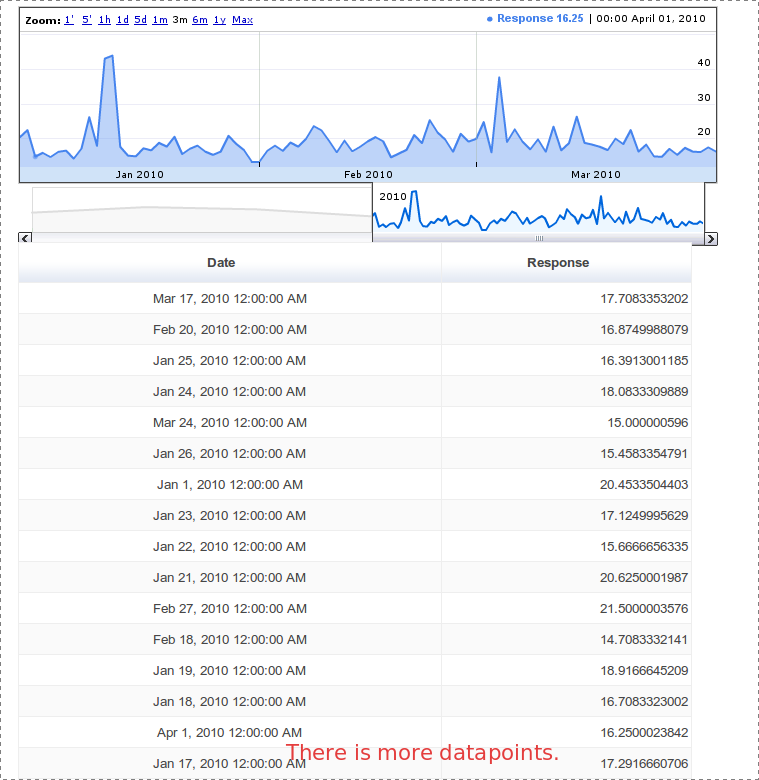
图表下方的表格显示了数据表中的内容。这就是绘图代码的样子。
var g_graph = new google.visualization.AnnotatedTimeLine(document.getElementById('graph_div_json'));
var table = new google.visualization.Table(document.getElementById('table_div_json'));
function handleQueryResponse(response){
    log("Drawing graph")
    var data = response.getDataTable()
    g_graph.draw(data, {allowRedraw:true, thickness:2, fill:50, scaleType:'maximized'})
    table.draw(data, {allowRedraw:true})
}
我试图找到一种方法让它只显示数据表中的数据。我尝试删除allowRedraw标志,但它破坏了缩放操作。
任何帮助将不胜感激。
谢谢
另请参阅
I am trying to build a graph that will change resolution depending on how far you are zoomed in. Here is what it looks like when you are complete zoomed out.
So this looks good so when I zoom in I get a higher resolution data and my graph looks like this:
The problem is when I zoom out the higher resolution data does not get cleared out of the graph:
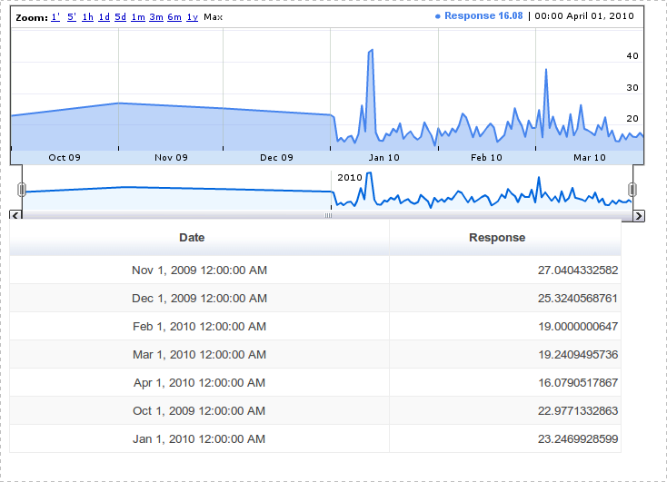
The tables below the graphs are table display what is in the DataTable. This is what drawing code looks like.
var g_graph = new google.visualization.AnnotatedTimeLine(document.getElementById('graph_div_json'));
var table = new google.visualization.Table(document.getElementById('table_div_json'));
function handleQueryResponse(response){
    log("Drawing graph")
    var data = response.getDataTable()
    g_graph.draw(data, {allowRedraw:true, thickness:2, fill:50, scaleType:'maximized'})
    table.draw(data, {allowRedraw:true})
}
I am try to find a way for it to only displaying the data that is in the DataTable. I have tried removing the allowRedraw flag but then it breaks the zooming operation.
Any help would be greatly appreciated.
Thanks
See also


发布评论
评论(2)
您可以删除允许重绘标志。
在这种情况下,您必须手动将数据点放入数据表中
这将保留您的缩放操作。
我想您已经看到删除allowRedraw标志可以工作,但有一个小问题,整个图表闪烁。
you can remove the allow redraw flag.
In that case you have to put the data points manually in your data table
this will retain your zooming operation.
I think you have already seen removing the allowRedraw flag, works but with a small problem, flickering the whole chart.
在我看来,最好的解决方案是绘制每个nth个数据点,具体取决于您的缩放级别。在 Google 财经图表上,缩放级别在顶部预先确定:1m、5m、1h、1 天、5 天等。很明显,这正是 Google 正在做的事情。在最大视图级别,他们绘制了该月的点。如果您每天投票 1000 次(每次投票生成一个点),那么您将获取每 30,000 个点(第一个点是该月的第一个点,并且第 30,000 个是最后一点)。
每个缩放级别都会实现不同的数据点图。每个点都应该有一个精确到秒的时间戳,这样您就可以轻松地根据详细程度缩放绘图。
It seems to me that the best solution would be to draw every nth data point, depending on your level of zoom. On the Google Finance graph(s), the zoom levels are pre-determined at the top: 1m, 5m, 1h, 1 day, 5 days, etc. It seems evident that this is exactly what Google is doing. At the max view level, they're plotting points that fall on the month. If you're polling 1000 times a day (with each poll generating a single point), then you'd be taking every 30,000th point (the fist point being the very first one of the month, and the 30,000th one being the last point).
Each of these zoom levels would implement a different plot of the data points. Each point should have a time stamp with accuracy to the second, so you'll easily be able to scale the plot based on the level of detail.