打开Flash图表rails x轴问题
我在 Rails 应用程序中使用 Open Flash Chart 2(插件)。除了 x 轴上的范围之外,一切看起来都很平滑。我正在创建一条线来表示特定使用量的手机计划成本,并生成 8 个值,其中 1-5 低于允许的使用量,而 6-8 则演示超过限制的使用成本。
我遇到的问题是如何将 ruby on Rails 中 X 轴的范围设置为特定于数据的范围。现在显示的值是我给出的数组的索引。当我尝试将哈希传递给值时,图表甚至根本不加载。
所以基本上我需要帮助找到一种方法来正确设置我的行的数据,以便它正确显示,现在它正在将每个值视为代表数组索引的 x 值。
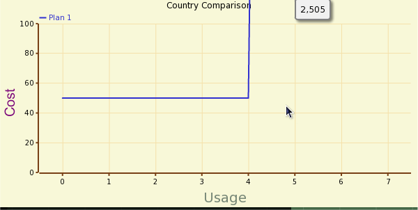
这是一个屏幕截图,可能比我所说的更好: http ://i163.photobucket.com/albums/t286/Xeno56/Screenshot.png 请注意,这些值是正确的,只是 x 轴上的范围不正确,它应该类似于 100、200、300, 400, 500, 600, 700
代码:
y = YAxis.new
y.set_range(0,100, 20)

x_legend = XLegend.new("Usage")
x_legend.set_style('{font-size: 20px; color: #778877}')

y_legend = YLegend.new("Cost")
y_legend.set_style('{font-size: 20px; color: #770077}')

chart =OpenFlashChart.new
chart.set_x_legend(x_legend)
chart.set_y_legend(y_legend)
chart.y_axis = y

line = Line.new
line.text = plan.name
line.width = 2
line.color = '#006633'
line.dot_size = 2
line.values = generate_data(plan)
chart.add_element(line)

def generate_data(plan)
  values = []
  #generate below threshold numbers
  5.times do |x|
    usage = plan.usage / 5 * x
    cost = plan.cost
    values << cost
  end
  #generate above threshold numbers
  3.times do |x|
    usage = plan.usage + ((plan.usage / 5) * x)
    cost = plan.cost + (usage * plan.overage)
    values << cost
  end
  return values
end
我遇到的另一个问题是我不能只添加几个点,因为我给出的任何值都被视为 x 是数组中的元素位置,y 是值,而我需要能够为每个点指定 x 和 y 值,这样我就不必用一堆空值来缓冲我的数组
I am using open flash chart 2 (the plugin) in my rails application. Everything is looking smooth except for the range on my x axis. I am creating a line to represent cell phone plan cost over a specific amount of usage and I'm generate 8 values, 1-5 are below the allowed usage while 6-8 are demonstrations of the cost for usage over the limit.
The problem I'm encountering is how to set the range of the X axis in ruby on rails to something specific to the data. Right now the values being displayed are the indexes of the array that I'm giving. When I try to hand a hash to the values the chart doesn't even load at all.
So basically I need help getting a way to set the data for my line properly so that it displays correctly, right now it is treating every value as if it represents the x value of the index of the array.
Here is a screen shot which may be a better description than what I am saying: http://i163.photobucket.com/albums/t286/Xeno56/Screenshot.png Note that those values are correct just the range on the x-axis is incorrect, it should be something like 100, 200, 300, 400, 500, 600, 700
Code:
y = YAxis.new
y.set_range(0,100, 20)

x_legend = XLegend.new("Usage")
x_legend.set_style('{font-size: 20px; color: #778877}')

y_legend = YLegend.new("Cost")
y_legend.set_style('{font-size: 20px; color: #770077}')

chart =OpenFlashChart.new
chart.set_x_legend(x_legend)
chart.set_y_legend(y_legend)
chart.y_axis = y

line = Line.new
line.text = plan.name
line.width = 2
line.color = '#006633'
line.dot_size = 2
line.values = generate_data(plan)
chart.add_element(line)

def generate_data(plan)
  values = []
  #generate below threshold numbers
  5.times do |x|
    usage = plan.usage / 5 * x
    cost = plan.cost
    values << cost
  end
  #generate above threshold numbers
  3.times do |x|
    usage = plan.usage + ((plan.usage / 5) * x)
    cost = plan.cost + (usage * plan.overage)
    values << cost
  end
  return values
end
Also the other problem I'm having is I can't just add a few points as any values I give are taken as x being the elements position in the array and y being the value, whereas I need to be able to specify the x and y values for each point so I don't have to buffer my array with a bunch of null values
如果你对这篇内容有疑问,欢迎到本站社区发帖提问 参与讨论,获取更多帮助,或者扫码二维码加入 Web 技术交流群。

绑定邮箱获取回复消息
由于您还没有绑定你的真实邮箱,如果其他用户或者作者回复了您的评论,将不能在第一时间通知您!


发布评论
评论(3)
您必须创建一个 XAxis 对象来设置标签:
You have to create an XAxis Object to set the labels:
根据我的经验,使用 Open Flash Chart 2 有很多方法可以完成任务。上面的 mikezter 示例几乎是正确的;然而,这就是我设置 XAxis 标签的方式。
请注意,我的示例和 mikezter 的示例之间的唯一区别是我使用:
而不是
From my experience there are many ways to do things with Open Flash Chart 2. mikezter example above is almost correct; however, this is how I set the XAxis labels.
Note the only difference between my example and mikezter's is I use:
instead of
我最终放弃了 Open Flash Chart 2 并选择了 Flotr
I ended up ditching open flash chart 2 and going with Flotr