如何更好地从 ggplot2 创建具有多个变量的堆叠条形图?
我经常需要制作堆叠条形图来比较变量,并且因为我在 R 中完成所有统计,所以我更喜欢使用 ggplot2 在 R 中完成所有图形。我想学习如何做两件事:
首先,我希望能够为每个变量添加适当的百分比刻度线,而不是按计数添加刻度线。计数会令人困惑,这就是为什么我完全去掉轴标签的原因。
其次,必须有一种更简单的方法来重新组织我的数据才能实现这一目标。这似乎是我应该能够在 ggplot2 中使用 plyR 本地完成的事情,但是 plyR 的文档不是很清楚(我已经阅读了 ggplot2 书和在线 plyR 文档。
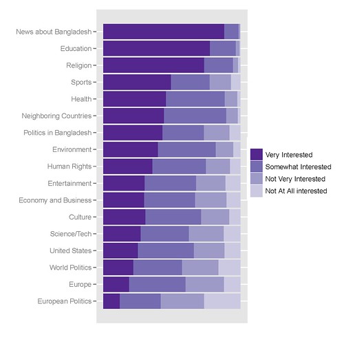
我最好的图表看起来像这样,创建它的代码如下:
我用来获取它的 R 代码如下:
library(epicalc)

### recode the variables to factors ###
recode(c(int_newcoun, int_newneigh, int_neweur, int_newusa, int_neweco, int_newit, int_newen, int_newsp, int_newhr, int_newlit, int_newent, int_newrel, int_newhth, int_bapo, int_wopo, int_eupo, int_educ), c(1,2,3,4,5,6,7,8,9, NA),
c('Very Interested','Somewhat Interested','Not Very Interested','Not At All interested',NA,NA,NA,NA,NA,NA))

### Combine recoded variables to a common vector
Interest1<-c(int_newcoun, int_newneigh, int_neweur, int_newusa, int_neweco, int_newit, int_newen, int_newsp, int_newhr, int_newlit, int_newent, int_newrel, int_newhth, int_bapo, int_wopo, int_eupo, int_educ)


### Create a second vector to label the first vector by original variable ###
a1<-rep("News about Bangladesh", length(int_newcoun))
a2<-rep("Neighboring Countries", length(int_newneigh))
[...]
a17<-rep("Education", length(int_educ))


Interest2<-c(a1, a2, a3, a4, a5, a6, a7, a8, a9, a10, a11, a12, a13, a14, a15, a16, a17)

### Create a Weighting vector of the proper length ###
Interest.weight<-rep(weight, 17)

### Make and save a new data frame from the three vectors ###
Interest.df<-cbind(Interest1, Interest2, Interest.weight)
Interest.df<-as.data.frame(Interest.df)

write.csv(Interest.df, 'C:\\Documents and Settings\\[name]\\Desktop\\Sweave\\InterestBangladesh.csv')

### Sort the factor levels to display properly ###

Interest.df$Interest1<-relevel(Interest$Interest1, ref='Not Very Interested')
Interest.df$Interest1<-relevel(Interest$Interest1, ref='Somewhat Interested')
Interest.df$Interest1<-relevel(Interest$Interest1, ref='Very Interested')

Interest.df$Interest2<-relevel(Interest$Interest2, ref='News about Bangladesh')
Interest.df$Interest2<-relevel(Interest$Interest2, ref='Education')
[...]
Interest.df$Interest2<-relevel(Interest$Interest2, ref='European Politics')

detach(Interest)
attach(Interest)

### Finally create the graph in ggplot2 ###

library(ggplot2)
p<-ggplot(Interest, aes(Interest2, ..count..))
p<-p+geom_bar((aes(weight=Interest.weight, fill=Interest1)))
p<-p+coord_flip()
p<-p+scale_y_continuous("", breaks=NA)
p<-p+scale_fill_manual(value = rev(brewer.pal(5, "Purples")))
p
update_labels(p, list(fill='', x='', y=''))
I非常感谢任何提示、技巧或提示。
I often have to make stacked barplots to compare variables, and because I do all my stats in R, I prefer to do all my graphics in R with ggplot2. I would like to learn how to do two things:
First, I would like to be able to add proper percentage tick marks for each variable rather than tick marks by count. Counts would be confusing, which is why I take out the axis labels completely.
Second, there must be a simpler way to reorganize my data to make this happen. It seems like the sort of thing I should be able to do natively in ggplot2 with plyR, but the documentation for plyR is not very clear (and I have read both the ggplot2 book and the online plyR documentation.
My best graph looks like this, the code to create it follows:
The R code I use to get it is the following:
library(epicalc)

### recode the variables to factors ###
recode(c(int_newcoun, int_newneigh, int_neweur, int_newusa, int_neweco, int_newit, int_newen, int_newsp, int_newhr, int_newlit, int_newent, int_newrel, int_newhth, int_bapo, int_wopo, int_eupo, int_educ), c(1,2,3,4,5,6,7,8,9, NA),
c('Very Interested','Somewhat Interested','Not Very Interested','Not At All interested',NA,NA,NA,NA,NA,NA))

### Combine recoded variables to a common vector
Interest1<-c(int_newcoun, int_newneigh, int_neweur, int_newusa, int_neweco, int_newit, int_newen, int_newsp, int_newhr, int_newlit, int_newent, int_newrel, int_newhth, int_bapo, int_wopo, int_eupo, int_educ)


### Create a second vector to label the first vector by original variable ###
a1<-rep("News about Bangladesh", length(int_newcoun))
a2<-rep("Neighboring Countries", length(int_newneigh))
[...]
a17<-rep("Education", length(int_educ))


Interest2<-c(a1, a2, a3, a4, a5, a6, a7, a8, a9, a10, a11, a12, a13, a14, a15, a16, a17)

### Create a Weighting vector of the proper length ###
Interest.weight<-rep(weight, 17)

### Make and save a new data frame from the three vectors ###
Interest.df<-cbind(Interest1, Interest2, Interest.weight)
Interest.df<-as.data.frame(Interest.df)

write.csv(Interest.df, 'C:\\Documents and Settings\\[name]\\Desktop\\Sweave\\InterestBangladesh.csv')

### Sort the factor levels to display properly ###

Interest.df$Interest1<-relevel(Interest$Interest1, ref='Not Very Interested')
Interest.df$Interest1<-relevel(Interest$Interest1, ref='Somewhat Interested')
Interest.df$Interest1<-relevel(Interest$Interest1, ref='Very Interested')

Interest.df$Interest2<-relevel(Interest$Interest2, ref='News about Bangladesh')
Interest.df$Interest2<-relevel(Interest$Interest2, ref='Education')
[...]
Interest.df$Interest2<-relevel(Interest$Interest2, ref='European Politics')

detach(Interest)
attach(Interest)

### Finally create the graph in ggplot2 ###

library(ggplot2)
p<-ggplot(Interest, aes(Interest2, ..count..))
p<-p+geom_bar((aes(weight=Interest.weight, fill=Interest1)))
p<-p+coord_flip()
p<-p+scale_y_continuous("", breaks=NA)
p<-p+scale_fill_manual(value = rev(brewer.pal(5, "Purples")))
p
update_labels(p, list(fill='', x='', y=''))
I'd very much appreciate any tips, tricks or hints.
如果你对这篇内容有疑问,欢迎到本站社区发帖提问 参与讨论,获取更多帮助,或者扫码二维码加入 Web 技术交流群。

绑定邮箱获取回复消息
由于您还没有绑定你的真实邮箱,如果其他用户或者作者回复了您的评论,将不能在第一时间通知您!


发布评论
评论(5)
你的第二个问题可以通过 reshape 包中的 Melt 和 Cast 来解决
在你分解了 data.frame 中的元素之后,你可以使用类似的东西:
顺便说一句,我喜欢使用 grep 从混乱的导入中提取列。例如:
当您不必输入 c(' ', ...) 一百万次时,因式分解会更容易。
Your second problem can be solved with melt and cast from the reshape package
After you've factored the elements in your data.frame called you can use something like:
As an aside, I like to use grep to pull in columns from a messy import. For example:
And factoring is easier when you don't have to type c(' ', ...) a million times.
您不需要
prop.tables或 count 等来完成 100% 堆叠条形。你只需要+geom_bar(position="stack")You don't need
prop.tablesor count etc to do the 100% stacked bars. You just need+geom_bar(position="stack")关于
..count..插入的百分比,请尝试:但是由于将函数推入
aes()中并不是一个好主意,因此您可以编写自定义函数来创建..count..中的百分比,四舍五入为n小数等。您用
plyr标记了这篇文章,但我没有看到任何plyr在这里起作用,我敢打赌,一个ddply()可以完成这项工作。在线plyr文档就足够了。About percentages insted of
..count.., try:but since it's not a good idea to shove a function into the
aes(), you can write custom function to create percentages out of..count.., round it tondecimals etc.You labeled this post with
plyr, but I don't see anyplyrin action here, and I bet that oneddply()can do the job. Onlineplyrdocumentation should suffice.如果我理解正确,要解决轴标签问题,请进行以下更改:
至于第二个,我认为您最好使用 重塑包。您可以使用它非常轻松地将数据聚合到组中。
参考下面 aL3xa 的评论...
返回...
替代文本http://www.drewconway.com/zia/wp-content/uploads/2010/04/密度.png
垃圾箱现在是密度...
If I am understanding you correctly, to fix the axis labeling problem make the following change:
As for the second one, I think you would be better off working with the reshape package. You can use it to aggregate data into groups very easily.
In reference to aL3xa's comment below...
Returns...
alt text http://www.drewconway.com/zia/wp-content/uploads/2010/04/density.png
The bins are now densities...
您的第一个问题:这有帮助吗?
你的第二个问题;你可以使用重新排序来对条形图进行排序吗?类似的东西
(刚从七个小时的车程回来 - 我很累 - 但我想它应该有用)
Your first question: Would this help?
Your second question; could you use reorder to sort the bars? Something like
(just back from a seven hour drive - am tired - but I guess it should work)