如何为 ItemsControl 中的每个项目创建叠加层?

发布于 2024-08-18 16:18:12 字数 748 浏览 1 评论 0原文

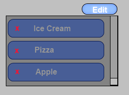
我正在尝试装饰一个 ItemsControl,以便每个项目都有一个“删除”按钮,该按钮在特定条件下浮动在项目内容上,这在某种程度上受到 iPhone UI 的启发。我心里有几种方法可以解决这个问题,但我可以使用其他 WPF 人员的一些指导,他们可能对如何最好地完成此操作有更好的想法。下面是一个模型图像,可帮助表达我想要做的事情。

示例模型

我当前的想法是尝试仅使用 XAML 来尝试此操作,仅使用样式、模板,如果需要,还可能使用附加属性。这个想法是为项目控件创建条件 DataTemplate,该控件将以某种方式用包含“删除”按钮的装饰器包装原始内容。为了在我的 ItemsControl 上有一个状态来知道我是否处于删除模式,我想也许创建一个附加属性,然后我可以通过多种方式设置它,例如例如,将其绑定到切换按钮或复选框的状态。

在这一点上,这个概念是有道理的,但细节对我来说有点不清楚使用 ItemTemplate 是否是最好的举动,因为在某些情况下,给定 ItemsControl 的 ItemTemplate 可能已经存在,我不想覆盖它,而只会想要包装它(如果有意义的话)。我想,如果我拉得正确,我应该能够通过指定样式和附加属性将其应用到任何项目控件。

如果有人可以帮助说明这些更详细的细节或就我如何进行提供任何更好的建议,请分享。

I'm trying to decorate an ItemsControl so that each item will have a Delete button that floats over the item's content under a specific condition inspired by somewhat by the iPhone UI. I have a few ways in mind of how I can approach this but I could use some guidance from other WPF folks who might have a better idea about how this would best be done. Below is a mock-up image to help express what I'm trying to do.

Example mock-up

My current thoughts are to try to attempt this by only using XAML only using styles, templates, and maybe attached properties if necessary. The idea is to create conditional DataTemplate for the items control that would somehow wrap the original content with an adorner that contains my Delete button. In order to have a state on my ItemsControl to know whether I'm in a delete mode or not I'm thinking maybe to create an attached property that I can then set in a variety of ways such as binding it to the state of a toggle button or a checkbox for example.

At this point the concept makes sense but the fine details are a little unclear to me whether using the ItemTemplate is the best move since in some cases an ItemTemplate may already exist for a given ItemsControl and I do not want to overwrite it but instead would only want to wrap it (if that makes sense). I'm thinking that if I pull if off right I should be able to apply this to any items control by specifying the style and maybe an attached property.

If anybody could help illustrate these finer details or offer any better suggestions on how I could go about please share.

如果你对这篇内容有疑问,欢迎到本站社区发帖提问 参与讨论,获取更多帮助,或者扫码二维码加入 Web 技术交流群。

扫码二维码加入Web技术交流群

发布评论

需要 登录 才能够评论, 你可以免费 注册 一个本站的账号。

评论(2

夏花。依旧 2024-08-25 16:18:12

我创建了以下模型来说明一种简单的方法,即使用单个 DataTemplate 和一些绑定来完成此操作。您绝对走在正确的道路上。

<Window x:Class="TestWpfApplication.Foods"
xmlns="http://schemas.microsoft.com/winfx/2006/xaml/presentation"
xmlns:x="http://schemas.microsoft.com/winfx/2006/xaml"
xmlns:local="clr-namespace:TestWpfApplication"
xmlns:sys="clr-namespace:System;assembly=mscorlib"
Title="Foods" ResizeMode="NoResize"
SizeToContent="WidthAndHeight"
DataContext="{Binding RelativeSource={RelativeSource Self}}">
<Window.Resources>
    <local:BoolToVisConverter x:Key="BoolToVisConverter"/>
</Window.Resources>
<StackPanel Background="LightGray">
    <ToggleButton Name="EditModeToggle" Content="Edit" HorizontalAlignment="Right" FontFamily="Arial" Padding="4" 
                  Background="#7FA4E6" Foreground="White" BorderBrush="Black" Width="60" Margin="5,5,5,0"/>
    <ListBox ItemsSource="{Binding Items}" 
             Background="#999" BorderBrush="Black" Margin="5">
        <ListBox.ItemTemplate>
            <DataTemplate>
                <Border CornerRadius="8" Background="#3565BC" Padding="8" 
                        BorderBrush="#333" BorderThickness="1" Margin="2" Width="255">
                    <StackPanel Orientation="Horizontal">
                        <Button Command="{Binding RelativeSource={RelativeSource FindAncestor, AncestorType={x:Type Window}}, Path=RemoveItemCommand}"
                                Visibility="{Binding ElementName=EditModeToggle, Path=IsChecked, Converter={StaticResource BoolToVisConverter}}">
                            <Button.Content>
                                <TextBlock Foreground="Red" Text="X" FontWeight="Bold"/>
                            </Button.Content>
                        </Button>
                        <TextBlock Text="{Binding}" Margin="12,0" Foreground="#AAA" VerticalAlignment="Center"
                                   FontSize="14" FontWeight="Bold" FontFamily="Arial"/>
                    </StackPanel>
                </Border>
            </DataTemplate>
        </ListBox.ItemTemplate>
    </ListBox>
</StackPanel>

您不需要太多代码来完成这项工作,但仍然有一些代码隐藏,主要是针对 RoutedCommand:

public partial class Foods : Window
{
    private ObservableCollection<String> items = new ObservableCollection<string>();
    private RoutedCommand removeItemCommand = new RoutedCommand();

    public Foods()
    {
        InitializeComponent();

        items.Add("Ice Cream");
        items.Add("Pizza");
        items.Add("Apple");

        CommandBindings.Add(new CommandBinding(removeItemCommand, ExecutedRemoveItem));
    }

    public ObservableCollection<String> Items
    {
        get { return items; }
    }

    public RoutedCommand RemoveItemCommand
    {
        get { return removeItemCommand; }
    }

    private void ExecutedRemoveItem(object sender, ExecutedRoutedEventArgs e)
    {
        DependencyObject container = 
            ItemsControl.ContainerFromElement(e.Source as ItemsControl, e.OriginalSource as DependencyObject);
        ListBoxItem item = container as ListBoxItem;
        items.Remove(item.Content as String);
    }
}

显然,结果可以在视觉上更具吸引力,但我几乎重复了你的想法哈哈:

alt text http://img697.imageshack.us/img697/7033/食品窗口.png

I've created the following mock-up to illustrate one easy way this can be done, using a single DataTemplate a few bindings. You are definitely on the right track.

<Window x:Class="TestWpfApplication.Foods"
xmlns="http://schemas.microsoft.com/winfx/2006/xaml/presentation"
xmlns:x="http://schemas.microsoft.com/winfx/2006/xaml"
xmlns:local="clr-namespace:TestWpfApplication"
xmlns:sys="clr-namespace:System;assembly=mscorlib"
Title="Foods" ResizeMode="NoResize"
SizeToContent="WidthAndHeight"
DataContext="{Binding RelativeSource={RelativeSource Self}}">
<Window.Resources>
    <local:BoolToVisConverter x:Key="BoolToVisConverter"/>
</Window.Resources>
<StackPanel Background="LightGray">
    <ToggleButton Name="EditModeToggle" Content="Edit" HorizontalAlignment="Right" FontFamily="Arial" Padding="4" 
                  Background="#7FA4E6" Foreground="White" BorderBrush="Black" Width="60" Margin="5,5,5,0"/>
    <ListBox ItemsSource="{Binding Items}" 
             Background="#999" BorderBrush="Black" Margin="5">
        <ListBox.ItemTemplate>
            <DataTemplate>
                <Border CornerRadius="8" Background="#3565BC" Padding="8" 
                        BorderBrush="#333" BorderThickness="1" Margin="2" Width="255">
                    <StackPanel Orientation="Horizontal">
                        <Button Command="{Binding RelativeSource={RelativeSource FindAncestor, AncestorType={x:Type Window}}, Path=RemoveItemCommand}"
                                Visibility="{Binding ElementName=EditModeToggle, Path=IsChecked, Converter={StaticResource BoolToVisConverter}}">
                            <Button.Content>
                                <TextBlock Foreground="Red" Text="X" FontWeight="Bold"/>
                            </Button.Content>
                        </Button>
                        <TextBlock Text="{Binding}" Margin="12,0" Foreground="#AAA" VerticalAlignment="Center"
                                   FontSize="14" FontWeight="Bold" FontFamily="Arial"/>
                    </StackPanel>
                </Border>
            </DataTemplate>
        </ListBox.ItemTemplate>
    </ListBox>
</StackPanel>

You don't need much code to make this work, but there is still some code-behind, mainly for the RoutedCommand:

public partial class Foods : Window
{
    private ObservableCollection<String> items = new ObservableCollection<string>();
    private RoutedCommand removeItemCommand = new RoutedCommand();

    public Foods()
    {
        InitializeComponent();

        items.Add("Ice Cream");
        items.Add("Pizza");
        items.Add("Apple");

        CommandBindings.Add(new CommandBinding(removeItemCommand, ExecutedRemoveItem));
    }

    public ObservableCollection<String> Items
    {
        get { return items; }
    }

    public RoutedCommand RemoveItemCommand
    {
        get { return removeItemCommand; }
    }

    private void ExecutedRemoveItem(object sender, ExecutedRoutedEventArgs e)
    {
        DependencyObject container = 
            ItemsControl.ContainerFromElement(e.Source as ItemsControl, e.OriginalSource as DependencyObject);
        ListBoxItem item = container as ListBoxItem;
        items.Remove(item.Content as String);
    }
}

And the result could be made far more visually appealing, obviously, but I nearly duplicated your idea haha:

alt text http://img697.imageshack.us/img697/7033/foodswindow.png

野心澎湃 2024-08-25 16:18:12

通常,您会在 ItemContainerStyle 中添加类似的内容,以免每次要应用此内容时都弄乱 DataTemplate 本身。虽然这对于 ListBox 来说很简单,您可以在其中修改 ListBoxItem 的模板,但不幸的是,基本 ItemsControl 仅使用 ContentPresenter 作为其容器,因此无法以相同的方式进行模板化。

如果您确实希望它可重用,我建议您将其包装到一个新的自定义 ItemsControl 中,您可以将其替换为标准控件,而无需修改正在使用的特定 DataTemplate。这还允许您将原本在外部创建的属性包装为附加的 prop 和控件本身的删除命令。

显然,删除逻辑和视觉样式尚未在此处完成,但这应该可以帮助您开始:

public class DeleteItemsControl : ItemsControl
{
    public static readonly DependencyProperty CanDeleteProperty = DependencyProperty.Register(
        "CanDelete",
        typeof(bool),
        typeof(DeleteItemsControl),
        new UIPropertyMetadata(null));

    public bool CanDelete
    {
        get { return (bool)GetValue(CanDeleteProperty); }
        set { SetValue(CanDeleteProperty, value); }
    }

    public static RoutedCommand DeleteCommand { get; private set; }

    static DeleteItemsControl()
    {
        DeleteCommand = new RoutedCommand("DeleteCommand", typeof(DeleteItemsControl));
        DefaultStyleKeyProperty.OverrideMetadata(typeof(DeleteItemsControl), new FrameworkPropertyMetadata(typeof(DeleteItemsControl)));
    }

    protected override DependencyObject GetContainerForItemOverride()
    {
        return new DeleteItem();
    }

    protected override bool IsItemItsOwnContainerOverride(object item)
    {
        return item is DeleteItem;
    }
}

public class DeleteItem : ContentControl
{
    static DeleteItem()
    {
        DefaultStyleKeyProperty.OverrideMetadata(typeof(DeleteItem), new FrameworkPropertyMetadata(typeof(DeleteItem)));
    }

}

这将放入 Generic.xaml 中,或者您可以像应用程序中的普通样式一样应用它们:

<Style TargetType="{x:Type local:DeleteItemsControl}">
    <Setter Property="Template">
        <Setter.Value>
            <ControlTemplate TargetType="{x:Type local:DeleteItemsControl}">
                <Border Background="{TemplateBinding Background}"
                        BorderBrush="{TemplateBinding BorderBrush}"
                        BorderThickness="{TemplateBinding BorderThickness}">
                    <ItemsPresenter/>
                </Border>
            </ControlTemplate>
        </Setter.Value>
    </Setter>
</Style>

<Style TargetType="{x:Type local:DeleteItem}">
    <Setter Property="Template">
        <Setter.Value>
            <ControlTemplate TargetType="{x:Type local:DeleteItem}">
                <Border Background="{TemplateBinding Background}" BorderBrush="{TemplateBinding BorderBrush}"
                    BorderThickness="{TemplateBinding BorderThickness}">
                    <DockPanel>
                        <Button Command="local:DeleteItemsControl.DeleteCommand" Content="X" HorizontalAlignment="Left" VerticalAlignment="Center"
                            Visibility="{Binding RelativeSource={RelativeSource Mode=FindAncestor, AncestorType={x:Type local:DeleteItemsControl}}, Path=CanDelete, Converter={StaticResource BooleanToVisibilityConverter}}"/>
                        <ContentPresenter VerticalAlignment="{TemplateBinding VerticalContentAlignment}" HorizontalAlignment="{TemplateBinding HorizontalContentAlignment}"/>
                    </DockPanel>
                </Border>
            </ControlTemplate>
        </Setter.Value>
    </Setter>
</Style>

Normally you would add something like this in an ItemContainerStyle so as not to mess with the DataTemplate itself every time you want to apply this. While this is simple with a ListBox where you can modify the Template for ListBoxItem, unfortunately the base ItemsControl uses just a ContentPresenter as its container and so can't be templated in the same way.

If you really want this to be reusable I would suggest that you wrap it up into a new custom ItemsControl that you can drop in to replace a standard one without having to modify the specific DataTemplate being used. This will also allow you to wrap up the property that you would otherwise create externally as an attached prop and the delete command in the control itself.

Obviously the delete logic and visual styling have not been done here but this should get you started:

public class DeleteItemsControl : ItemsControl
{
    public static readonly DependencyProperty CanDeleteProperty = DependencyProperty.Register(
        "CanDelete",
        typeof(bool),
        typeof(DeleteItemsControl),
        new UIPropertyMetadata(null));

    public bool CanDelete
    {
        get { return (bool)GetValue(CanDeleteProperty); }
        set { SetValue(CanDeleteProperty, value); }
    }

    public static RoutedCommand DeleteCommand { get; private set; }

    static DeleteItemsControl()
    {
        DeleteCommand = new RoutedCommand("DeleteCommand", typeof(DeleteItemsControl));
        DefaultStyleKeyProperty.OverrideMetadata(typeof(DeleteItemsControl), new FrameworkPropertyMetadata(typeof(DeleteItemsControl)));
    }

    protected override DependencyObject GetContainerForItemOverride()
    {
        return new DeleteItem();
    }

    protected override bool IsItemItsOwnContainerOverride(object item)
    {
        return item is DeleteItem;
    }
}

public class DeleteItem : ContentControl
{
    static DeleteItem()
    {
        DefaultStyleKeyProperty.OverrideMetadata(typeof(DeleteItem), new FrameworkPropertyMetadata(typeof(DeleteItem)));
    }

}

This would go in Generic.xaml or you could just apply them like normal styles in your app:

<Style TargetType="{x:Type local:DeleteItemsControl}">
    <Setter Property="Template">
        <Setter.Value>
            <ControlTemplate TargetType="{x:Type local:DeleteItemsControl}">
                <Border Background="{TemplateBinding Background}"
                        BorderBrush="{TemplateBinding BorderBrush}"
                        BorderThickness="{TemplateBinding BorderThickness}">
                    <ItemsPresenter/>
                </Border>
            </ControlTemplate>
        </Setter.Value>
    </Setter>
</Style>

<Style TargetType="{x:Type local:DeleteItem}">
    <Setter Property="Template">
        <Setter.Value>
            <ControlTemplate TargetType="{x:Type local:DeleteItem}">
                <Border Background="{TemplateBinding Background}" BorderBrush="{TemplateBinding BorderBrush}"
                    BorderThickness="{TemplateBinding BorderThickness}">
                    <DockPanel>
                        <Button Command="local:DeleteItemsControl.DeleteCommand" Content="X" HorizontalAlignment="Left" VerticalAlignment="Center"
                            Visibility="{Binding RelativeSource={RelativeSource Mode=FindAncestor, AncestorType={x:Type local:DeleteItemsControl}}, Path=CanDelete, Converter={StaticResource BooleanToVisibilityConverter}}"/>
                        <ContentPresenter VerticalAlignment="{TemplateBinding VerticalContentAlignment}" HorizontalAlignment="{TemplateBinding HorizontalContentAlignment}"/>
                    </DockPanel>
                </Border>
            </ControlTemplate>
        </Setter.Value>
    </Setter>
</Style>
~没有更多了~
我们使用 Cookies 和其他技术来定制您的体验包括您的登录状态等。通过阅读我们的 隐私政策 了解更多相关信息。 单击 接受 或继续使用网站,即表示您同意使用 Cookies 和您的相关数据。
原文