- Install
- Set up an editor
- Test drive
- Write your first Flutter app, part 1
- Learn more
- Flutter for Android developers
- Flutter for iOS developers
- Flutter for React Native developers
- Flutter for web developers
- Flutter for Xamarin.Forms developers
- Introduction to declarative UI
- Cookbook
- Codelabs
- Tutorials
- User interface
- Introduction to widgets
- Layouts in Flutter
- Layout tutorial
- Dealing with box constraints
- Adding interactivity to your Flutter app
- Adding assets and images
- Navigation & routing
- Introduction to animations
- Animations overview
- Animations tutorial
- Hero Animations
- Staggered Animations
- Advanced UI
- Slivers
- Taps, drags, and other gestures
- Widget catalog
- Data & backend
- State management
- State management
- Start thinking declaratively
- Differentiate between ephemeral state and app state
- Simple app state management
- List of state management approaches
- JSON and serialization
- Firebase
- Accessibility & internationalization
- Accessibility
- Internationalizing Flutter apps
- Platform integration
- Writing custom platform-specific code
- Packages & plugins
- Using packages
- Developing packages & plugins
- Background processes
- Tools & techniques
- Android Studio / IntelliJ
- Visual Studio Code
- Upgrading Flutter
- Hot reload
- Code formatting
- Debugging Flutter apps
- Using OEM debuggers
- Flutter's build modes
- Testing Flutter apps
- Performance best practices
- Flutter performance profiling
- Creating flavors for Flutter
- Preparing an Android App for Release
- Preparing an iOS App for Release
- Continuous Delivery using fastlane with Flutter
- Bootstrap into Dart
- Inside Flutter
- Platform specific behaviors and adaptations
- Technical Overview
- Technical videos
- FAQ
- Flutter widget index
- Install
- Windows install
- MacOS install
- Linux install
- Set up an editor
- Write your first Flutter app, part 1
- Learn more
- Cupertino (iOS-style) widgets
- Layout widgets
- Animation and motion widgets
- Retrieve the value of a text field
- Basic widgets
- Material Components widgets
- Animate the properties of a Container
- Fade a Widget in and out
- Add a Drawer to a screen
- Displaying SnackBars
- Exporting fonts from a package
- Updating the UI based on orientation
- Using Themes to share colors and font styles
- Using custom fonts
- Working with Tabs
- Building a form with validation
- Create and style a text field
- Focus on a Text Field
- Handling changes to a text field
- Retrieve the value of a text field
- Adding Material Touch Ripples
- Handling Taps
- Implement Swipe to Dismiss
- Display images from the internet
- Fade in images with a placeholder
- Working with cached images
- Basic List
- Create a horizontal list
- Creating a Grid List
- Creating lists with different types of items
- Place a floating app bar above a list
- Working with long lists
- Report errors to a service
- Animating a Widget across screens
- Navigate to a new screen and back
- Navigate with named routes
- Pass arguments to a named route
- Return data from a screen
- Send data to a new screen
- Fetch data from the internet
- Making authenticated requests
- Parsing JSON in the background
- Working with WebSockets
- Persist data with SQLite
- Reading and Writing Files
- Storing key-value data on disk
- Play and pause a video
- Take a picture using the Camera
- An introduction to integration testing
- Performance profiling
- Scrolling
- An introduction to unit testing
- Mock dependencies using Mockito
- An introduction to widget testing
- Finding widgets
- Tapping, dragging and entering text
- Development
- Introduction to widgets
- Layout tutorial
- Dealing with box constraints
- Adding interactivity to your Flutter app
- Adding assets and images
- Navigation & routing
- Navigate to a new screen and back
- Send data to a new screen
- Return data from a screen
- Navigate with named routes
- Animating a Widget across screens
- AnimatedList
- Sample App Catalog
- Animations overview
- Animations tutorial
- Staggered Animations
- Slivers
- Taps, drags, and other gestures
- Accessibility widgets
- Assets, images, and icon widgets
- Async widgets
- Input widgets
- Interaction model widgets
- Painting and effect widgets
- Scrolling widgets
- Styling widgets
- Text widgets
- State management
- Start thinking declaratively
- Differentiate between ephemeral state and app state
- Simple app state management
- List of state management approaches
- JSON and serialization
- Accessibility
- Internationalizing Flutter apps
- Writing custom platform-specific code
- Using packages
- Fetch data from the internet
- Developing packages & plugins
- Background processes
- Android Studio / IntelliJ
- Set up an editor
- Flutter inspector
- Creating Useful Bug Reports
- Visual Studio Code
- Set up an editor
- Upgrading Flutter
- Hot reload
- Code formatting
Material Components widgets
Visual, behavioral, and motion-rich widgets implementing the Material Design guidelines.
- App structure and navigation
- Buttons
- Input and selections
- Dialogs, alerts, and panels
- Information displays
- Layout
See more widgets in the widget catalog.
App structure and navigation
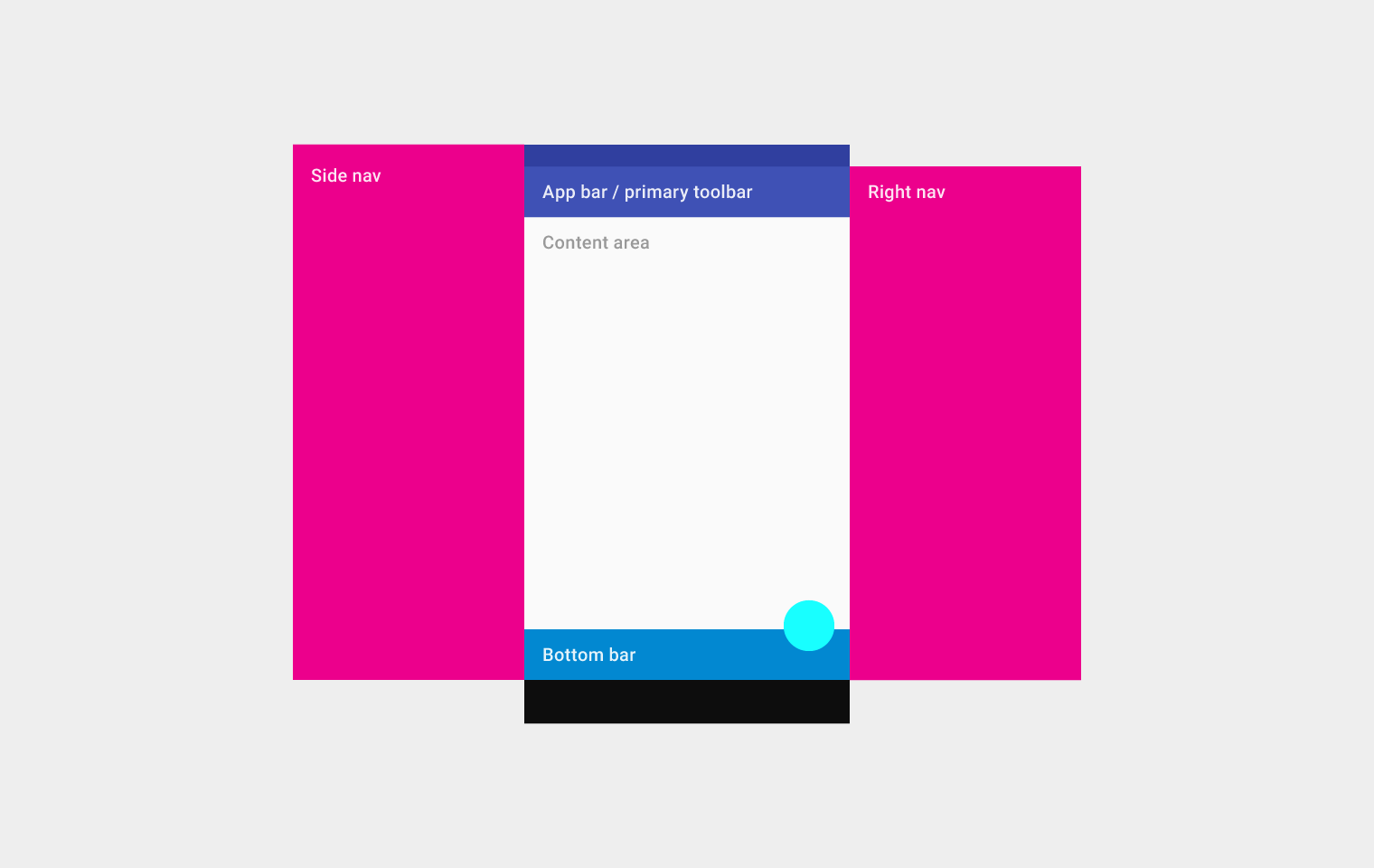
Implements the basic Material Design visual layout structure. This class provides APIs for showing drawers, snack bars, and bottom sheets.
Documentation
A Material Design app bar. An app bar consists of a toolbar and potentially other widgets, such as a TabBar and a FlexibleSpaceBar.
Documentation
Bottom navigation bars make it easy to explore and switch between top-level views in a single tap. The BottomNavigationBar widget implements this component.
Documentation
A Material Design widget that displays a horizontal row of tabs.
Documentation A page view that displays the widget which corresponds to the currently selected tab. Typically used in conjunction with a TabBar.
Documentation
A convenience widget that wraps a number of widgets that are commonly required for applications implementing Material Design.
Documentation
A convenience class that wraps a number of widgets that are commonly required for an application.
Documentation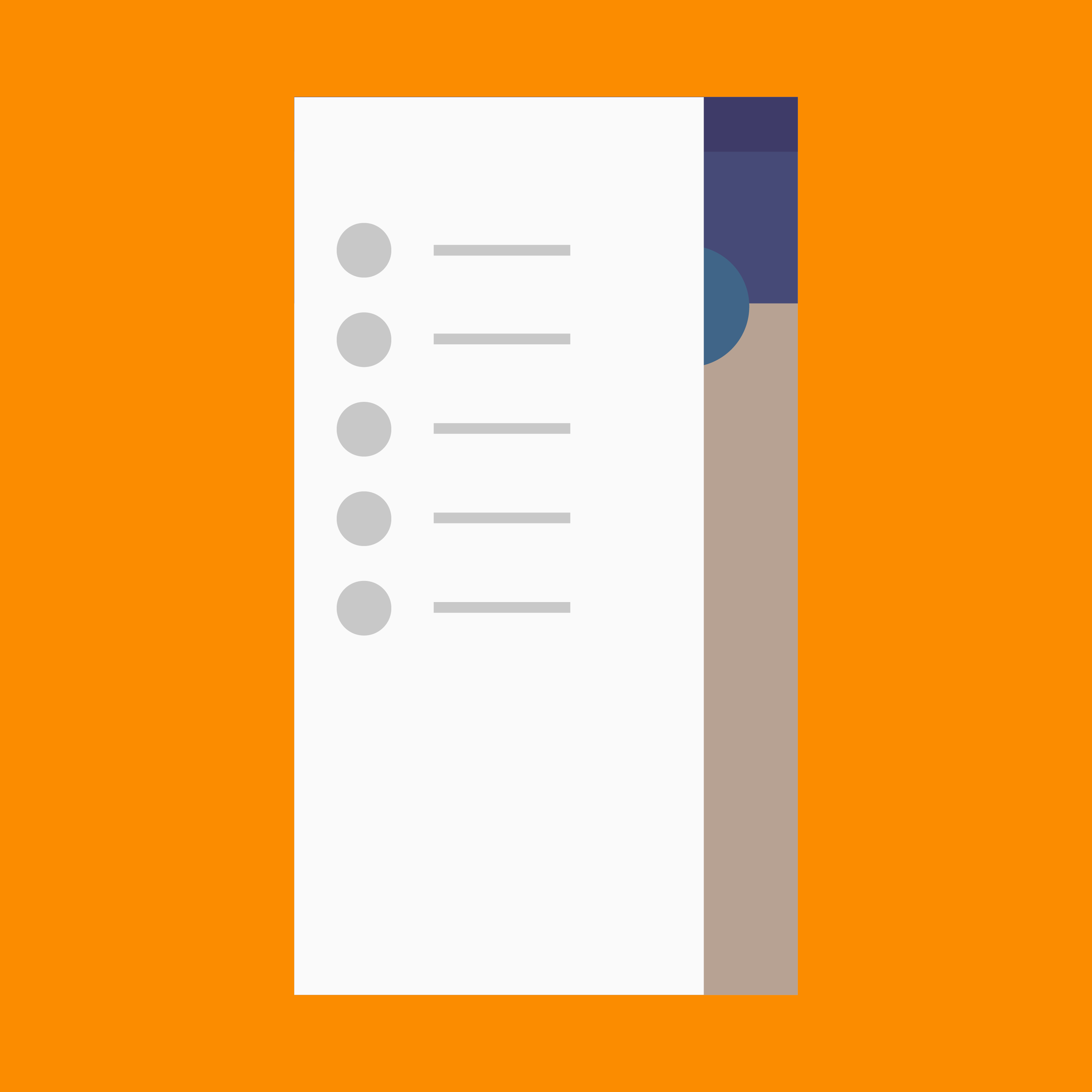
A Material Design panel that slides in horizontally from the edge of a Scaffold to show navigation links in an application.
Documentation A material design app bar that integrates with a CustomScrollView.
DocumentationButtons
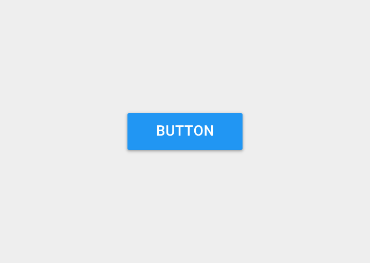
A Material Design raised button. A raised button consists of a rectangular piece of material that hovers over the interface.
Documentation
A floating action button is a circular icon button that hovers over content to promote a primary action in the application. Floating action buttons are most commonly used in the Scaffold.floatingActionButton field.
Documentation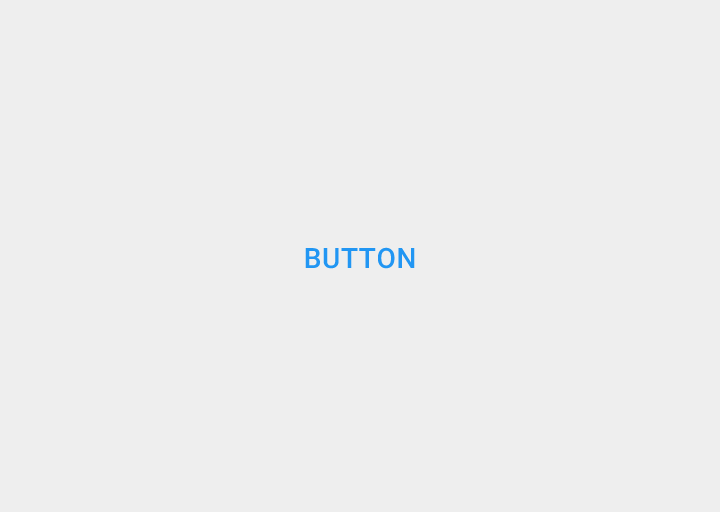
A flat button is a section printed on a Material Components widget that reacts to touches by filling with color.
Documentation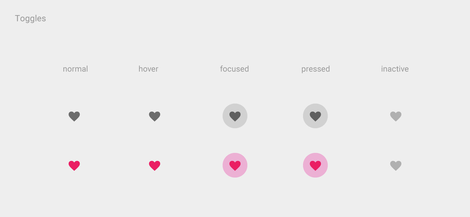
An icon button is a picture printed on a Material widget that reacts to touches by filling with color (ink).
Documentation Shows the currently selected item and an arrow that opens a menu for selecting another item.
Documentation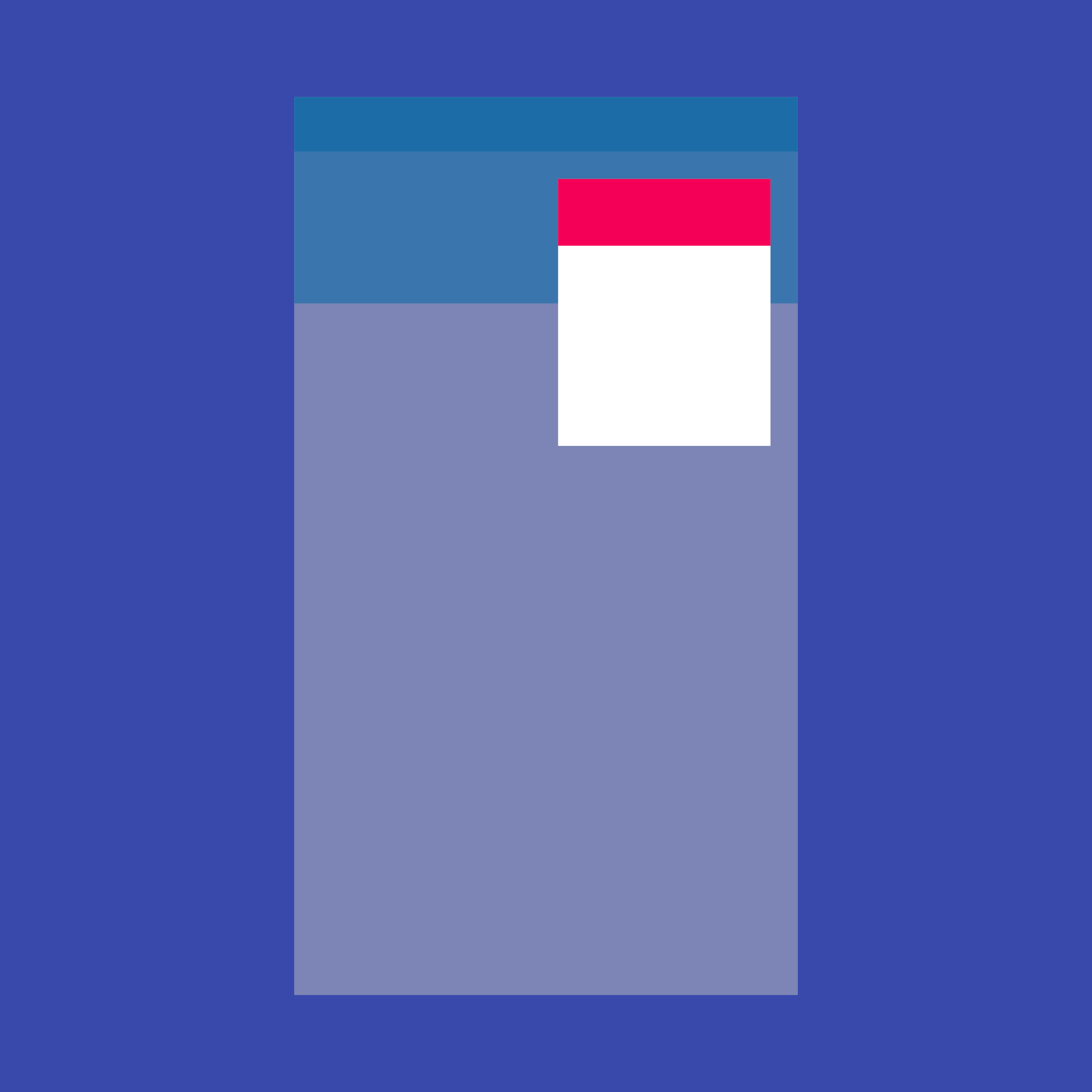
Displays a menu when pressed and calls onSelected when the menu is dismissed because an item was selected.
Documentation A horizontal arrangement of buttons.
DocumentationInput and selections
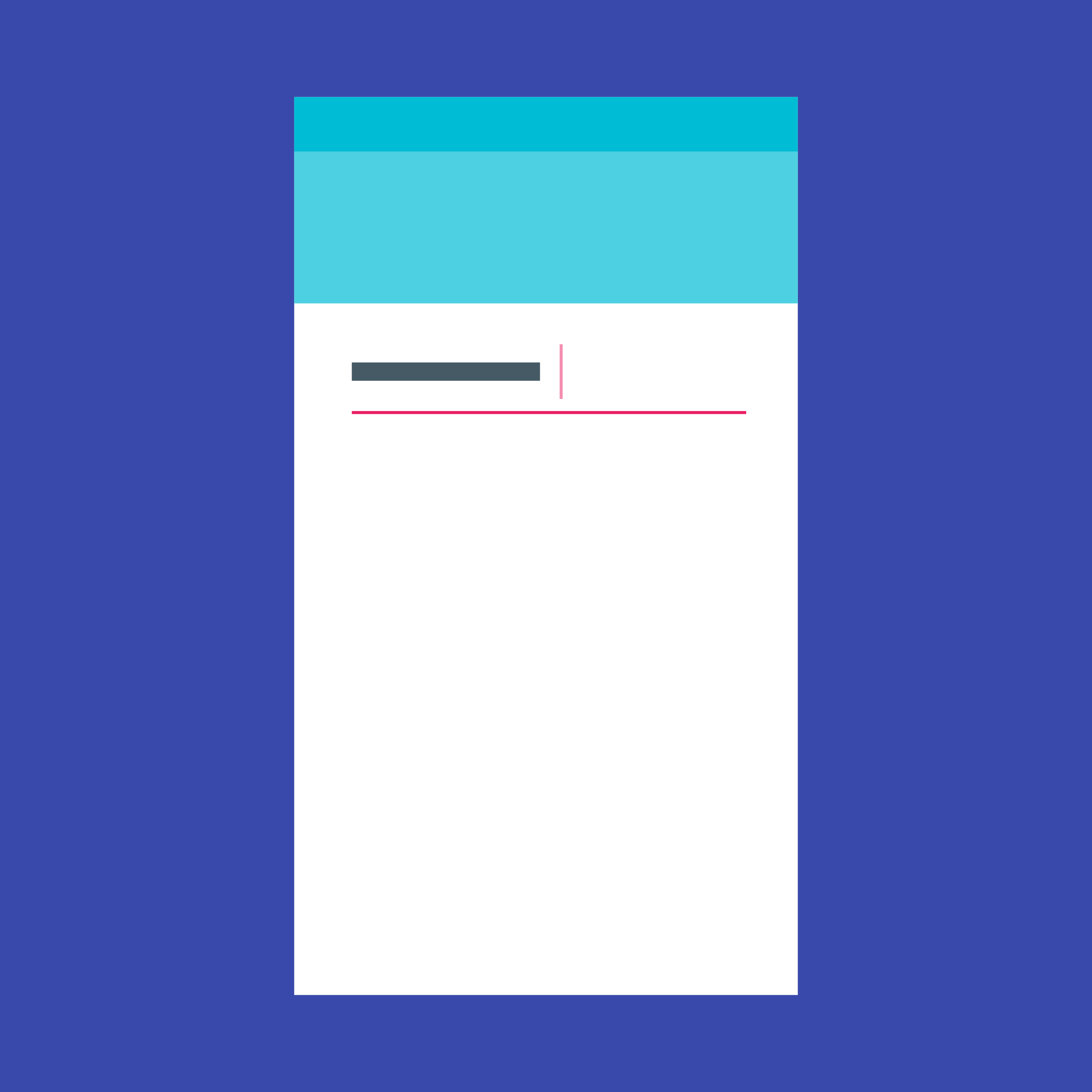
Touching a text field places the cursor and displays the keyboard. The TextField widget implements this component.
Documentation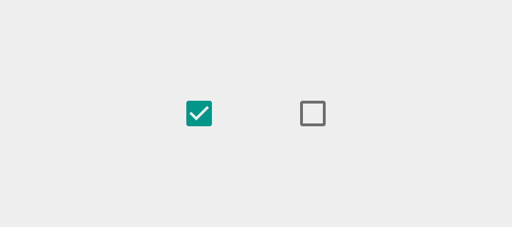
Checkboxes allow the user to select multiple options from a set. The Checkbox widget implements this component.
Documentation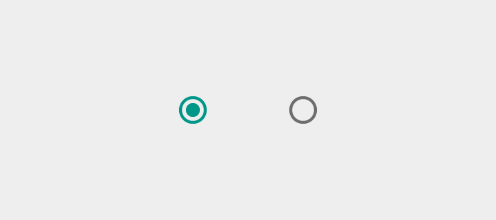
Radio buttons allow the user to select one option from a set. Use radio buttons for exclusive selection if you think that the user needs to see all available options side-by-side.
Documentation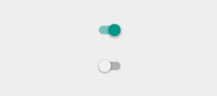
On/off switches toggle the state of a single settings option. The Switch widget implements this component.
Documentation
Sliders let users select from a range of values by moving the slider thumb.
Documentation
Date pickers use a dialog window to select a single date on mobile. Time pickers use a dialog to select a single time (in the hours:minutes format) on mobile.
DocumentationDialogs, alerts, and panels
Simple dialogs can provide additional details or actions about a list item. For example they can display avatars icons clarifying subtext or orthogonal actions (such as adding an account).
Documentation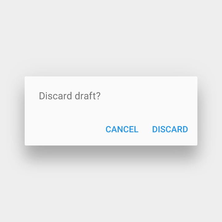
Alerts are urgent interruptions requiring acknowledgement that inform the user about a situation. The AlertDialog widget implements this component.
Documentation
Bottom sheets slide up from the bottom of the screen to reveal more content. You can call showBottomSheet() to implement a persistent bottom sheet or showModalBottomSheet() to implement a modal bottom sheet.
Documentation
Expansion panels contain creation flows and allow lightweight editing of an element. The ExpansionPanel widget implements this component.
Documentation
A lightweight message with an optional action which briefly displays at the bottom of the screen.
DocumentationInformation displays
A widget that displays an image.
Documentation A Material Design icon.
Documentation如果你对这篇内容有疑问,欢迎到本站社区发帖提问 参与讨论,获取更多帮助,或者扫码二维码加入 Web 技术交流群。

绑定邮箱获取回复消息
由于您还没有绑定你的真实邮箱,如果其他用户或者作者回复了您的评论,将不能在第一时间通知您!
发布评论