- Install
- Set up an editor
- Test drive
- Write your first Flutter app, part 1
- Learn more
- Flutter for Android developers
- Flutter for iOS developers
- Flutter for React Native developers
- Flutter for web developers
- Flutter for Xamarin.Forms developers
- Introduction to declarative UI
- Cookbook
- Codelabs
- Tutorials
- User interface
- Introduction to widgets
- Layouts in Flutter
- Layout tutorial
- Dealing with box constraints
- Adding interactivity to your Flutter app
- Adding assets and images
- Navigation & routing
- Introduction to animations
- Animations overview
- Animations tutorial
- Hero Animations
- Staggered Animations
- Advanced UI
- Slivers
- Taps, drags, and other gestures
- Widget catalog
- Data & backend
- State management
- State management
- Start thinking declaratively
- Differentiate between ephemeral state and app state
- Simple app state management
- List of state management approaches
- JSON and serialization
- Firebase
- Accessibility & internationalization
- Accessibility
- Internationalizing Flutter apps
- Platform integration
- Writing custom platform-specific code
- Packages & plugins
- Using packages
- Developing packages & plugins
- Background processes
- Tools & techniques
- Android Studio / IntelliJ
- Visual Studio Code
- Upgrading Flutter
- Hot reload
- Code formatting
- Debugging Flutter apps
- Using OEM debuggers
- Flutter's build modes
- Testing Flutter apps
- Performance best practices
- Flutter performance profiling
- Creating flavors for Flutter
- Preparing an Android App for Release
- Preparing an iOS App for Release
- Continuous Delivery using fastlane with Flutter
- Bootstrap into Dart
- Inside Flutter
- Platform specific behaviors and adaptations
- Technical Overview
- Technical videos
- FAQ
- Flutter widget index
- Install
- Windows install
- MacOS install
- Linux install
- Set up an editor
- Write your first Flutter app, part 1
- Learn more
- Cupertino (iOS-style) widgets
- Layout widgets
- Animation and motion widgets
- Retrieve the value of a text field
- Basic widgets
- Material Components widgets
- Animate the properties of a Container
- Fade a Widget in and out
- Add a Drawer to a screen
- Displaying SnackBars
- Exporting fonts from a package
- Updating the UI based on orientation
- Using Themes to share colors and font styles
- Using custom fonts
- Working with Tabs
- Building a form with validation
- Create and style a text field
- Focus on a Text Field
- Handling changes to a text field
- Retrieve the value of a text field
- Adding Material Touch Ripples
- Handling Taps
- Implement Swipe to Dismiss
- Display images from the internet
- Fade in images with a placeholder
- Working with cached images
- Basic List
- Create a horizontal list
- Creating a Grid List
- Creating lists with different types of items
- Place a floating app bar above a list
- Working with long lists
- Report errors to a service
- Animating a Widget across screens
- Navigate to a new screen and back
- Navigate with named routes
- Pass arguments to a named route
- Return data from a screen
- Send data to a new screen
- Fetch data from the internet
- Making authenticated requests
- Parsing JSON in the background
- Working with WebSockets
- Persist data with SQLite
- Reading and Writing Files
- Storing key-value data on disk
- Play and pause a video
- Take a picture using the Camera
- An introduction to integration testing
- Performance profiling
- Scrolling
- An introduction to unit testing
- Mock dependencies using Mockito
- An introduction to widget testing
- Finding widgets
- Tapping, dragging and entering text
- Development
- Introduction to widgets
- Layout tutorial
- Dealing with box constraints
- Adding interactivity to your Flutter app
- Adding assets and images
- Navigation & routing
- Navigate to a new screen and back
- Send data to a new screen
- Return data from a screen
- Navigate with named routes
- Animating a Widget across screens
- AnimatedList
- Sample App Catalog
- Animations overview
- Animations tutorial
- Staggered Animations
- Slivers
- Taps, drags, and other gestures
- Accessibility widgets
- Assets, images, and icon widgets
- Async widgets
- Input widgets
- Interaction model widgets
- Painting and effect widgets
- Scrolling widgets
- Styling widgets
- Text widgets
- State management
- Start thinking declaratively
- Differentiate between ephemeral state and app state
- Simple app state management
- List of state management approaches
- JSON and serialization
- Accessibility
- Internationalizing Flutter apps
- Writing custom platform-specific code
- Using packages
- Fetch data from the internet
- Developing packages & plugins
- Background processes
- Android Studio / IntelliJ
- Set up an editor
- Flutter inspector
- Creating Useful Bug Reports
- Visual Studio Code
- Set up an editor
- Upgrading Flutter
- Hot reload
- Code formatting
Layout tutorial
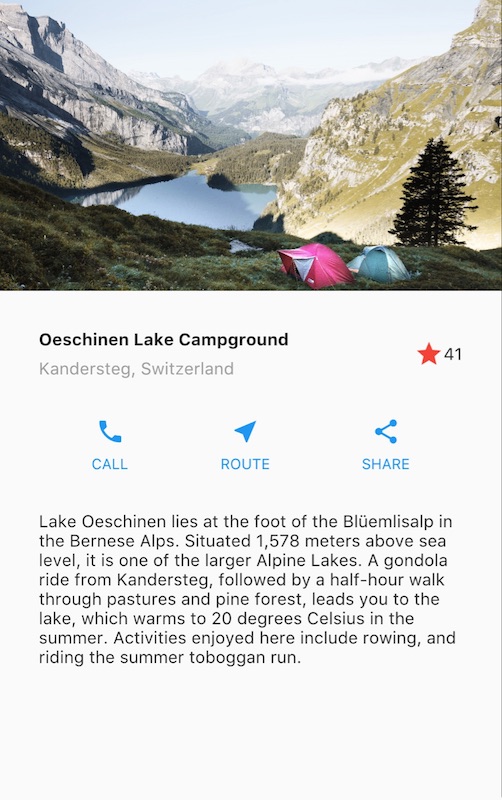
This is a guide to building layouts in Flutter. You’ll build the layout for the following app:

This guide then takes a step back to explain Flutter’s approach to layout, and shows how to place a single widget on the screen. After a discussion of how to lay widgets out horizontally and vertically, some of the most common layout widgets are covered.
If you want a “big picture” understanding of the layout mechanism, start with Flutter’s approach to layout.
Step 0: Create the app base code
Make sure you’ve set up your environment, then do the following:
- Create a basic “Hello World” Flutter app.
Change the app bar title and the app title as follows:
{codelabs/startup_namer/step1_base → layout/base}/lib/main.dart@@ -6,10 +6,10 @@ 6 6 @override 7 7 Widget build(BuildContext context) { 8 8 return MaterialApp( 9 - title: ' WelcometoFlutter',9 + title: 'Flutter layout demo', 10 10 home: Scaffold( 11 11 appBar: AppBar( 12 - title: Text(' WelcometoFlutter'),12 + title: Text('Flutter layout demo'), 13 13 ), 14 14 body: Center( 15 15 child: Text('Hello World'),
Step 1: Diagram the layout
The first step is to break the layout down to its basic elements:
- Identify the rows and columns.
- Does the layout include a grid?
- Are there overlapping elements?
- Does the UI need tabs?
- Notice areas that require alignment, padding, or borders.
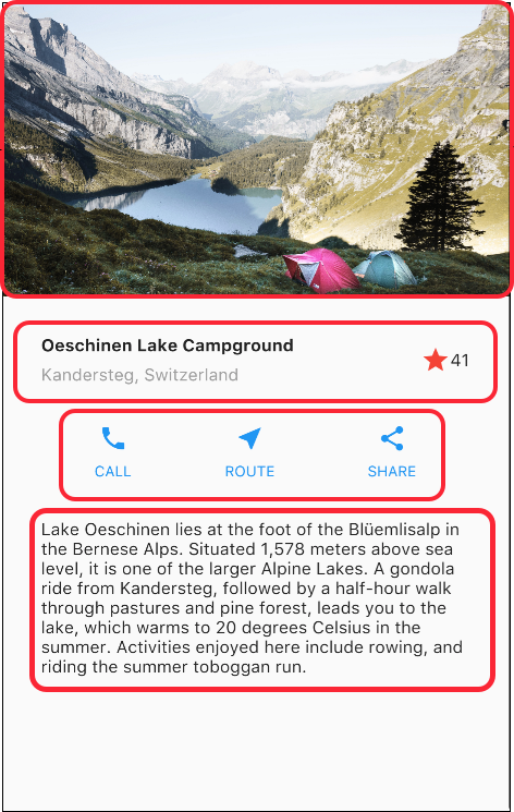
First, identify the larger elements. In this example, four elements are arranged into a column: an image, two rows, and a block of text.

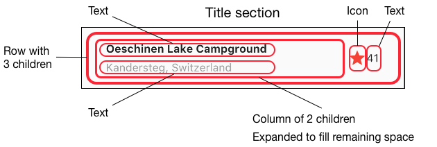
Next, diagram each row. The first row, called the Title section, has 3 children: a column of text, a star icon, and a number. Its first child, the column, contains 2 lines of text. That first column takes a lot of space, so it must be wrapped in an Expanded widget.

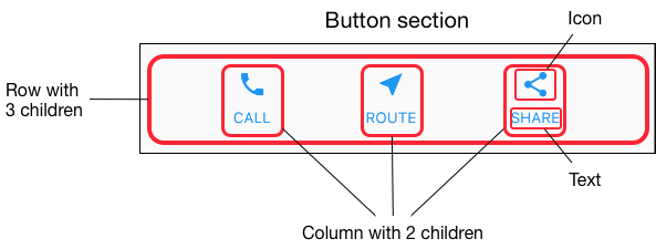
The second row, called the Button section, also has 3 children: each child is a column that contains an icon and text.

Once the layout has been diagrammed, it’s easiest to take a bottom-up approach to implementing it. To minimize the visual confusion of deeply nested layout code, place some of the implementation in variables and functions.
Step 2: Implement the title row
First, you’ll build the left column in the title section. Add the following code at the top of the build() method of the MyApp class:
Widget titleSection = Container(
  padding: const EdgeInsets.all(32),
  child: Row(
    children: [
      Expanded(
        /*1*/
        child: Column(
          crossAxisAlignment: CrossAxisAlignment.start,
          children: [
            /*2*/
            Container(
              padding: const EdgeInsets.only(bottom: 8),
              child: Text(
                'Oeschinen Lake Campground',
                style: TextStyle(
                  fontWeight: FontWeight.bold,
                ),
              ),
            ),
            Text(
              'Kandersteg, Switzerland',
              style: TextStyle(
                color: Colors.grey[500],
              ),
            ),
          ],
        ),
      ),
      /*3*/
      Icon(
        Icons.star,
        color: Colors.red[500],
      ),
      Text('41'),
    ],
  ),
);- Putting a Column inside an Expanded widget stretches the column to use all remaining free space in the row. Setting the
crossAxisAlignmentproperty toCrossAxisAlignment.startpositions the column at the start of the row. - Putting the first row of text inside a Container enables you to add padding. The second child in the Column, also text, displays as grey.
- The last two items in the title row are a star icon, painted red, and the text “41”. The entire row is in a Container and padded along each edge by 32 pixels.
Add the title section to the app body like this:
{../base → step2}/lib/main.dart| @@ -8,11 +46,13 @@ | |
| 8 46 | return MaterialApp( |
| 9 47 | title: 'Flutter layout demo', |
| 10 48 | home: Scaffold( |
| 11 49 | appBar: AppBar( |
| 12 50 | title: Text('Flutter layout demo'), |
| 13 51 | ), |
| 14 | - body: |
| 15 | - |
| 52 | + body: Column( |
| 53 | + children: [ |
| 54 | + titleSection, |
| 55 | + ], |
| 16 56 | ), |
| 17 57 | ), |
| 18 58 | ); |
Step 3: Implement the button row
The button section contains 3 columns that use the same layout—an icon over a row of text. The columns in this row are evenly spaced, and the text and icons are painted with the primary color.
Since the code for building each column is almost identical, create a private helper method named buildButtonColumn(), which takes a color, an Icon and Text, and returns a column with its widgets painted in the given color.
class MyApp extends StatelessWidget {
  @override
  Widget build(BuildContext context) {
    // ···
  }

  Column _buildButtonColumn(Color color, IconData icon, String label) {
    return Column(
      mainAxisSize: MainAxisSize.min,
      mainAxisAlignment: MainAxisAlignment.center,
      children: [
        Icon(icon, color: color),
        Container(
          margin: const EdgeInsets.only(top: 8),
          child: Text(
            label,
            style: TextStyle(
              fontSize: 12,
              fontWeight: FontWeight.w400,
              color: color,
            ),
          ),
        ),
      ],
    );
  }
}
The function adds the icon directly to the column. The text is inside a Container with a top-only margin, separating the text from the icon.
Build the row containing these columns by calling the function and passing the color, Icon, and text specific to that column. Align the columns along the main axis using MainAxisAlignment.spaceEvenly to arrange the free space evenly before, between, and after each column. Add the following code just below the titleSection declaration inside the build() method:
Color color = Theme.of(context).primaryColor;

Widget buttonSection = Container(
  child: Row(
    mainAxisAlignment: MainAxisAlignment.spaceEvenly,
    children: [
      _buildButtonColumn(color, Icons.call, 'CALL'),
      _buildButtonColumn(color, Icons.near_me, 'ROUTE'),
      _buildButtonColumn(color, Icons.share, 'SHARE'),
    ],
  ),
);
Add the button section to the body:
{step2 → step3}/lib/main.dart| @@ -46,3 +59,3 @@ | |
| 46 59 | return MaterialApp( |
| 47 60 | title: 'Flutter layout demo', |
| 48 61 | home: Scaffold( |
| @@ -52,8 +65,9 @@ | |
| 52 65 | body: Column( |
| 53 66 | children: [ |
| 54 67 | titleSection, |
| 68 | + buttonSection, |
| 55 69 | ], |
| 56 70 | ), |
| 57 71 | ), |
| 58 72 | ); |
| 59 73 | } |
Step 4: Implement the text section
Define the text section as a variable. Put the text in a Container and add padding along each edge. Add the following code just below the buttonSection declaration:
Widget textSection = Container(
  padding: const EdgeInsets.all(32),
  child: Text(
    'Lake Oeschinen lies at the foot of the Blüemlisalp in the Bernese '
        'Alps. Situated 1,578 meters above sea level, it is one of the '
        'larger Alpine Lakes. A gondola ride from Kandersteg, followed by a '
        'half-hour walk through pastures and pine forest, leads you to the '
        'lake, which warms to 20 degrees Celsius in the summer. Activities '
        'enjoyed here include rowing, and riding the summer toboggan run.',
    softWrap: true,
  ),
);
By setting softwrap to true, text lines will fill the column width before wrapping at a word boundary.
Add the text section to the body:
{step3 → step4}/lib/main.dart| @@ -59,3 +72,3 @@ | |
| 59 72 | return MaterialApp( |
| 60 73 | title: 'Flutter layout demo', |
| 61 74 | home: Scaffold( |
| @@ -66,6 +79,7 @@ | |
| 66 79 | children: [ |
| 67 80 | titleSection, |
| 68 81 | buttonSection, |
| 82 | + textSection, |
| 69 83 | ], |
| 70 84 | ), |
| 71 85 | ), |
Step 5: Implement the image section
Three of the four column elements are now complete, leaving only the image. Add the image file to the example:
- Create an
imagesdirectory at the top of the project. Add
lake.jpg.Update the
{step4 → step5}/pubspec.yamlpubspec.yamlfile to include anassetstag. This makes the image available to your code.@@ -17,3 +17,5 @@ 17 17 flutter: 18 18 uses-material-design: true 19 + assets: 20 + - images/lake.jpg
Now you can reference the image from your code:
{step4 → step5}/lib/main.dart| @@ -77,6 +77,12 @@ | |
| 77 77 | ), |
| 78 78 | body: Column( |
| 79 79 | children: [ |
| 80 | + Image.asset( |
| 81 | + 'images/lake.jpg', |
| 82 | + width: 600, |
| 83 | + height: 240, |
| 84 | + fit: BoxFit.cover, |
| 85 | + ), |
| 80 86 | titleSection, |
| 81 87 | buttonSection, |
| 82 88 | textSection, |
BoxFit.cover tells the framework that the image should be as small as possible but cover its entire render box.
Step 6: Final touch
In this final step, arrange all of the elements in a ListView, rather than a Column, because a ListView supports app body scrolling when the app is run on a small device.
| @@ -72,13 +77,13 @@ | |
| 72 77 | return MaterialApp( |
| 73 78 | title: 'Flutter layout demo', |
| 74 79 | home: Scaffold( |
| 75 80 | appBar: AppBar( |
| 76 81 | title: Text('Flutter layout demo'), |
| 77 82 | ), |
| 78 | - body: |
| 83 | + body: ListView( |
| 79 84 | children: [ |
| 80 85 | Image.asset( |
| 81 86 | 'images/lake.jpg', |
| 82 87 | width: 600, |
| 83 88 | height: 240, |
| 84 89 | fit: BoxFit.cover, |
Dart code: main.dart
Image: images
Pubspec: pubspec.yaml
That’s it! When you hot reload the app, you should see the same app layout as the screenshot at the top of this page.
You can add interactivity to this layout by following Adding Interactivity to Your Flutter App.
如果你对这篇内容有疑问,欢迎到本站社区发帖提问 参与讨论,获取更多帮助,或者扫码二维码加入 Web 技术交流群。

绑定邮箱获取回复消息
由于您还没有绑定你的真实邮箱,如果其他用户或者作者回复了您的评论,将不能在第一时间通知您!
发布评论